
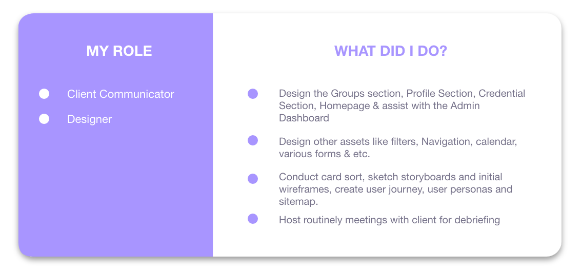
May 2021 - Present
Product Designer | UX Researcher
2 Designers | 3 Engineers | 2 CS Reps
Resources: GV Sprint, W3C Web Accessibility, NN/g | Design: Figma, Illustrator, Principle, Webflow | Research: PlaybookUX, Full Story, Mix Panel, Zoom | Ideation: FigmaJam | Collaboration: Jira, Confluence, Zoom, Slack, Google Meets
Papercurve is an AI-powered Content Lifecycle Management platform for life sciences companies to streamline their MLR review process. Woven into the DNA of Papercurve is to make “software disappear” through the emphasis on good UX in a sea of non-user friendly enterprise software.
End- to End 8 Full Features (so far)
12 Product Fixes (so far)

Product Strategy and build roadmap with PM & CEO and present decisions to company

Collaborate with cross functional teams (Product, Eng, CS)
Work 1:1 with engineering counterpart

Synthesize research and report in company meetings

Improve company processes by creating standard practices and work templates

Track and report success metrics for my features

Conduct UX research on current and future features

Write technical specs on Jira tickets & feature specs on Confluence

Design new pages on Webflow pages for company site

Run design workshops for larger features

Demo lucrative feature prototypes to prospects and clients
Maintain and improve Design System
This Case Study details 2/8 of the features I designed, each to illustrate a different point.
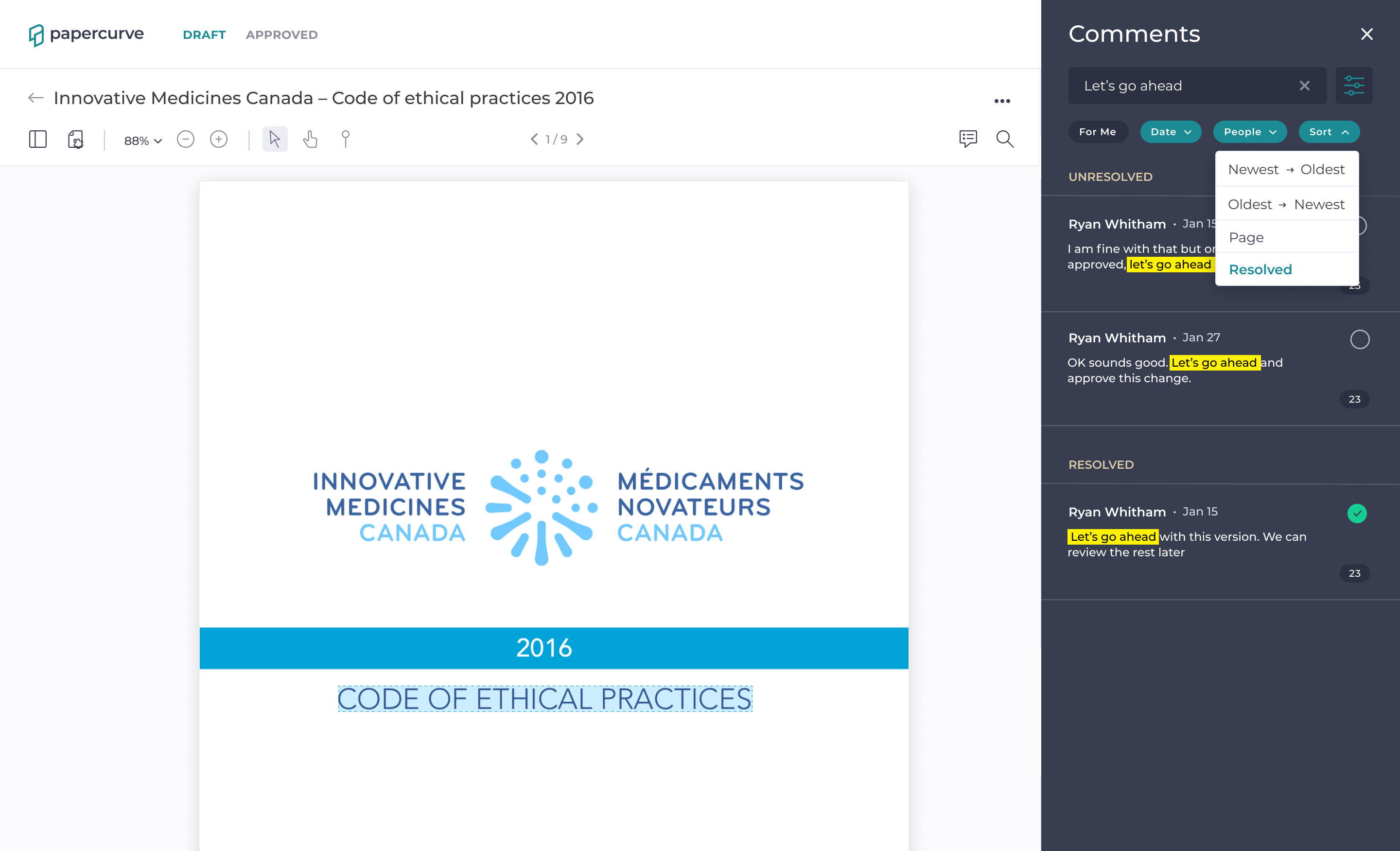
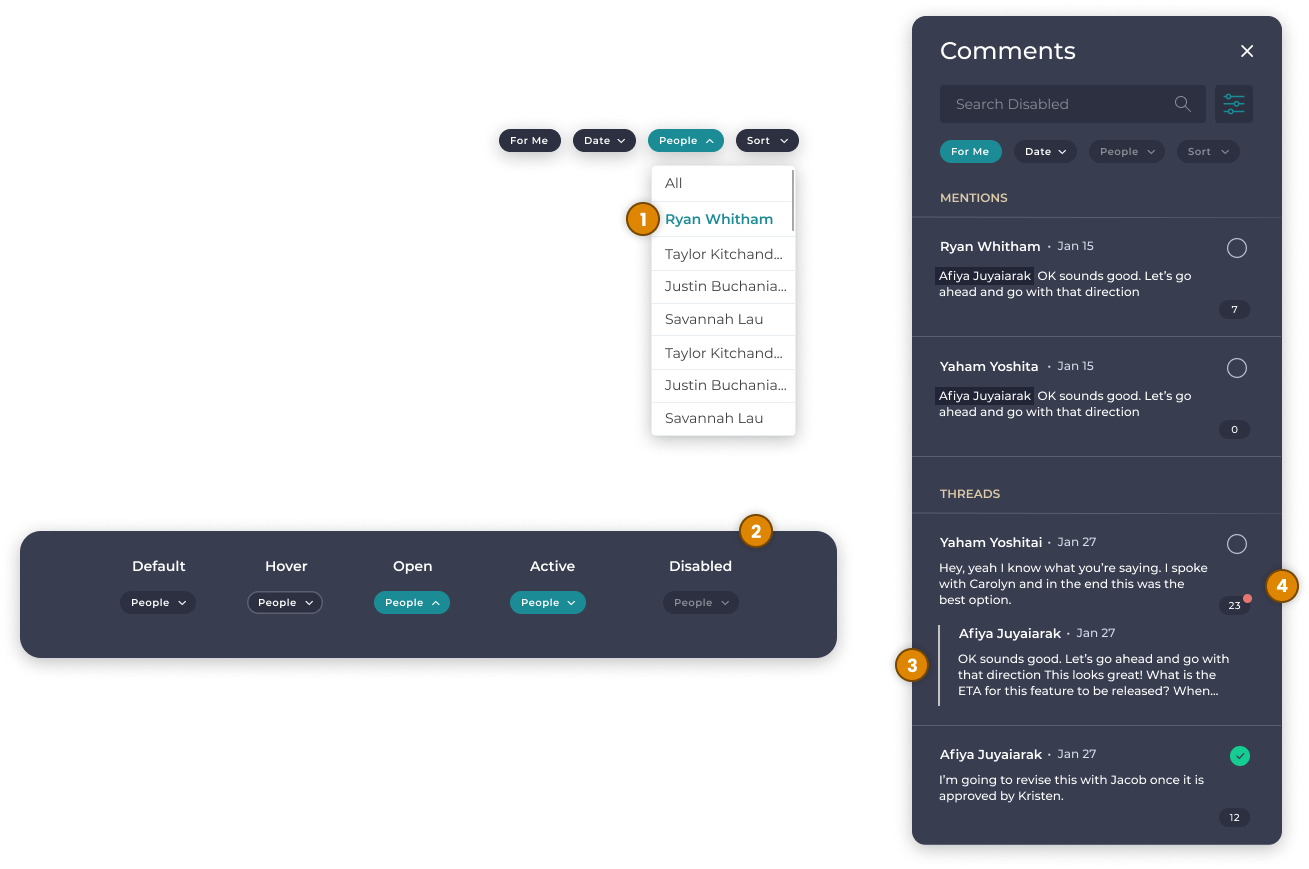
Comments Search, Sort & Filter
To show my design process when everything goes smoothly
Website Review
Designing with technological constraints and unforeseen challenges
Users did not have the ability to search or filter through comments on any given document using Papercurve, this is troubling because they would have to use poor work arounds or manually search for a specific comment when there could be 100s of them.
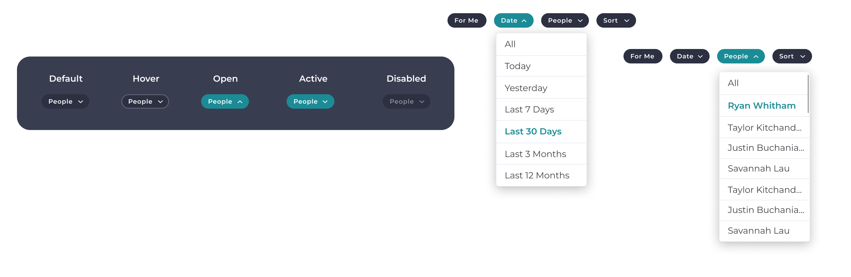
Users are able to narrow down comments by using simple date parameters and by reviewers who commented on the content
The simple date parameters were chosen over specific date selection because it is faster and less cognitive load. For the same reason, the people filter features only reviewers who have already commented to lessen a potentially massive list
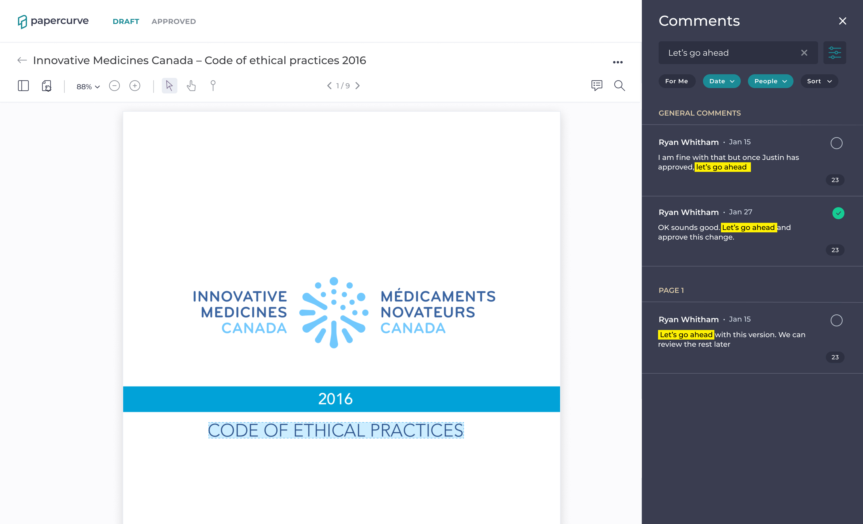
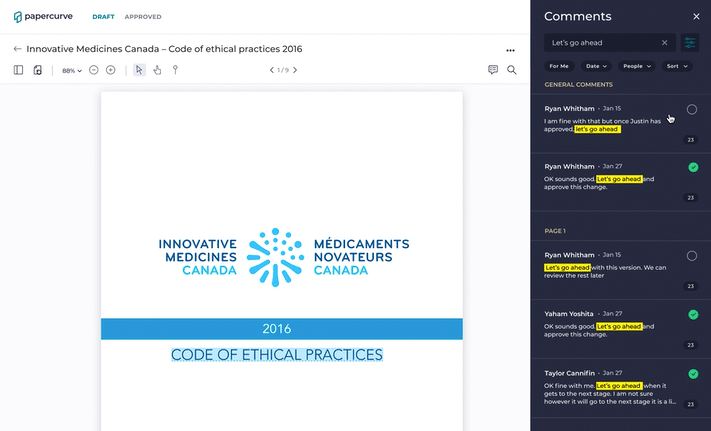
Users can search through comments by typing in any keyword.
Our research indicated that 30% of people use a search box when one is available and the searched terms remaining highlighted when the thread is open lowers the user's cognitive load by not having to look for it again.
Users are able to sort comments according to their need instead of being stuck with the default sort.
Enabling users to sort by other methods allows them to organize comments according to the need at hand.
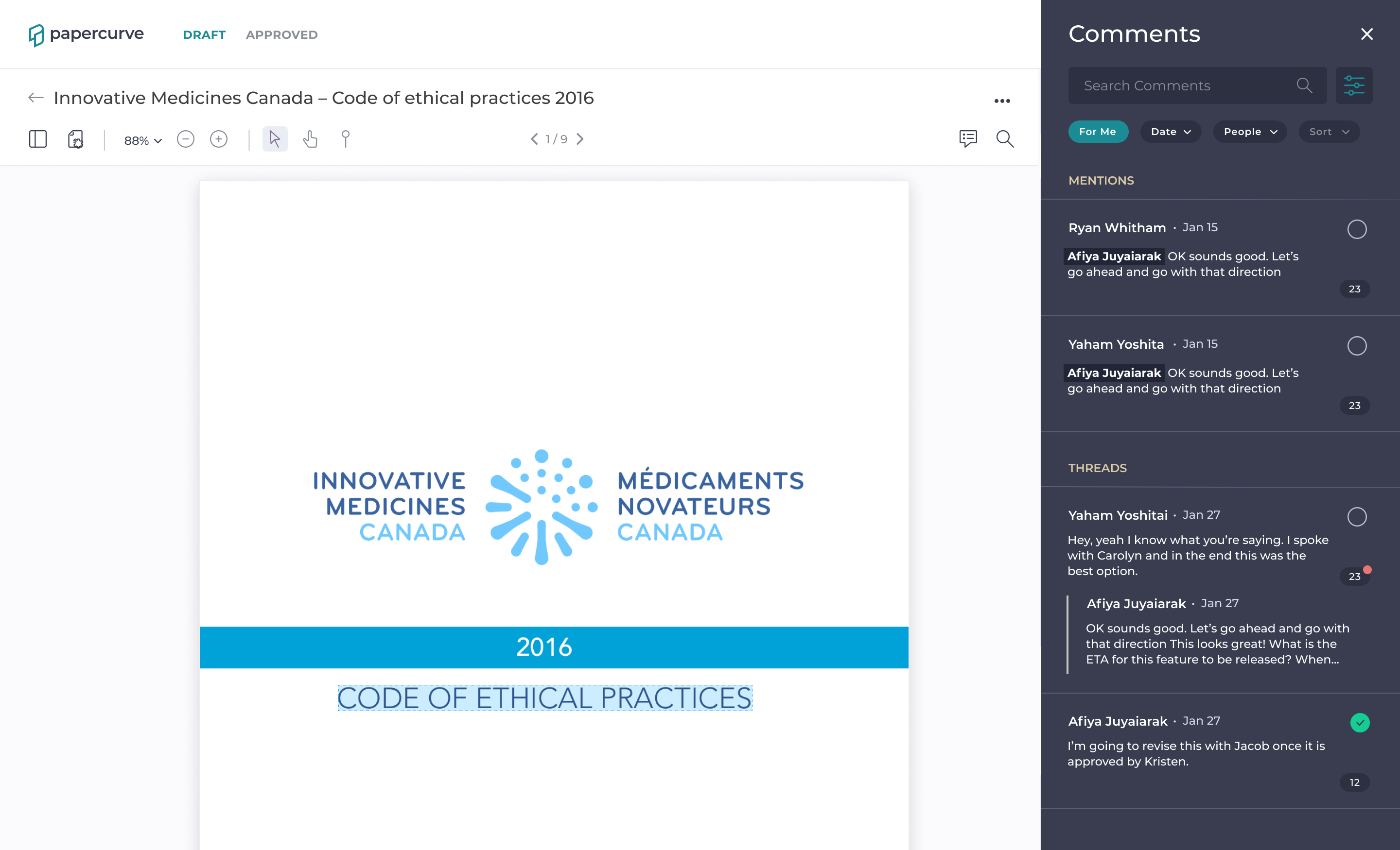
The "For Me" filter provides a personalized feed of comments.
Our research indicated that users mostly care about comments that are relevant to them. This enables users to see just that with a single click. This feature is inspired by Slack's "Threads" feature.
Our CS team records complaints, insights & requests along with the associated contact. So, I reached out to some of the contacts to find out what problems users are facing with comments as it exists now. What I found is that right now, if a user is trying to find a specific comment they can do so in 3 ways, none of which are good:
Manually search through with the comments panel on the side bar
This takes users along time and is tedious
Use the left side panel (Legacy UI)
This doesn't show the comment itself (only the author) and there is technically a search bar but doesn’t work, it doesn’t show general comments, and it mixes up references and comments
Use command F with Chrome
This works but is a Chrome feature not facilitated by Papercurve
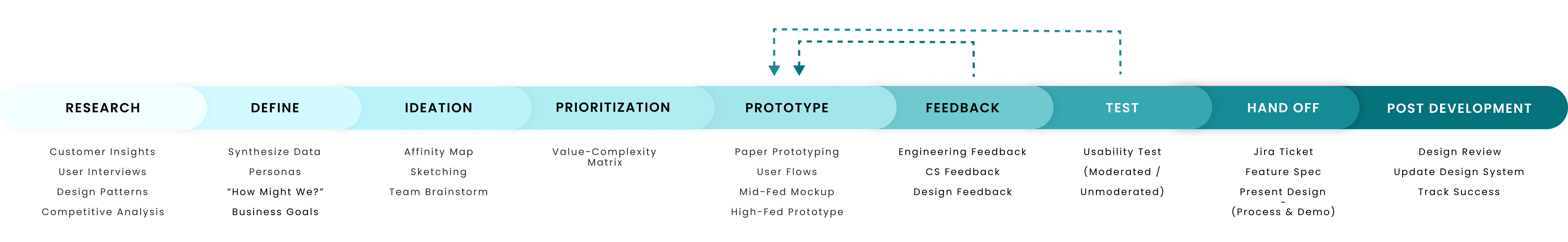
Before I dive into anything else, I identified the business goals with my Product Manager to ensure my later design decisions are aligned with them.
Increase Usefulness ASAP
Comments is already among the most used features, so creating value in a high traffic feature makes Papercurve more "sticky" and visibly valuable
Increase productivity & personalization
The ability to search, sort & filter comments should decrease the time users waste filtering through comments to find the few relevant ones
Lower cognitive load in searching comments
Currently, finding comments is cognitively intensive; lowering it is a huge win because it allows users to expend that time and energy more productively
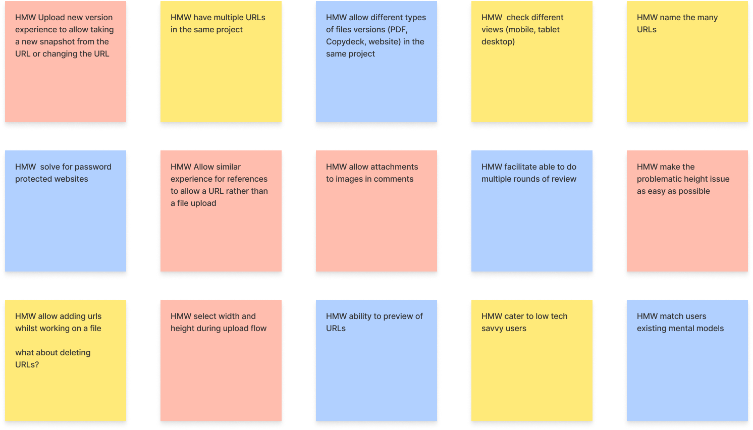
Using what I learned for my user research and conversations with customer success, product and engineering team, I listed out a summary of our users' pain points, technical constraints and business priorities and then conducted a HMW exercise with the design team.
Then, I organized the HMWs in an affinity map with a series of potential solutions with the design team.
Before I began my design phase, I looked at various applications for design flow, patterns, and concepts that would be relevant to my design. By doing this, I can cater to users' existing mental models and use safe, well research UI/UX concepts used by established platforms.
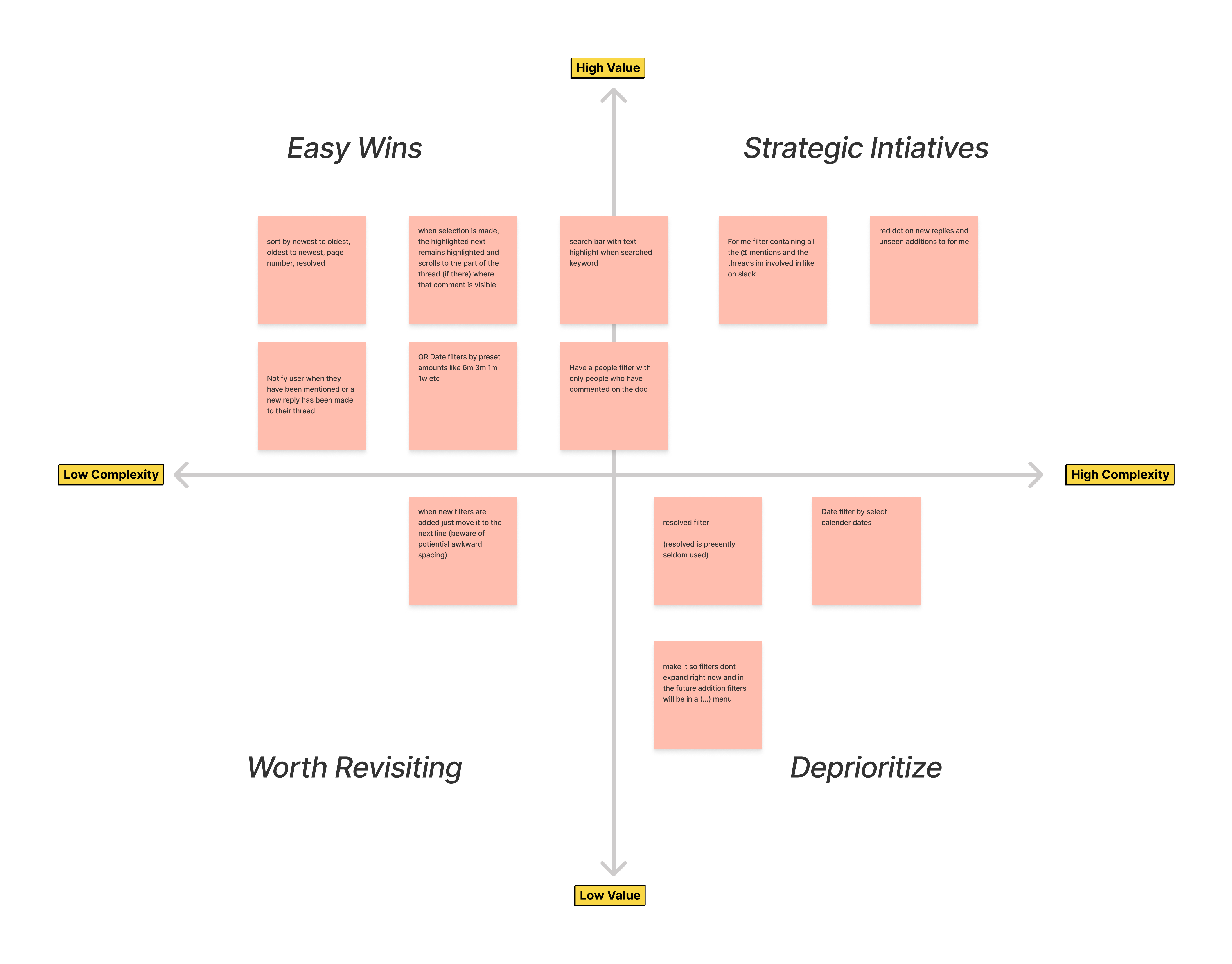
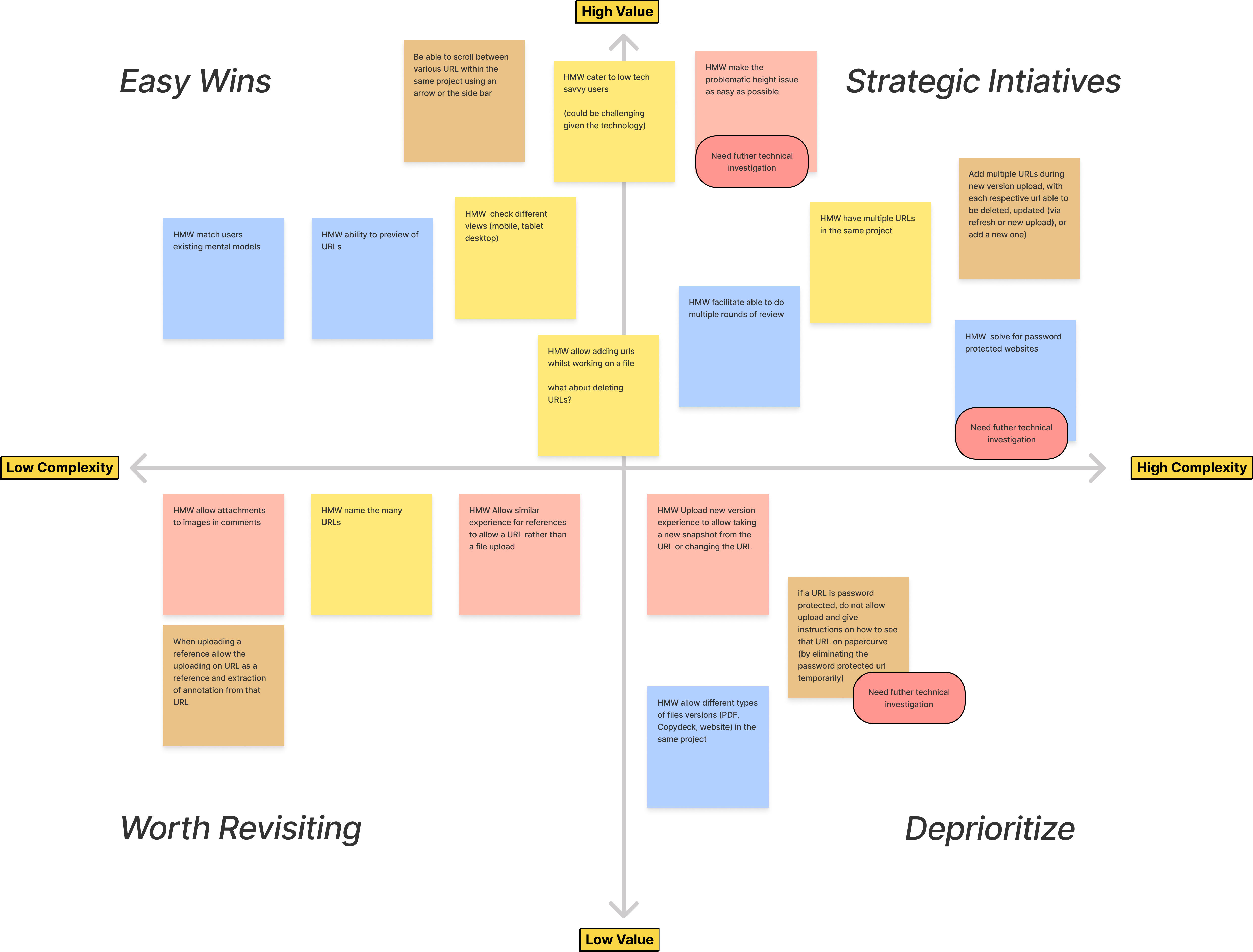
I wireframe the concepts (see above) and used it to communicate concepts to engineering, business development & my PM. Then, together we evaluate the concepts by placing them on a Value-Complexity Matrix based on business goals, desirability/value add & technical complexity.
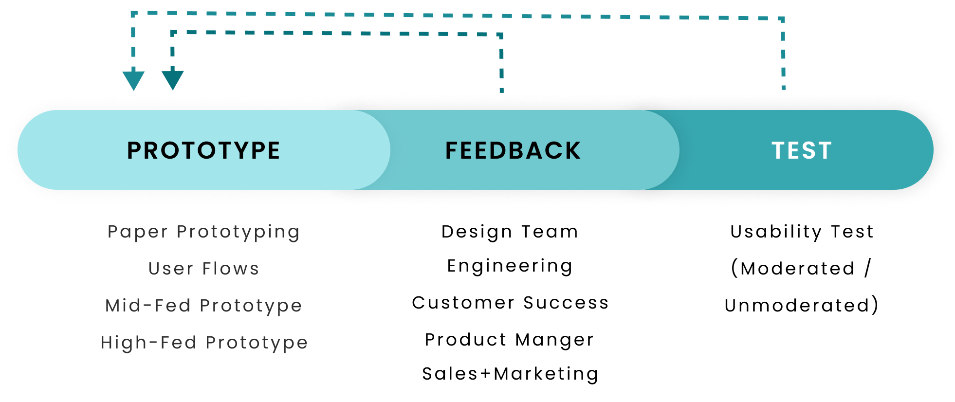
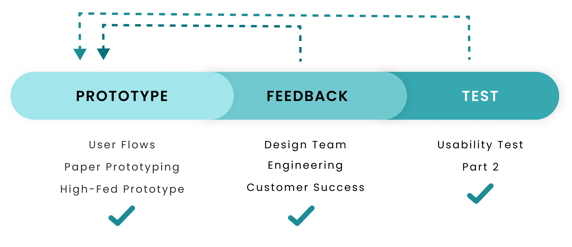
My design process consist of designing and receiving feedback in iterations from the design team for critique and engineering for technical feasibility and on later from CS, Sales and other teams.
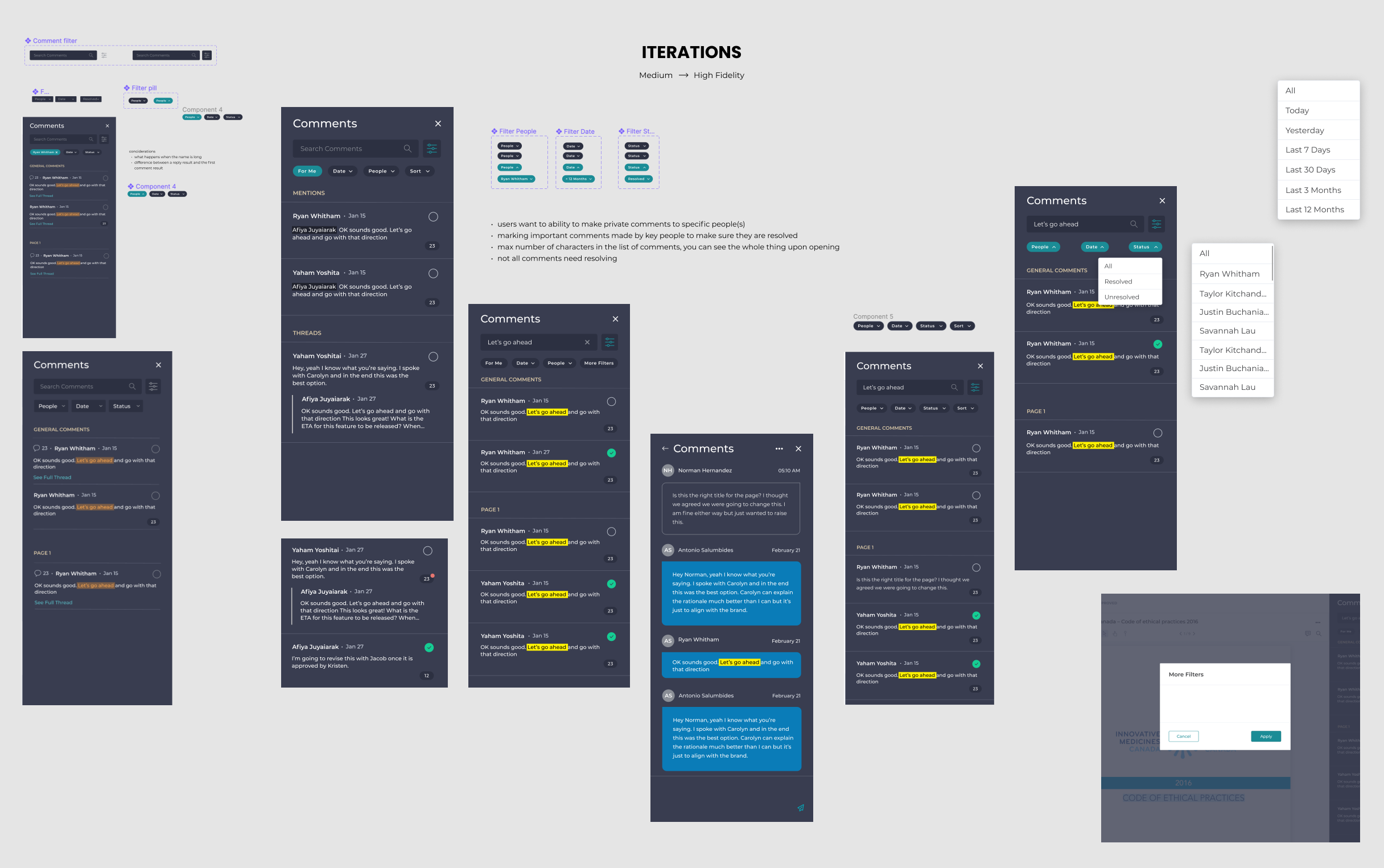
This feedback loop enables me to iteratively go from wireframes, to a high fidelity prototype. The image below is a sample of my iterations:
Io make sure there were no usability issues, I conducted an unmoderated usability test using PlaybookUX with 5 participants who work in Marketing, Sales or Brand Management at Life Sciences companies.
Tasks
Questions & Metrics
This usability test was an overall success and that meant it was ready to prep for development!
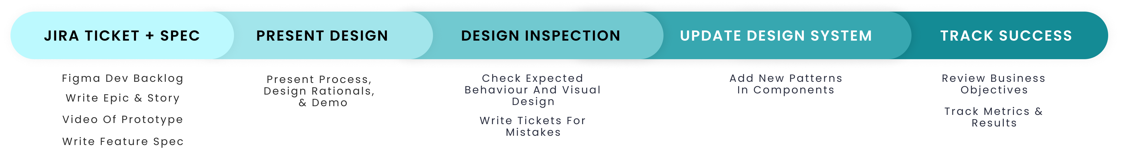
Once creating screens for the secondary screens, empty states, error states, and edge cases were done, I detail the expected behaviour for engineering and QA with "Given, When, Then" statements in a Jira tickets. I also wrote the feature specification for sales and marketing.
Though I make every effort to use existing patterns when creating new designs, to reduce engineering effort and follow users' existing mental models, new patterns are sometimes inevitable, so I have to update the design system to include the new components.
My final step is to go back to the business objectives and select success metrics. Once chosen, I keep track if them and report it in 3 months time.
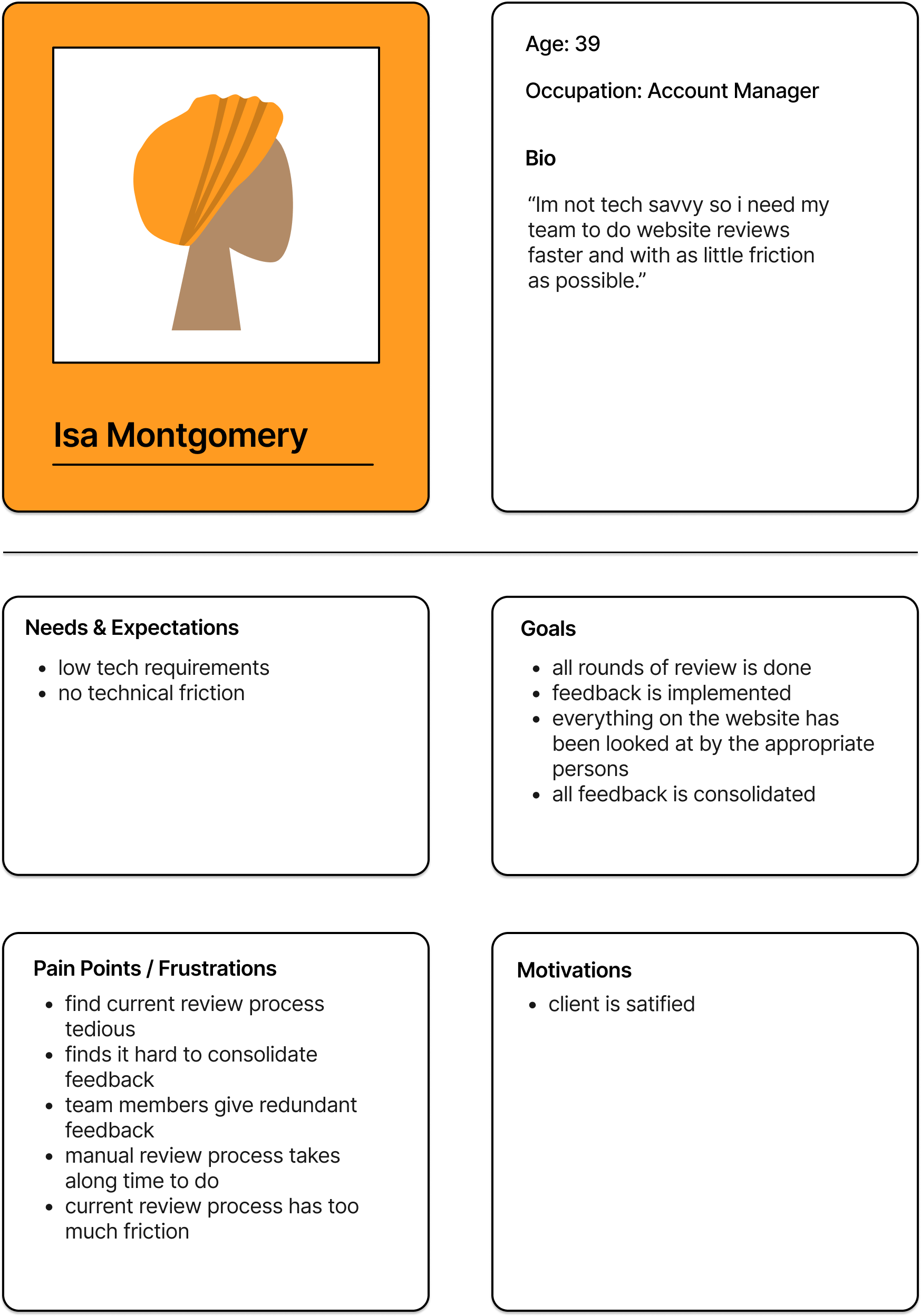
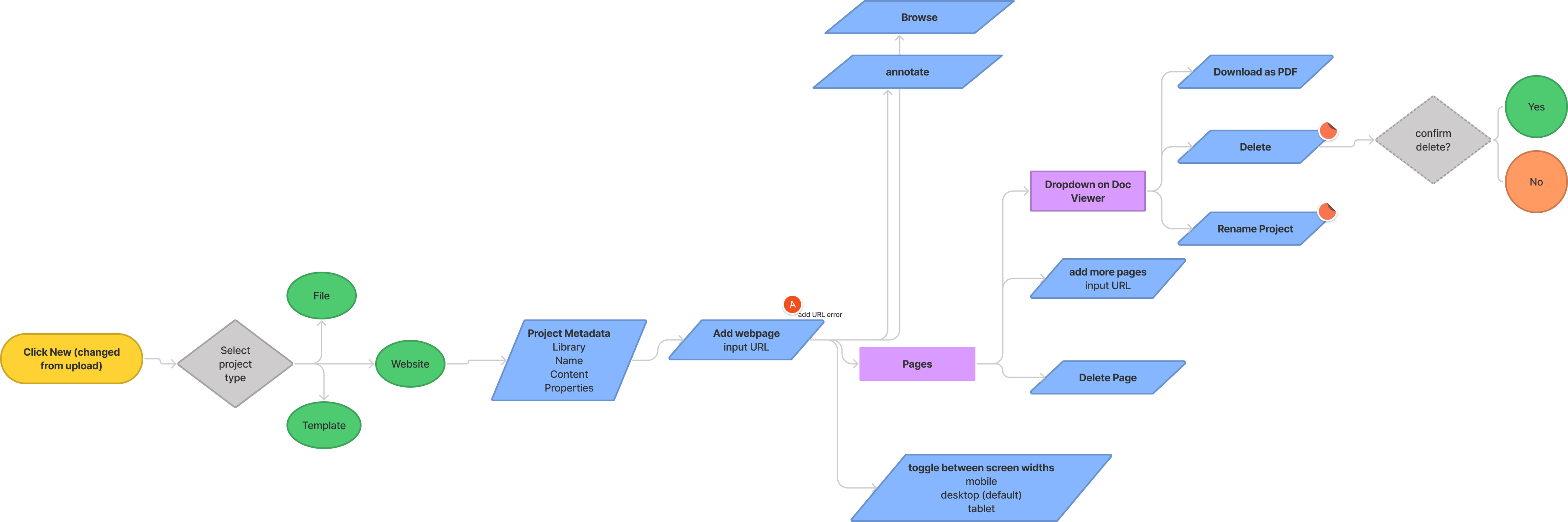
Currently, users don’t have an easy way to collaborate, review and approve website content. The only workaround is either screenshots, which do not allow highlighting of text or interactivity, or PDF exports which requires external tools and can be inaccurate.
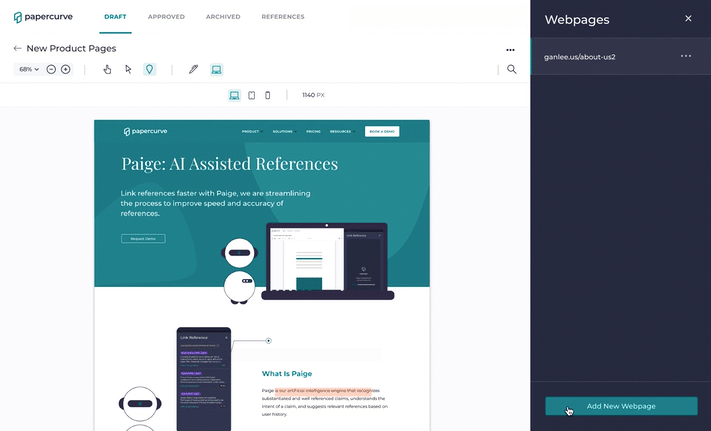
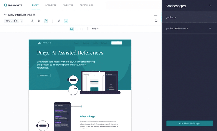
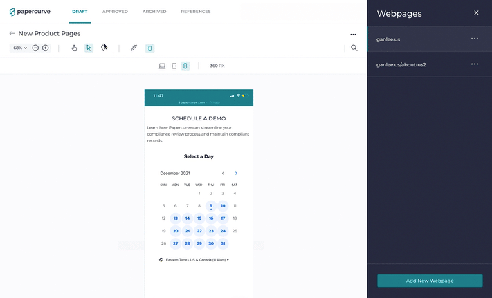
Users are able to add new webpages by simply inputting the URL.
Our research showed that website review is done on many URLs at a time and our low tech users want the simplest solution possible. This list also ensures all webpages in review are seen by reviewers.
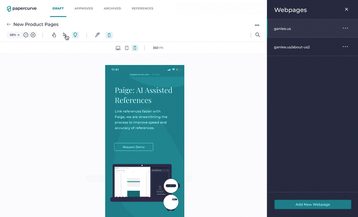
Users are able to review the responsiveness of their website with 3 of the most common screenwidths by clicking the screenwidth icons.
Our research indicated that users conduct review primarily on desktop but mobile and tablet views are also checked. Our users are also not very tech savvy, hence the 3 simple icons. Also, I selected the screenwidth PX sizes based on stats for most common screenwidths globally.
Users are able to click around and interact with the website using browse mode.
A website is an interactive medium, so a sufficient review cannot be done without being able to review the interactive elements. Users go into browse mode by clicking on the cursor icon, a pattern already familiar to users today.
Reviewers are able to leave feedback using annotate mode by selecting the pindrop icon, putting the pin on the webpage and then typing up a comment.
The pindrop flow to leave comments has not changed for website review so it is a familiar flow to users, thus matching their mental models.
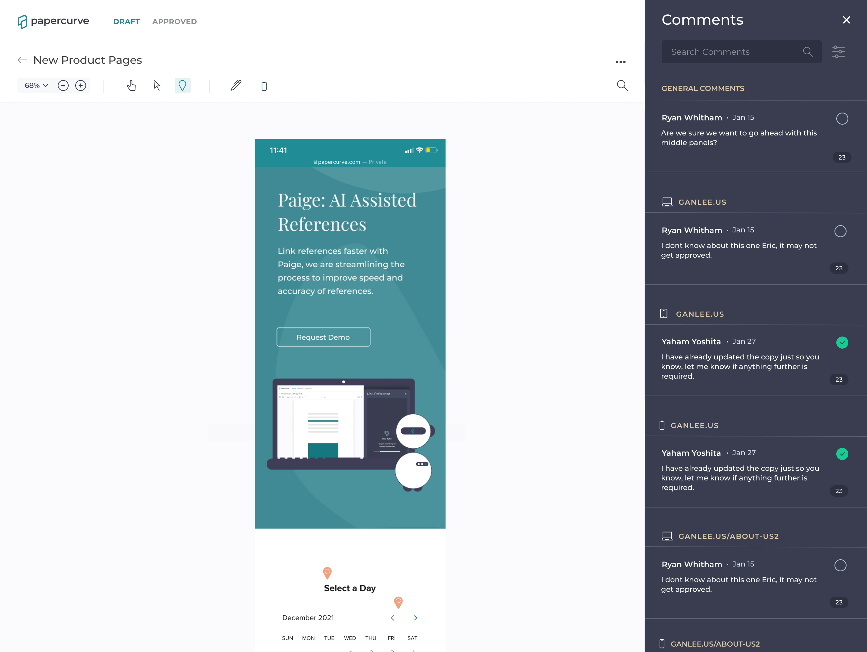
Users are able to see all the feedback in the comments panel which is categorized by page name and the accompanying screenwidth.
All the feedback (regardless where of it is left) lives in one area to make sure nothing is left uncheck. If one needs to filter further, they can use filter feature which now sports a new screenwidth filter.
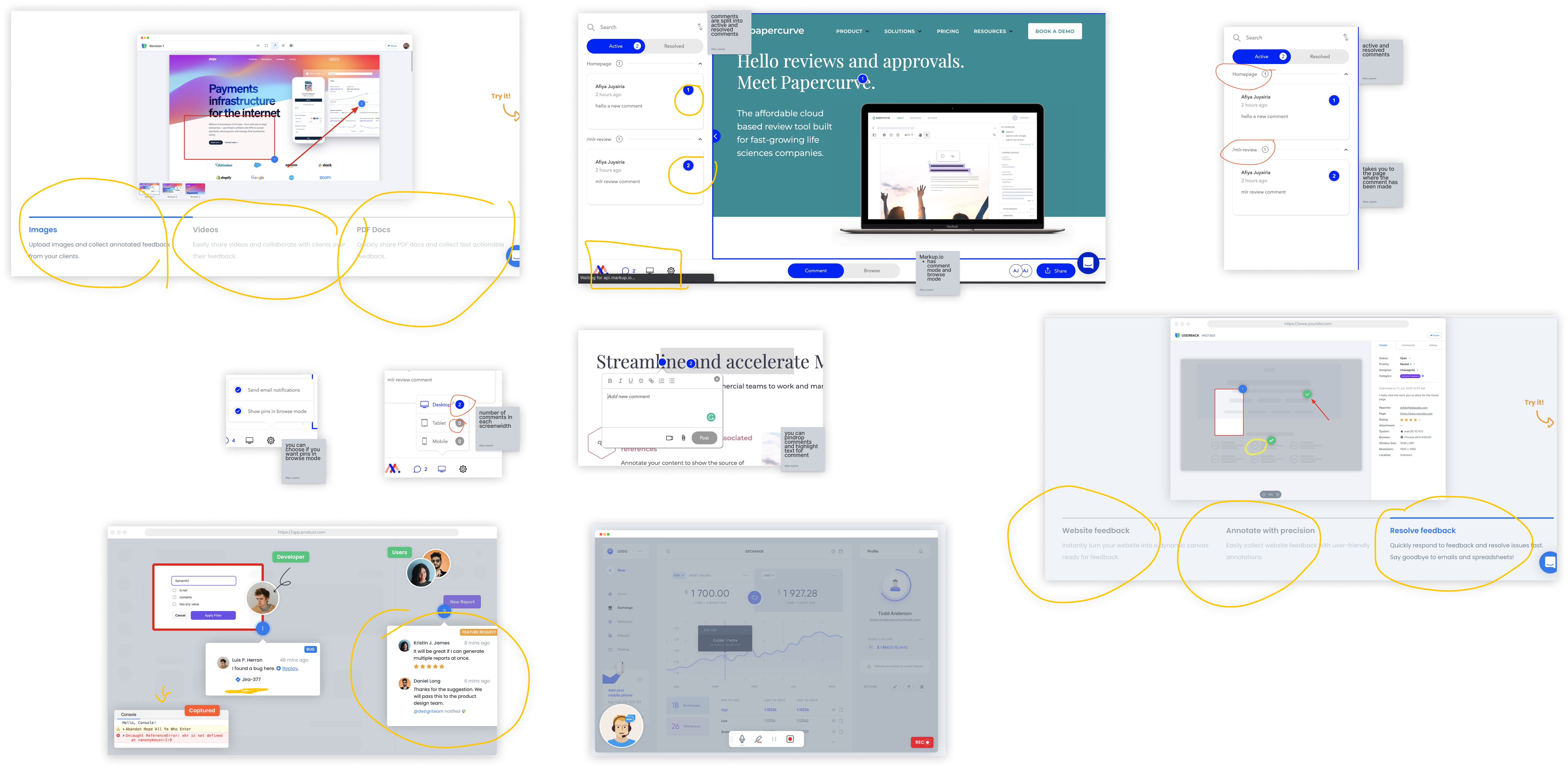
I found 2 products in the market designed for website review: Userback.io and Markup.io. I then investigated the platform for patterns, weaknesses/opportunities and how they overall solved the problem. Some features that stood out were:
Video feedback | image and video attachment | number ID for each comments | browse & annotate mode | desktop tablet and mobile view | naming pages with HTML page name | slack and jira plugin | share as pDF
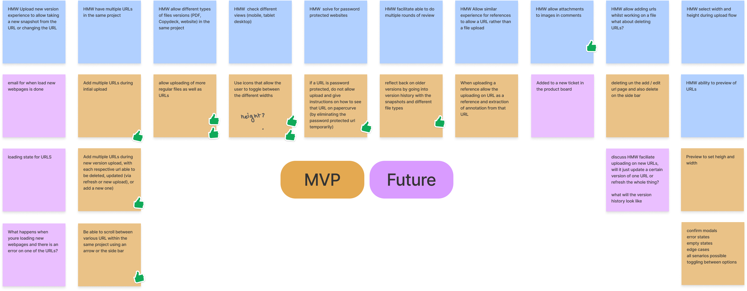
In a cross functional team exercise, we mapped out priorities based on business goals, constraints, and decided on what to include in the MVP.
Using screenshots, I identified the points where the regular upload flow would deviate and did some low fidelity mockups that were just good enough to communicate to my team how these differences could manifest.
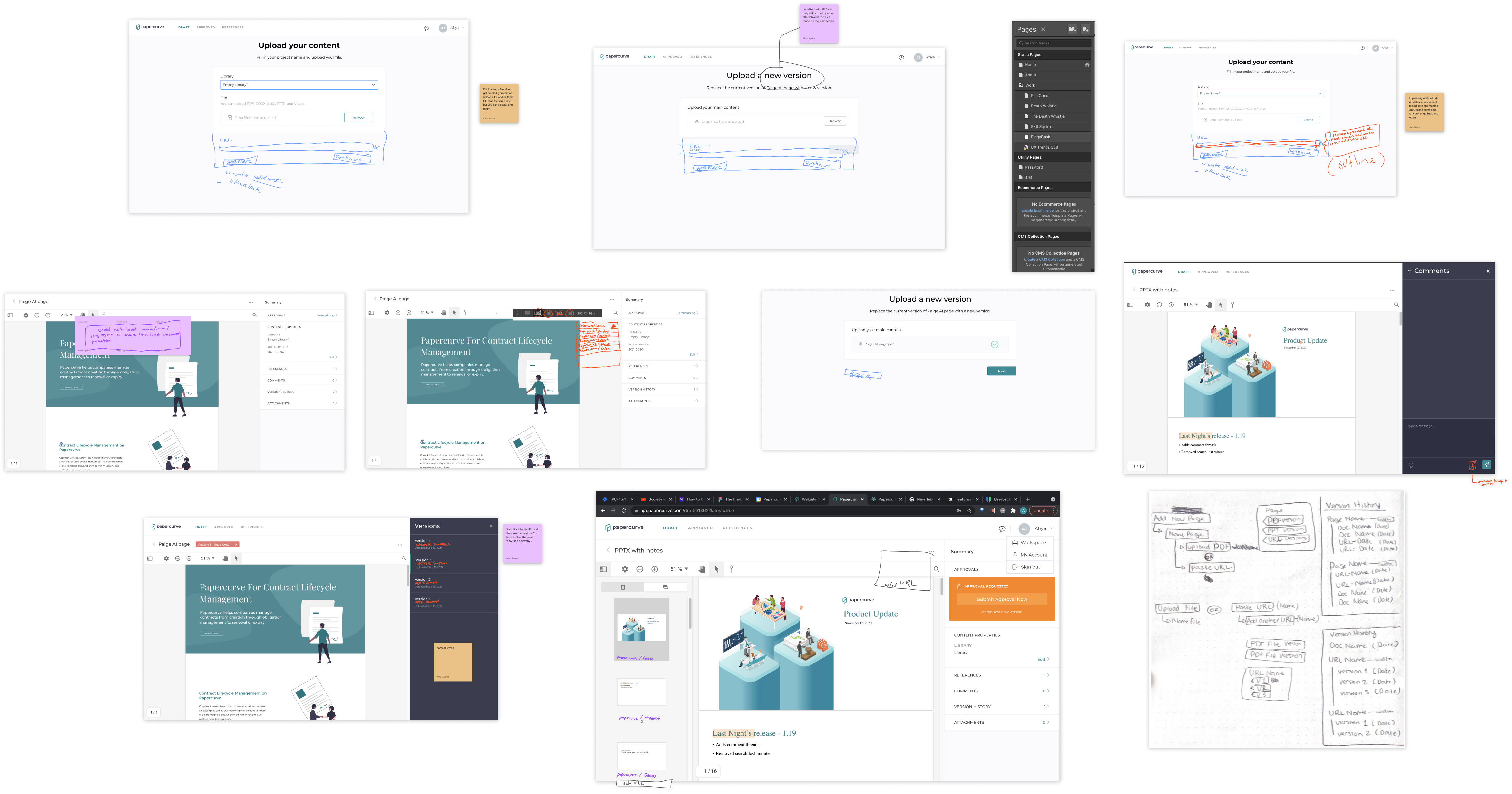
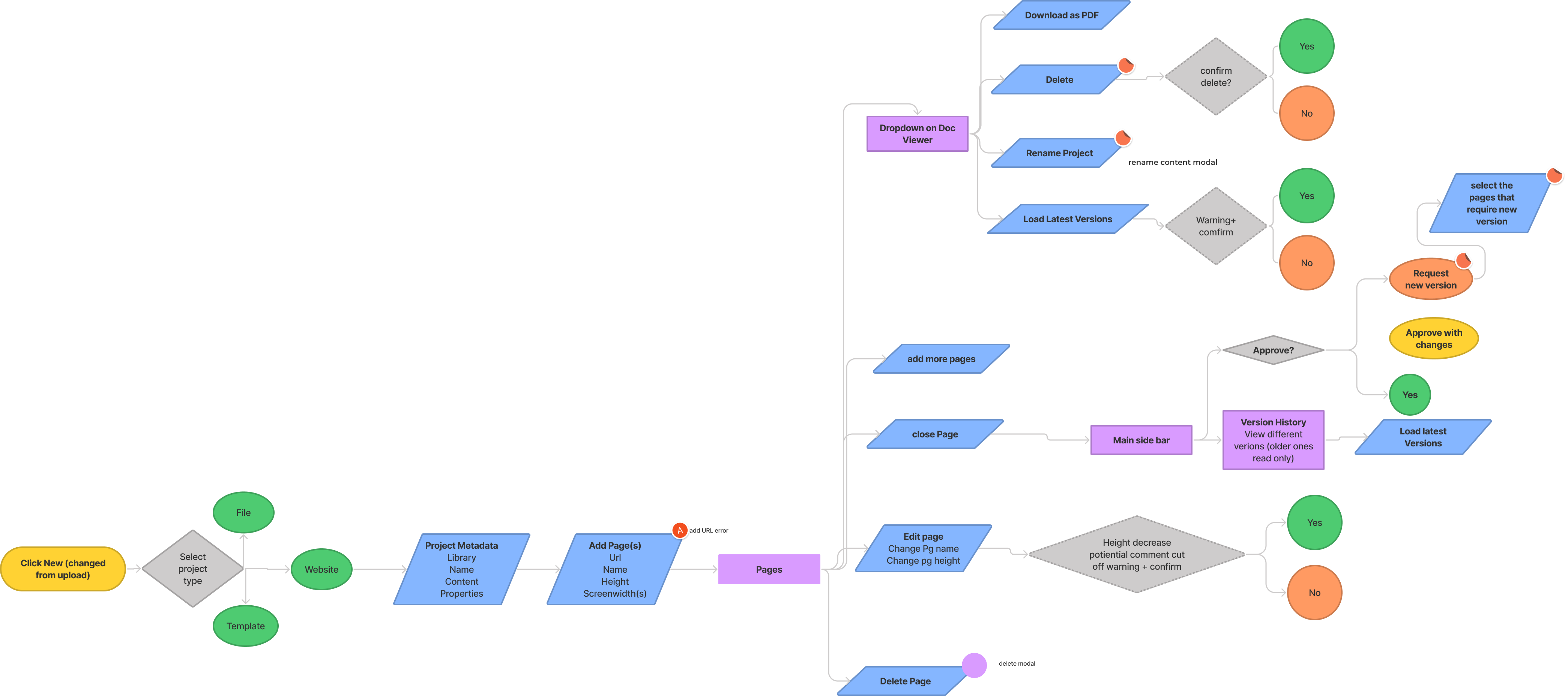
I began by mapping out the user flow for Website Review so that I could communicate my thought process and make a short list of screens and flows that need to be designed.
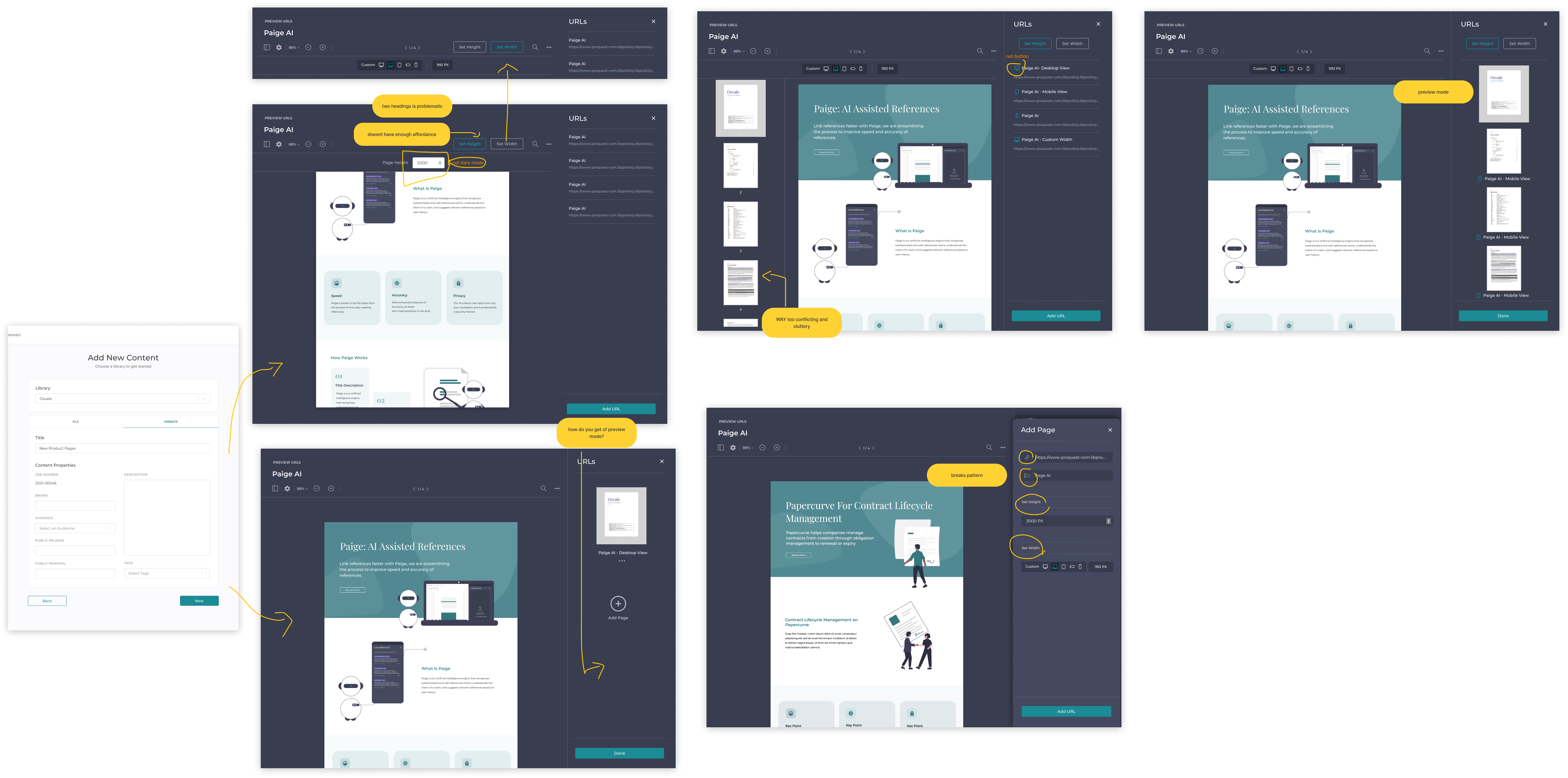
I did several iterations of design for each aspect of the feature to come to my solution, here are some iterations for the add new content flow with some feedback notes.
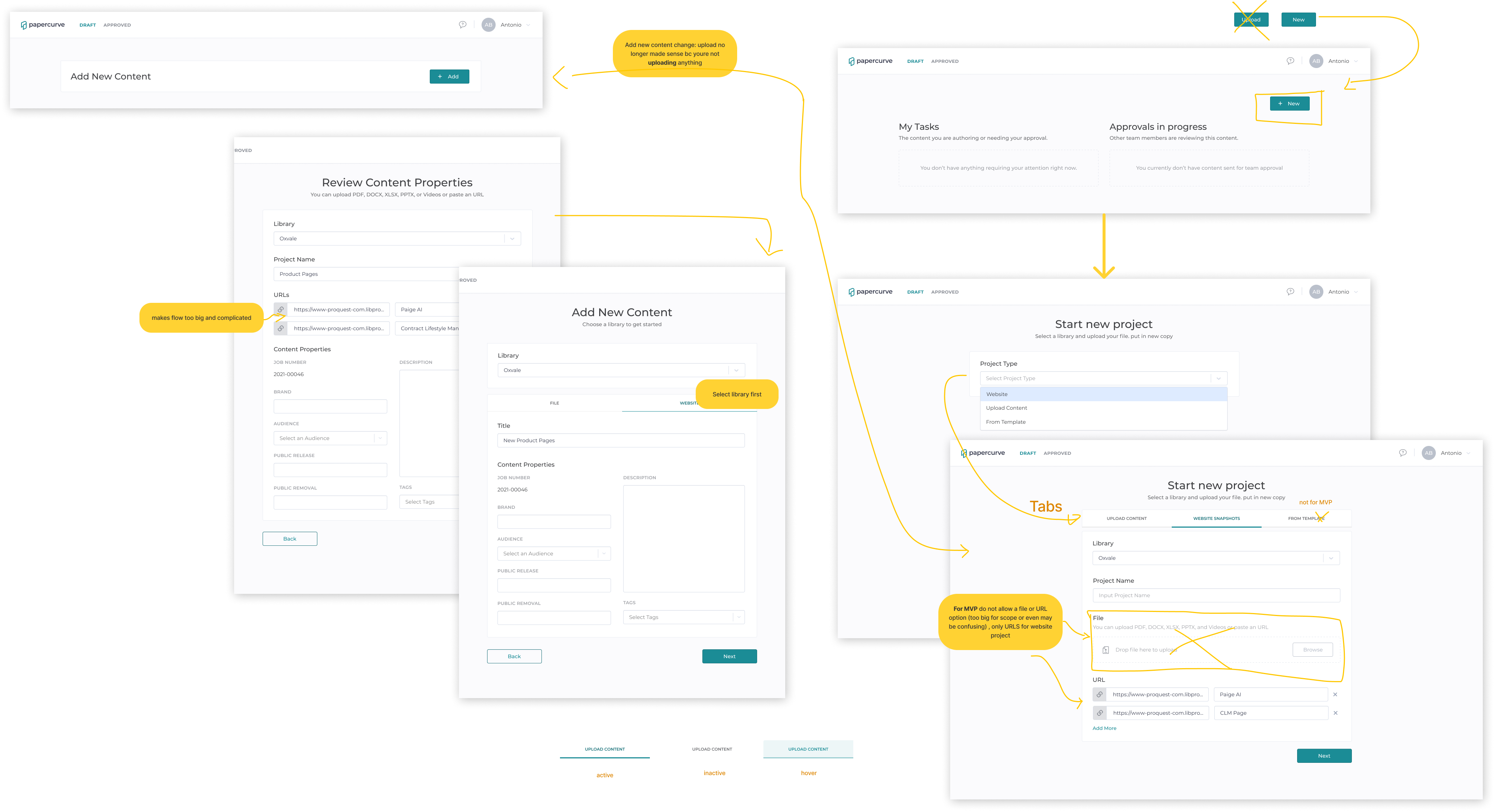
First version of adding page in a 'preview mode' had a visual separation between the adding webpages flow and doing the actual review but ultimately was retired due to not being very user friendly due to lack of affordance on key inputs and creating needless engineering effort.
Next I experimented with the 'add page' flow in the main viewer. This flow uses a familiar pattern to users, has the error prevention & affordance needed and also lower engineering effort. However, it brought with it lots of error states and technical complexity.
Based on feedback, a new version of 'preview mode' was brought back to the add page flow. Testing showed this flow solved the issues found in the previous iterations.
Lots went into figuring out how to facilitate multiple rounds of review & tackle versions, but due to the technical constraints, it had to be descoped until the technology improved.
I created all the secondary screens, empty states, edge cases and error states and then wrote the engineering tickets.
The day after I wrapped up ticketing, we got notice from PDFTron that the software has been updated with significant changes. Engineering then created a demo site to test with. Using that, I determined the new constraints and opportunities this update presented:
New Opportunities
New Constraints
I them took a look at the current flow and identified what needs to be changed, deleted and added.
Average time to add a webpage cut in half
Metrics showed the average time for the 'add a webpage' task cut down round 50% from the initial design
Correctly understood each feature element and its function
Post-test questions showed an understanding of each element of the feature and its value
Commented on the intuitiveness
Participants commented verbally the feature was overall comprehensive and intuitive in post-test questions
After completing my iterations of design, feedback and usability testing (where I found the average time i it took to add a page get cut down in half and users commented on how intuitive it was) , I moved on to revising the engineering tickets and wrapping up the feature. Below is the Figma ticket I wrote for development and you can see the solution here.
These are the success metrics that were selected and here are the results 3 months after release while I cannot report the exact numbers, these are the results.
This feature was a challenging one and really forced me to think outside of the box. I also got better at staying agile and adaptable when the technology is only tentative.
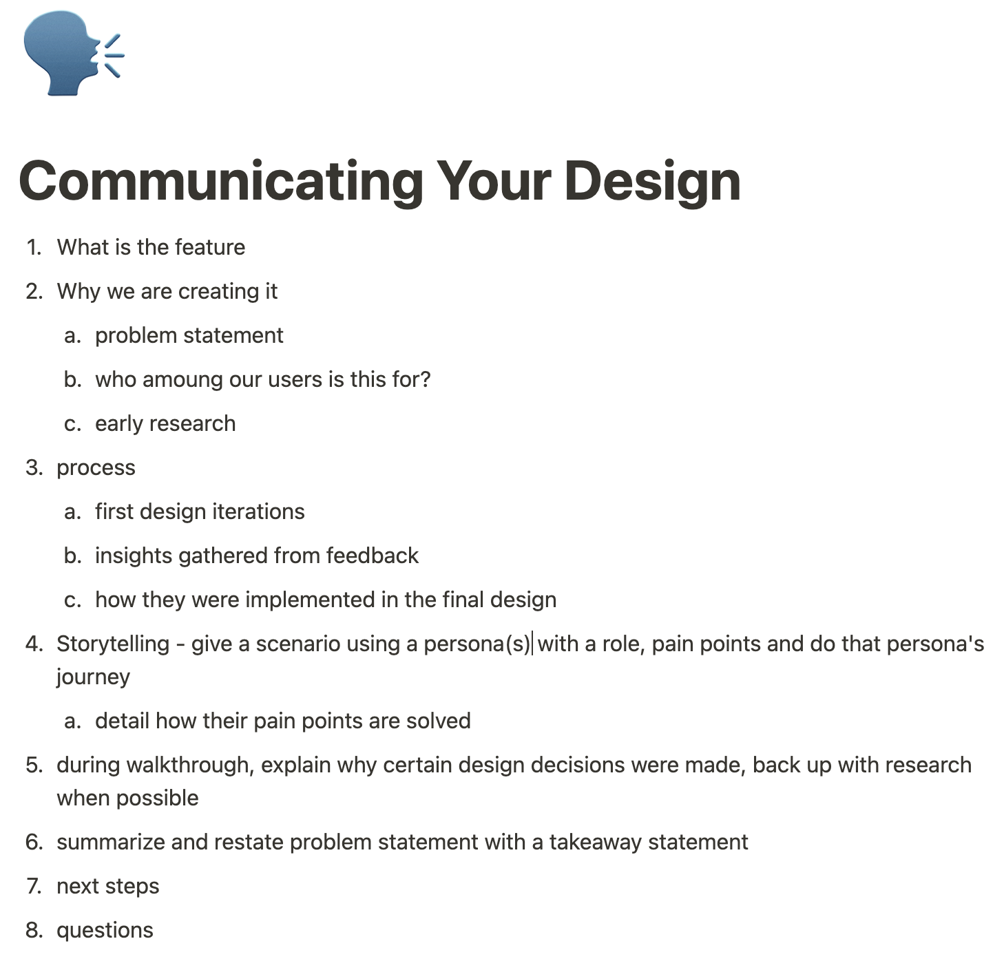
A key part of my process is pitching my design work. Through trial and error, I developed a method that is well received by my audience (below).
I begin by using storytelling to painting a picture of the problem, then I detail my process, followed by demoing the happy case, and finally detailing why certain design decisions were made.
For Papercurve's long-term product strategy, I conduct in-depth research on new features & systems. For instance, I recently I did a deep dive into Learning Management Systems where I looked at:
technical requirements
feasibility
user pain points
competitors
design patterns
I also conduct ethnographic studies, user interviews and/or focus groups when needed.
An important part of my process is constantly and actively empathizing with users; this is done through biweekly meetings where the CS teams breakdowns all the insights, feedback and requests made by our users and also by conducting monthly ethnographic studies (while not in a pandemic, of course).
This is crucial as a UX Designer because it is not enough to "do empathy" by conducting interviews once, drafting a persona or two and calling it a day.
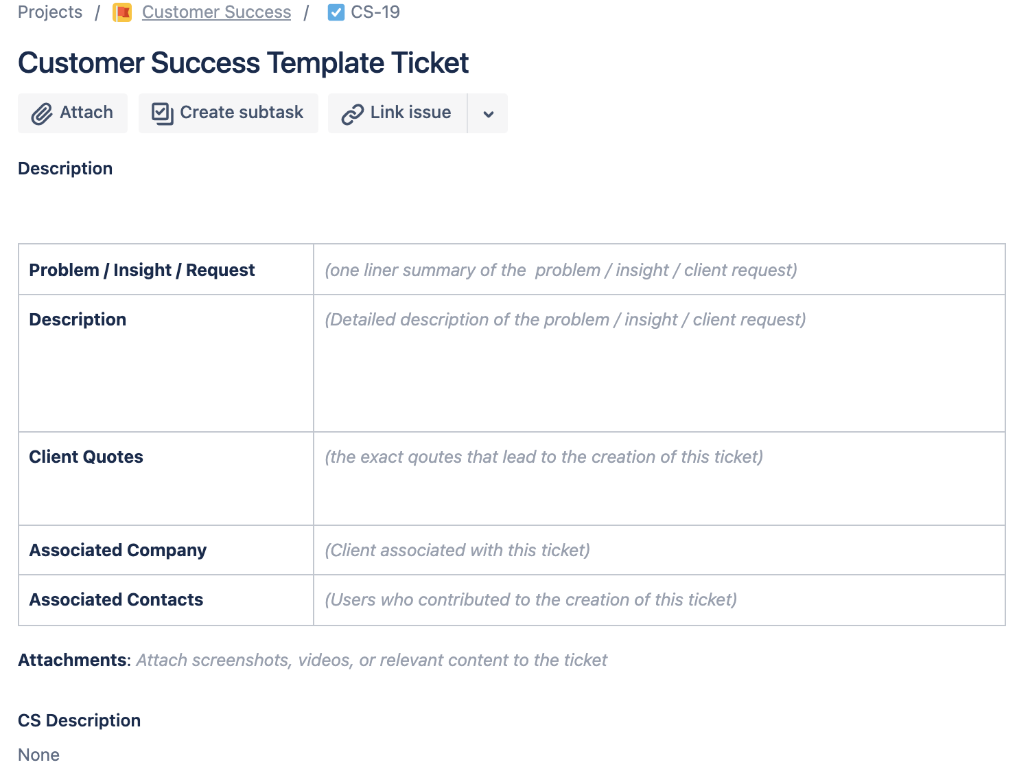
I create a number of work template to standardize & improve our process where there is friction. For example, I standardized the post-test questions for usability testing, engineering ticket template, and CS ticket template (see below).
Working at Papercurve over the past year has been an incredible learning journey, As a UX Designer, I am grateful to work at a company that truly "walks the walk" when it comes user-centred design.
I am also grateful to have an incredible mentor as my product manager as well as a team that supports me in my work and gives me constant feedback to improve.
Lastly, I am privileged to have gotten such a well around experience from product strategy/management to working 1:1 with engineering so early in my career.
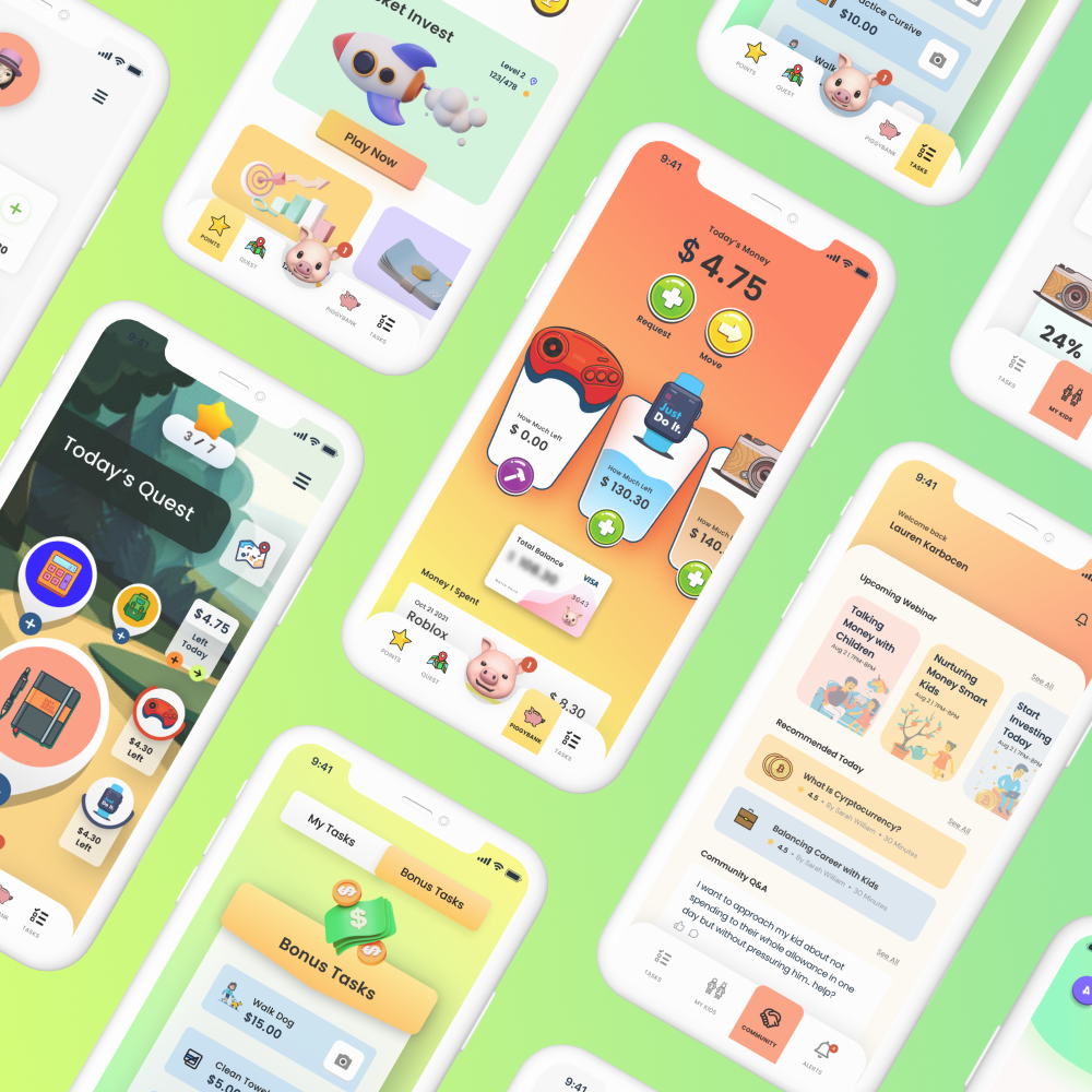
The design of a mobile app truly tailor for children, functioning to make kids financially literate and build lifelong finance habits using real money and real stakes.