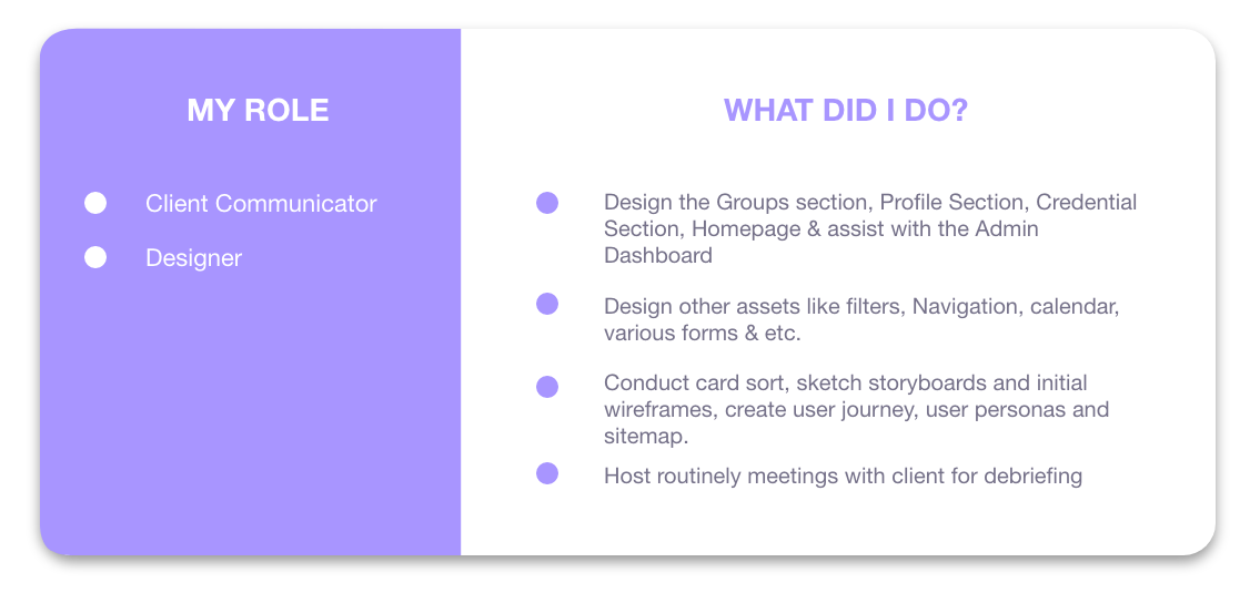
UX/UI Designer, UX Researcher
Class Project Turned Passion Project
Fatima, Kat, Taniya
Resources: IDEO Design Thinking, W3C Web Accessibility, NN/g | Design: Figma, Illustrator, Photoshop, After Effects | Ideation: Xtensio, XMind | Collaboration: FigmaJAM, Asana, Zoom
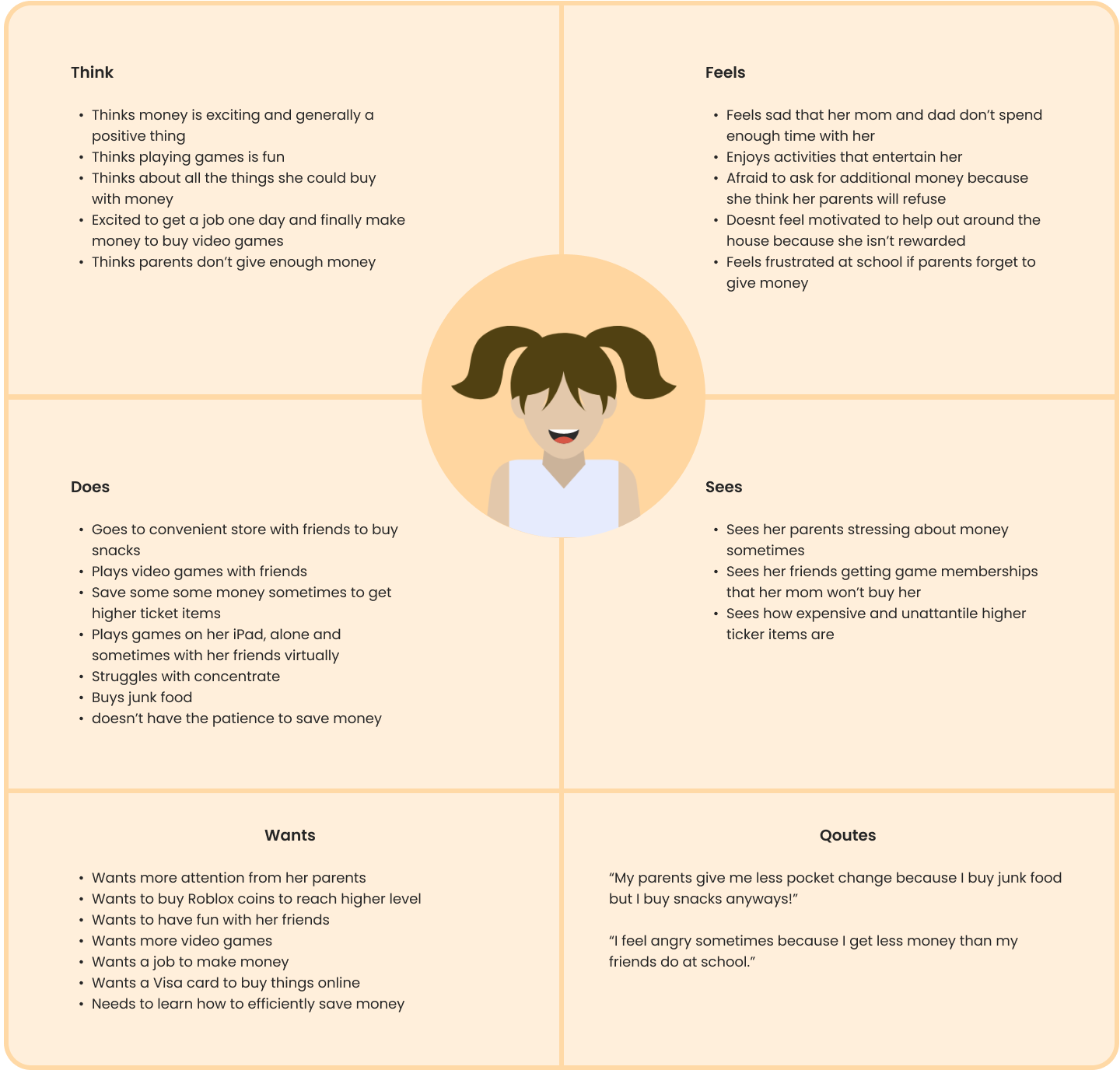
Parents are frustrated because they are aware that their kids future financial habits depends significantly on habits learned in childhood but struggle to even discuss finances with them.
PiggyBank is an innovative 3-in-1 mobile/tablet (banking, task management & financial education) app catered specifically to children.
It uses real money & real stakes to help kids build good money habits, learn self regulation, and become financially literate.
It also supports parents with financial education and household management.
Facilitated interviews
Co-authored survey
Contributed to secondary research
Aggregated and synthesized data
Sketched early wireframes
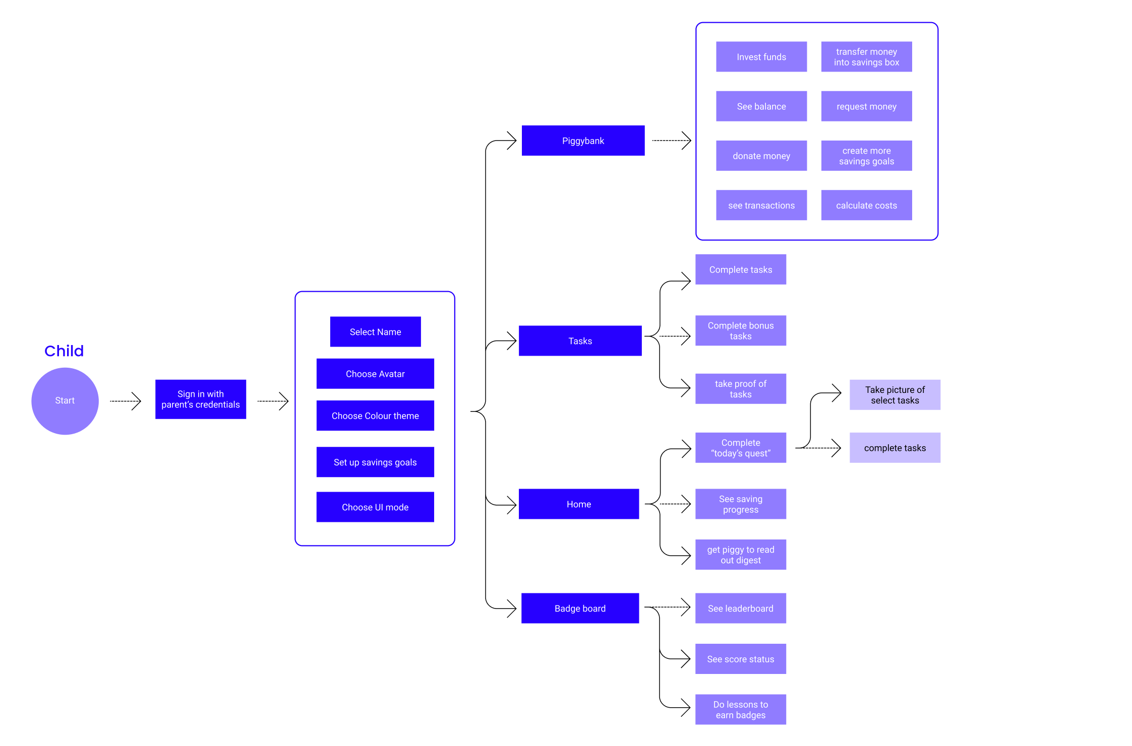
Created user flows
Lead two rounds of usability testing
Designed majority of high fidelity mockups
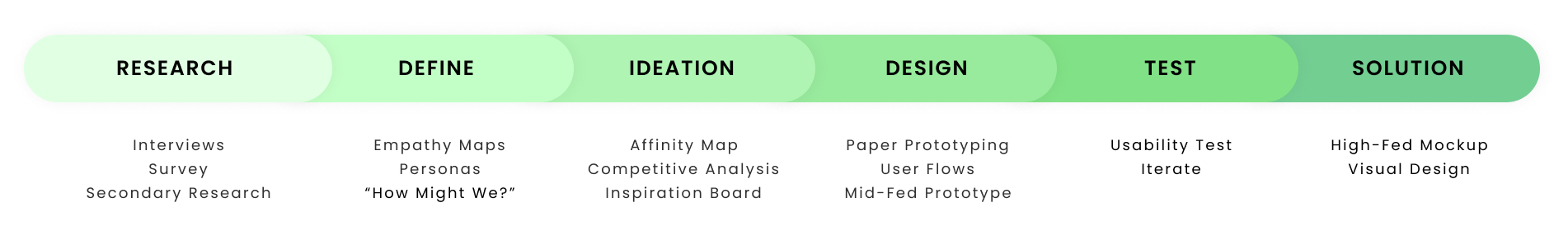
Define and Ideation phase activities and deliverables were done as a team in a series of day long sprints
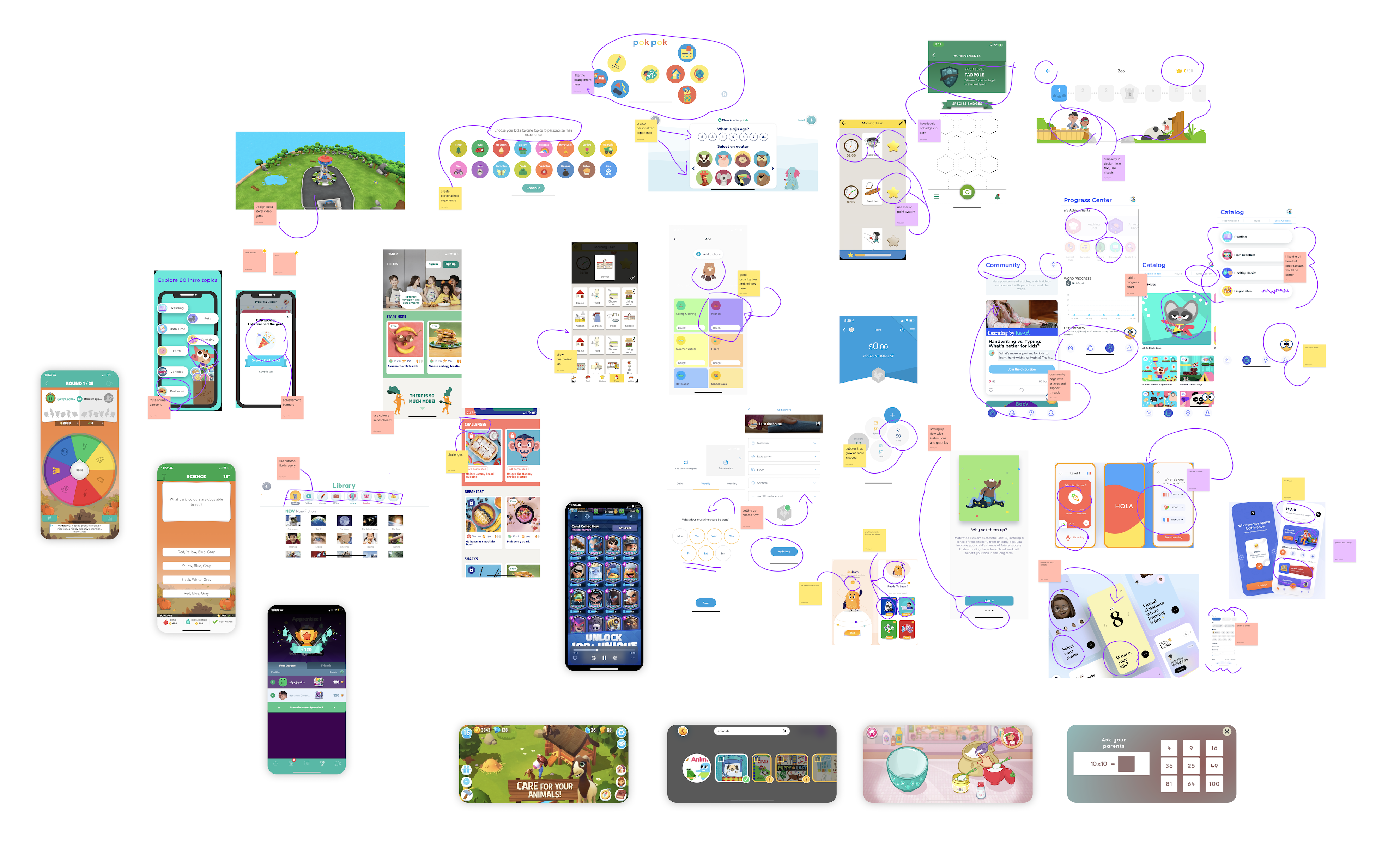
We observed the visual elements were guiding them through the app because they were visually salient and similar to their experience on gaming and entertainment apps.
“What is this? A game?”
Kids particularly were excited about the ability to complete additional tasks and play games to receive money & rewards, they couldn't believe they could earn them by playing games on their phone or iPad.
“This is like Pokemon Quest on mom's phone!”
Kids that never used a banking app didn't understand what it meant to request and move money, but when parents explained it, some of them were excited they could handle money like adults.
“Are you sure this is a bank? It looks like a game.”
Parents were especially interested in support and advice they could get from specialists & the community. They expressed frustration because their banks provided info on their finances but nothing on how to improve them.
“It would be great if my bank had this kind of support."
They saw how the app could improve family relationships through improved communication with kids and lowering their overall stress.
"It would be huge a peace of mind if my kids used this to learn better habits on their own, I worry a lot about them and it comes out as lecturing and taking their iPad away which makes them upset."
This project showed kids' interest and willingness to explore banking solutions when it is designed in a manner that is holistically digestible for children.
Overall, this was a challenging but rewarding project. It also helped me become a better designer because it strengthened my ability to empathize with my users; a skill that is invaluable to a UX designer.
Semi-structured interviews were conducted with two demographics, with children and young adults.
The reason for this specific demographic is because we wanted to gain insights into children’s (aged 6-12) relationship with money and how that relationship evolves into early adulthood.
Lack of Enthusiasm for Strictly Learning
Half of the kids we interviewed did not express much enthusiasm for a purely educational model.
Interested in Saving, Given that It Is Fun
All our young participants save money for both practical and quirky items but one thing they each had in common is that they wanted the process of saving and item saving towards to to be "fun".
Lack of money management skills
Young adult subjects understand that money is a key to a proper livelihood, but they state their lack of the necessary skills to productively approach money management in.
Sharing and Gamification Breeds Engagement
Older youth spoke stated social and gaming technology keep them most engaged, this is also echoed by our younger participants.
Parents Micromanage Their Children
Modern parents are very involved in their kids' lives and do a lot of things for them instead of allowing them to learn on their own, this breeds financially ignorant kids.
We also required insight into the needs of parents as they play a large role in their child’s financial literacy (not to mention, they are the ones distributing the income). So we conducted a survey with 27 different parents inquiring about a myriad of topics pertaining to parenting and money and them compiled the key takeaways:
Overall In the users we interviewed and surveyed, parents showed a preference for more educational content, while children were more interested in goal-setting features.
Designing for children requires special consideration because of their specific needs (cognitive and physical), so we conducted secondary research on design considerations for kids.
Linked below are some of the studies we found to be particularly useful to inform our subsequent design decisions:
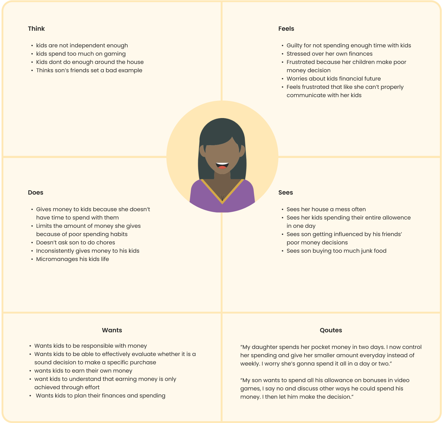
My team and I then created several empathy maps to better understand and visualize how we could build a solution that satisfies the needs and pain points of both user groups.
With the vast array of insights from our research, we produced a plethora of “How Might Me?” questions. This enabled us to use our data and develop them into actionable pursuits to answer during ideation. Here are a few of them below:
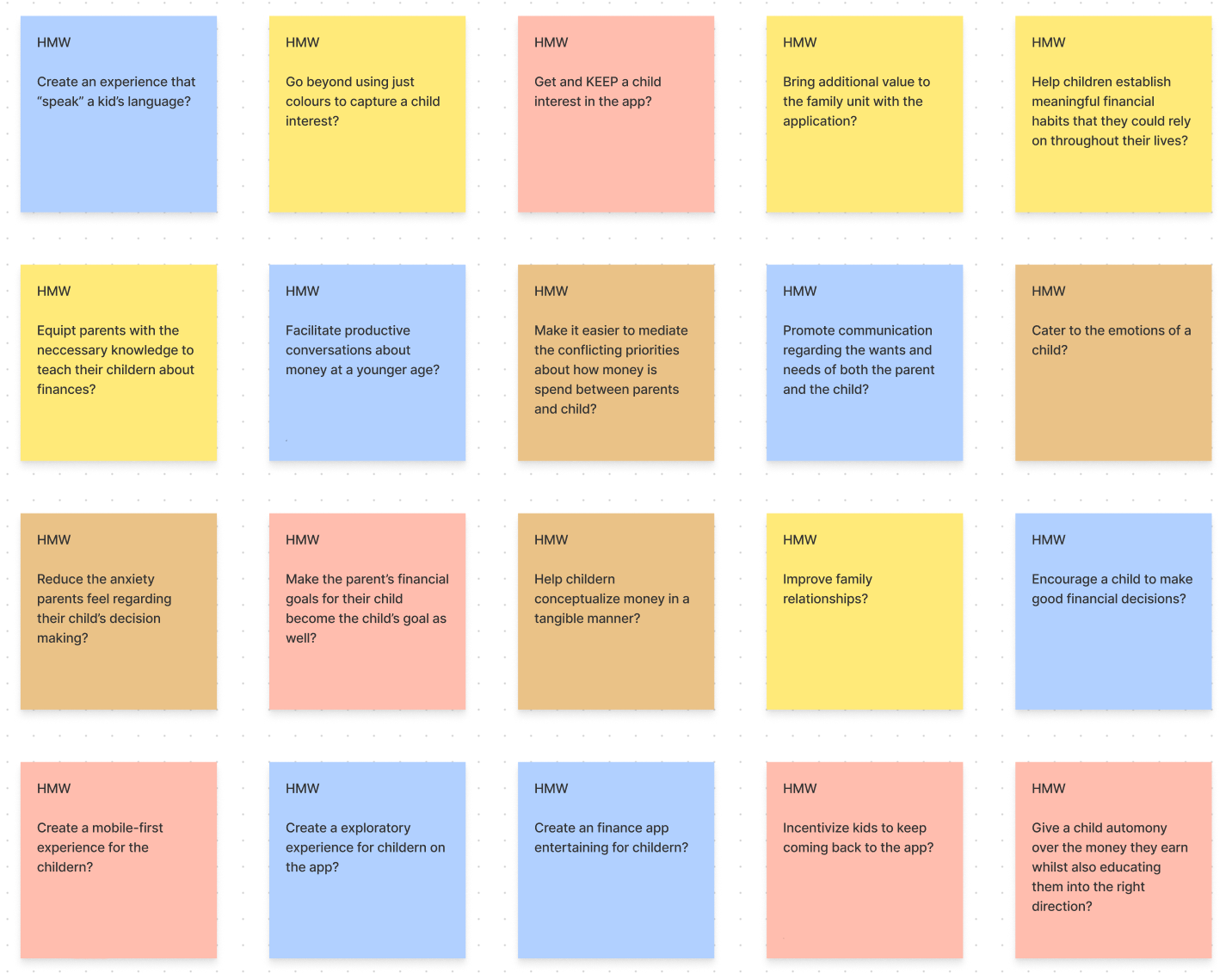
How Might We create a platform that is didactic but also entertaining and engaging to a curious and impatient youth audience?
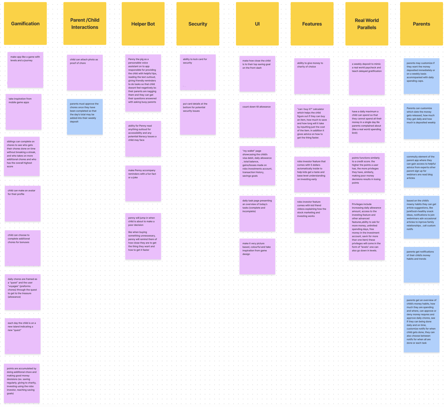
Then came my favourite part, ideation. We generated as many ideas as possible through creating an affinity map; the team spit ideas on post-its, stuck it to the board and then sorted them into 8 categories. We used Figma Jamboard to conduct this exercise so that we would have limitless whiteboard space and remote access.
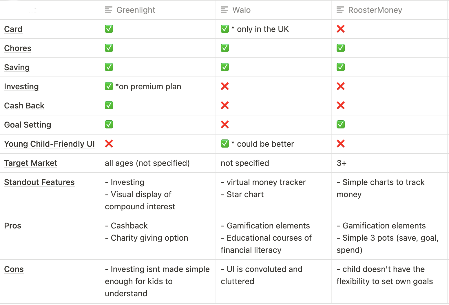
We carefully chose Greenlight, Walo and RoosterMoney as the direct competitors and applied basic usability and heuristic guidelines to analyze them. Through our analysis, we discovered that all three apps have most of the basic functionality you expect, however, all three suffer from appearing like an application designed for adults with a vibrant colour palette.
Before we began our design phase, we researched a wide array of applications to look for design flows, patterns, and concepts that would be relevant to our product. We took a special look at children's games because our research indicated that kids spend much of their screen time on games and we wanted to closely follow their mental models to make it feel familiar and therefore easy for kids to use. We also looked at kids education apps, banking apps and chore management apps.
We began our design phase by sketching out several iterations of low-fidelity wireframes then settled on the best ones to move to Figma. Here are some of mine below:
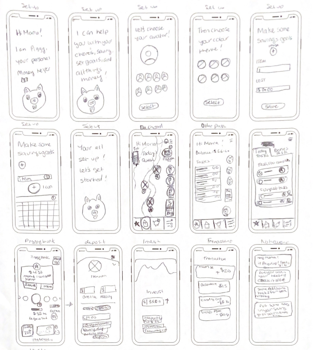
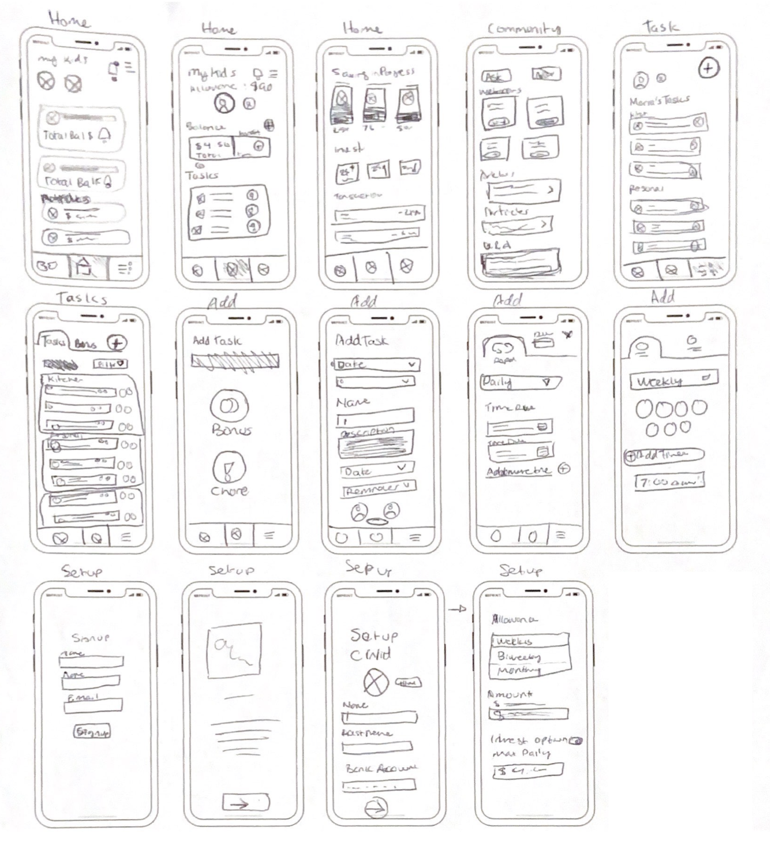
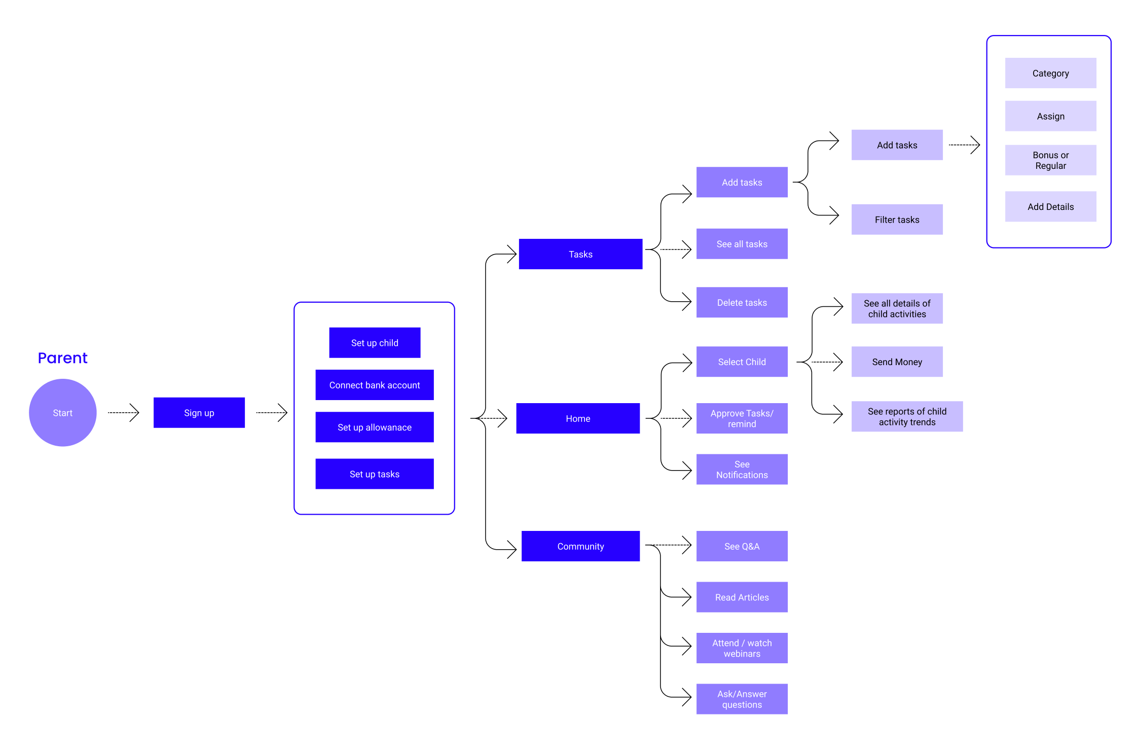
Next I mapped out the user flows so that we know what specific screens are required to be designed during the next iteration of design.
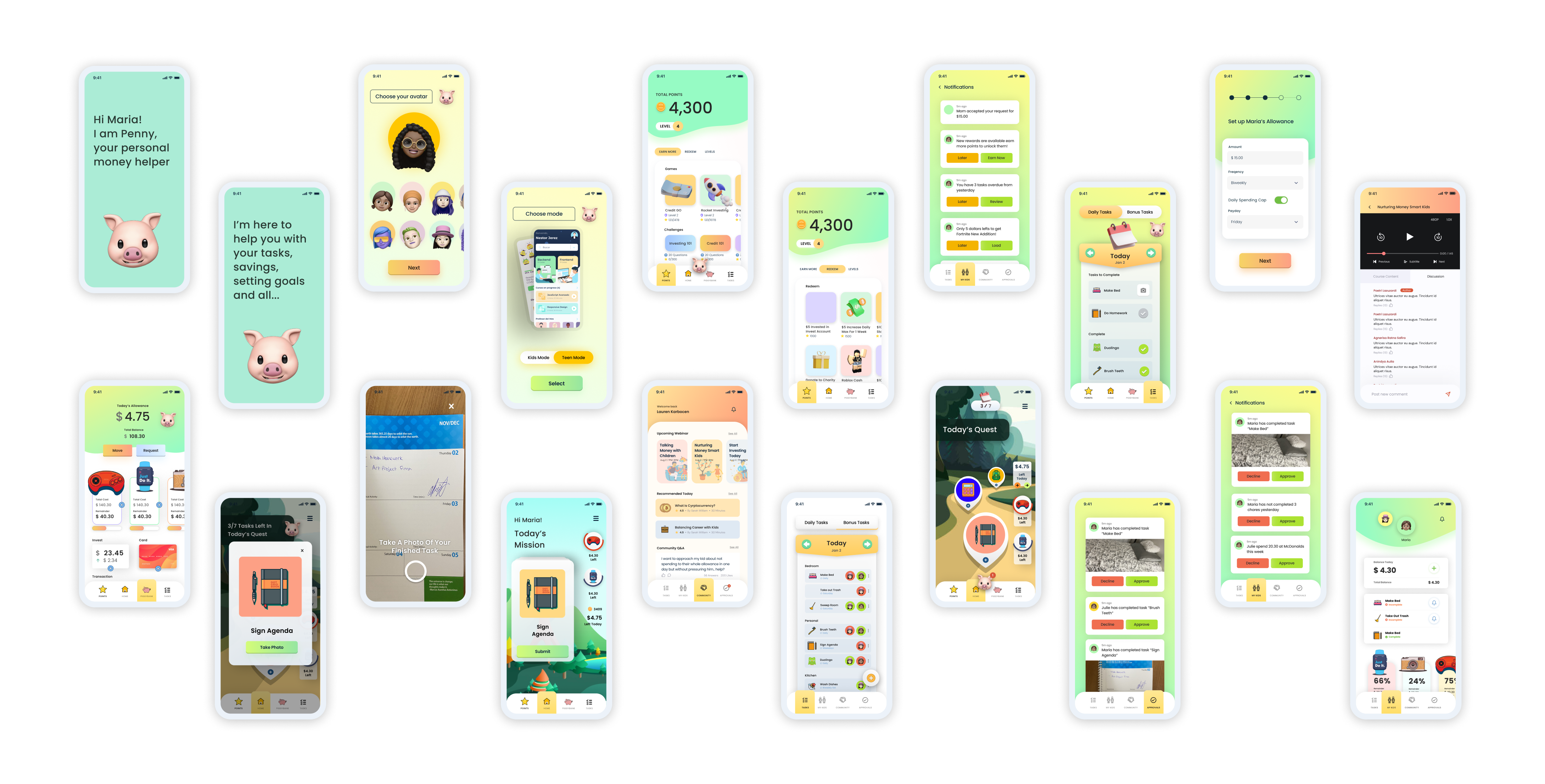
With the user flows fleshed out, I now has the basis to build the medium-fidelity mockups on Figma so that we can do the first phase of usability testing. Here are some of screens from the iterations screens below.
We recruited 3 children and 3 parents in our social circles to test our prototype. We did the test in the respective homes of our participants so that we could capture their experience of using the app in the setting where it is meant to be used.
Other than some UI issues, this study proved that we were going in the right direction and made the right design decisions so far.
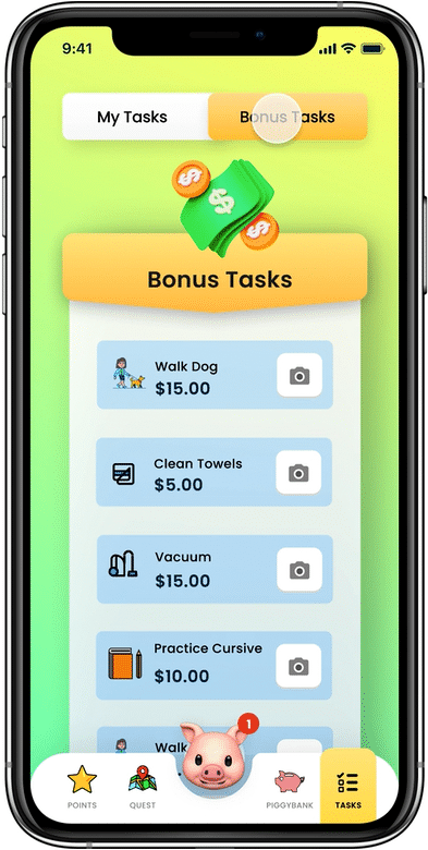
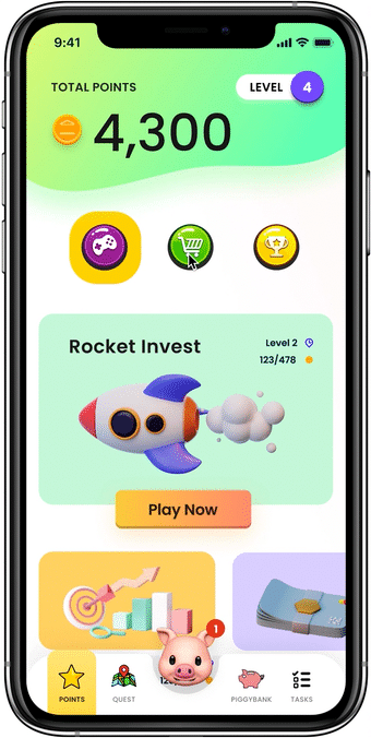
The ‘quest’ consist of pin-drops on a path representing each task which kids complete by tapping. At the end of the path is a treasure chest which unlocks points if everything is done on time.
Our research indicated that children primarily use their screen time to be entertained, so we gamified the process of task completion. Additionally, the treasure chest cater to the child's need for short-term gratification to stay engaged.
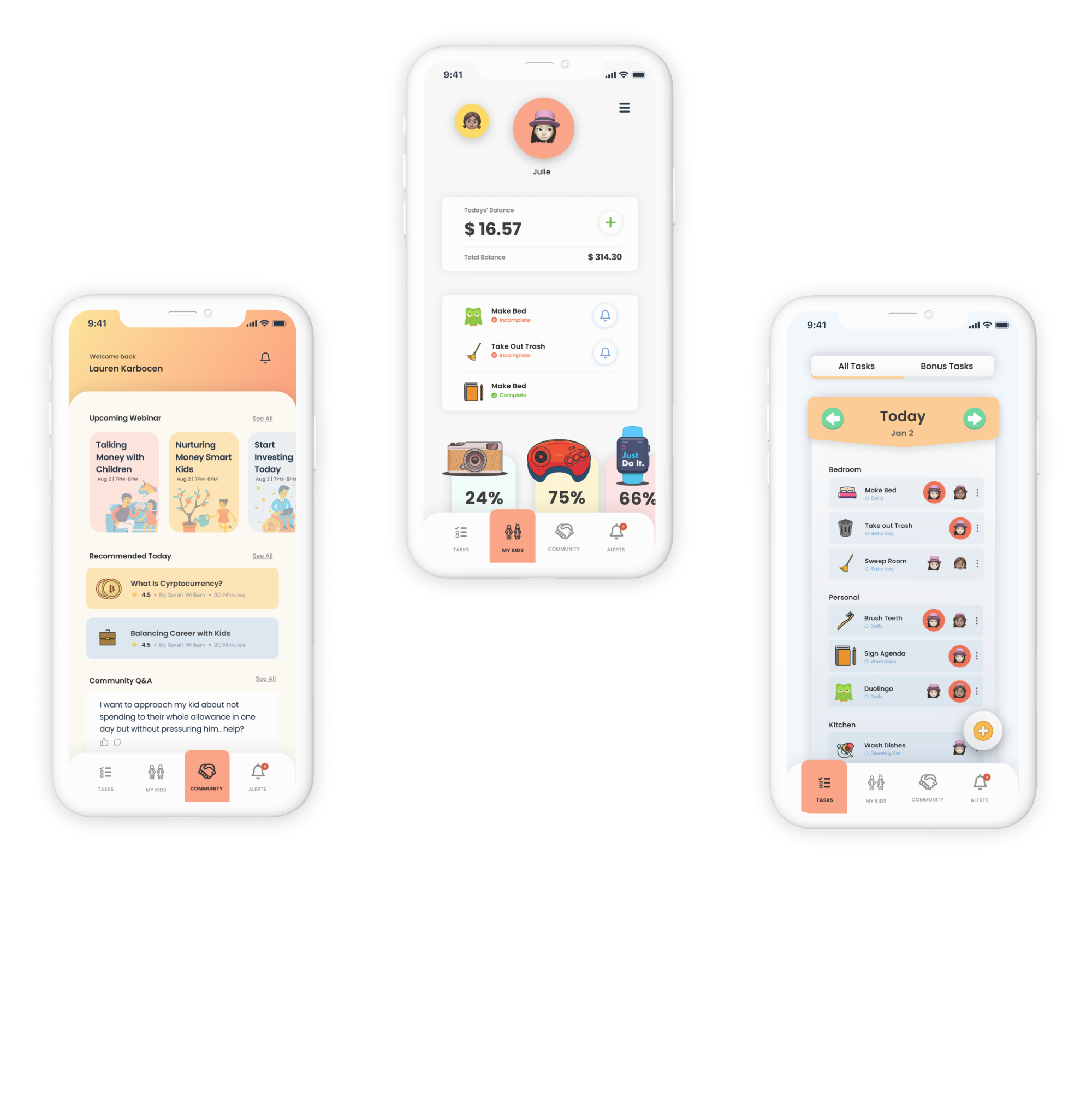
The quest tab features widgets detailing the amount of money left available and the top two savings goals.
Since this is the "homepage", key info is displayed so the child can see it without many clicks and the top saving goals being present reminds the child of their goals.
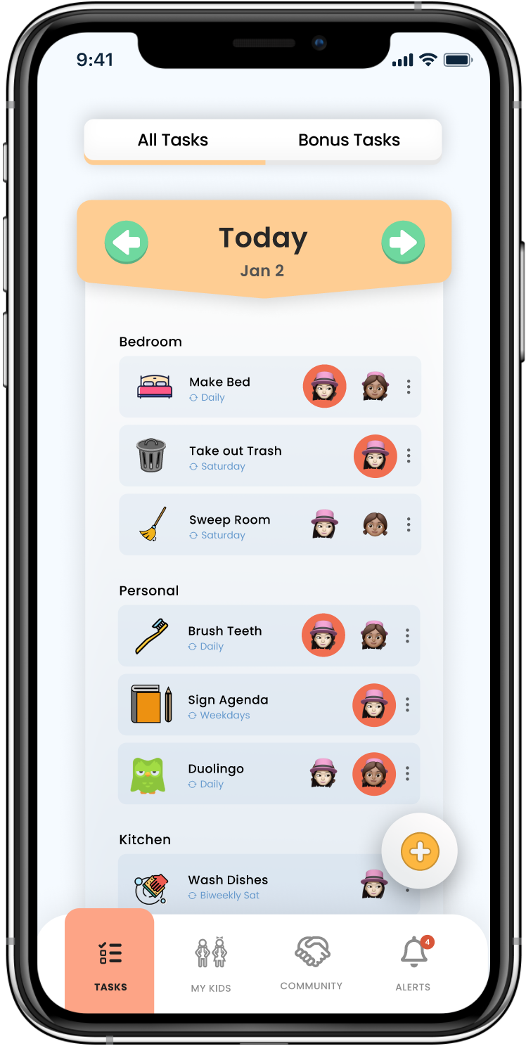
The tasks tab allows the child to see a detailed view of their tasks, and go back to do previous days tasks that are overdue.
This provides another way of completing current and overdue tasks. This is especially helpful as the child gets older and they don't want to use quest anymore.
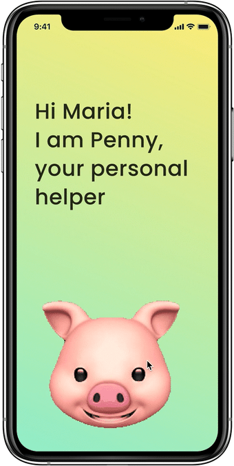
Penny is the personal assistant. She is introduced during onboarding where she conducts a walkthrough of the app.
She then lives in the centre of the nav bar where she can give vocal info about each page .
She also encourages the child to play the games, put money into savings, complete tasks & more.
Younger children have poor reading comprehension and memory, Penny aids with this by providing auditory instructions.
Mascots are common in kids apps and Penny is the personification of Piggybank; this builds trust as kids have "someone" who is encouraging and support them.
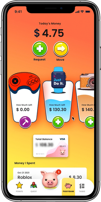
The Piggybank tab is the banking space where the child can add and break savings jar, request & move funds and see their transaction history.
They are also given the option to donate to a charity of choice when moving funds, teaching them that giving back is just as important as saving.
The savings "jar" allows kids to see visually how much they have left and break it once full, mimicking what they would do IRL.
The total balance is blurred until tapped on and is lower on the screen as a security measure
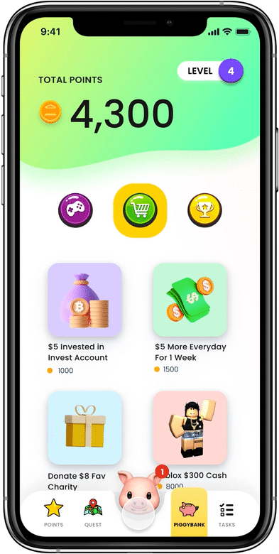
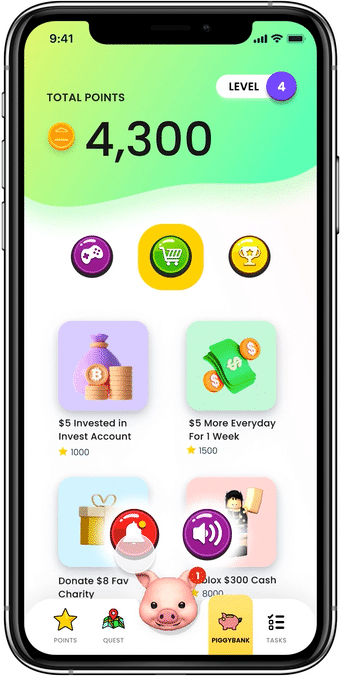
Points are accumulated primarily through playing financial education games and higher levels are reached by completing them to unlock new ones. The points can be then used to to redeem rewards.
Our research indicated that parents are struggling to financially educate thier kids, Piggybank allows parents to outsource this.
The goal of Piggybank was to create an app that caters to kids and research found that kids like to mostly play games, pass levels, and earn points on the apps they use.
When the child taps on Penny and selects the notification option, 3 alerts is displayed at a time which Penny also speaks aloud
Children have limited attention, reading comprehension and dexterity skills, displaying only three notifications at a time reduces their cognitive load.
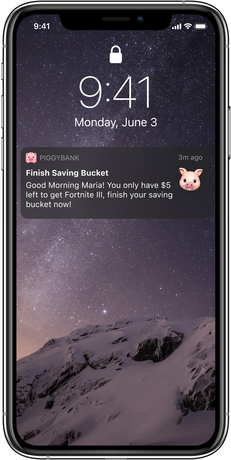
Our research showed that kids found it annoying when their parents nagged. Penny alleviates the need to nag by lightheartedly reminding the child in their place.
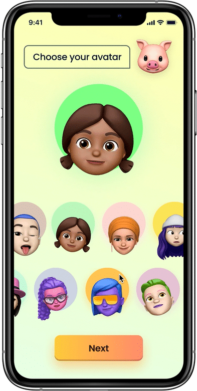
Kids choose an avatar similar to a video game during the onboarding process.
Knowing that kids primarily use digital product for games and entertainment we psychologically prime them to anticipate a game like experience which creates initial interest & engagement.
Parents can see all tasks sorted into categories to reduce cognitive load.
When creating a task, parents choose an icon to represent it so younger kids can use the visual cue to understand it.
Kids expressed sadness about their parents not spending enough time with them, Piggybank aids with this by allowing parents to create bonus tasks to get extra chores done which creates more free time for family.
Parents complained their children don't understand the value of money, Piggybank helps this by letting children to earn the money which not only empowers them but also enables them to learn its value.
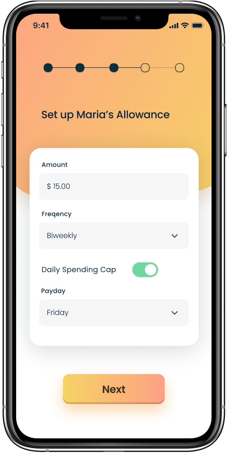
Parents can customize the consequences of not completing a task, set a pay day and optionally set a daily spending cap.
Children get their allowance on a set payday mimicking the real world, this also teaches them delayed gratification.
Parents complained kids spend their entire allowance in one day, the daily spending cap ensures kids cannot do this.
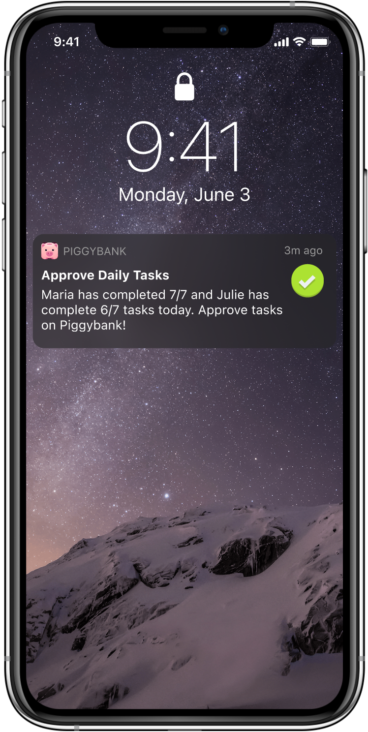
Parents can choose if they want photo evidence of a complete task that they have to approve.
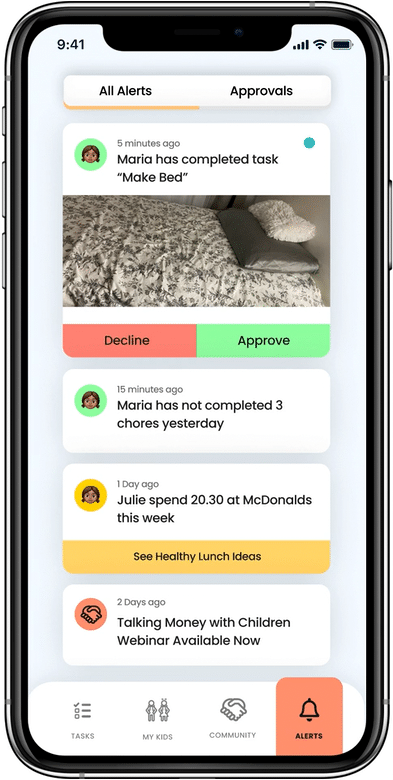
They also get notifications about incomplete tasks, money requests, upcoming webinars, helpful videos they might be interested in and their children's money habits with suggestion on how to help them make better choices (if they opt in).
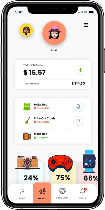
The 'My Kids' page breaks down each child's profiles including their balance, their daily task progress, savings goals, money habits trends and transaction history so that parents can keep tabs on their child's activity at a glance.
Our interviews with parents indicated that they needed to be informed about their activity, know their kids' account balances, and address any requests.
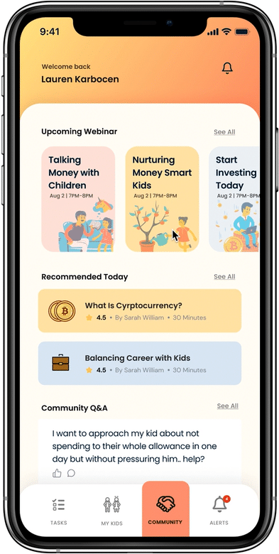
The Community tab is where parents can get support to become more financially literate themselves, support their children and build stronger family relationships through reading and watching the available content and using the community support feature to ask questions and get answers from specialists and other parents.
Our research found that adults struggle to manage their finances, in fact, 4/10 of adults couldn’t cover a $400 emergency expense, but they desperately want to see their kids grow up to have good financial habits. At the same time, 49% of parents don’t know how to discuss money with their kids. The community feature works to aid this pain point.
Our research showed that adults prefer designs that stick to the main path, have effective communication and gets the the point swiftly.
So, the visual design of the Parent app is:
Our goal was to design an app the caters to a child's unique cognitive and physical needs, so we conducted research into UX design for children and came up with the following UI/UX considerations:

Children mostly use apps to play games
Used many 3D illustrations often found in gaming apps to garner interest and match children's mental model

Younger children have difficulty reading
Copy is limited, is 12-14px minimum, as layman is possible, and accompanied with visual cues and audio feedback

Children have poor dexterity
Elements have high contrast, adequate spacing, limited clutter and clear large buttons like found on game UIs

Children like vibrant colourful interfaces
We used a vibrant colour palette often seen on children’s apps

Kids like animations on interactions (unlike adults)
Used animation often and created a 'mascot' to puts a personality to the app

Kids are responsive sounds on interactions
Most actions have audio & haptic feedback; ex. completing a task, or breaking a save jar
The next steps for Piggybank is to create a feature that allows kids to invest small sums in the stock market using a robo-investing account while they are learning about it so that they can experience and get comfortable with it at an early age.
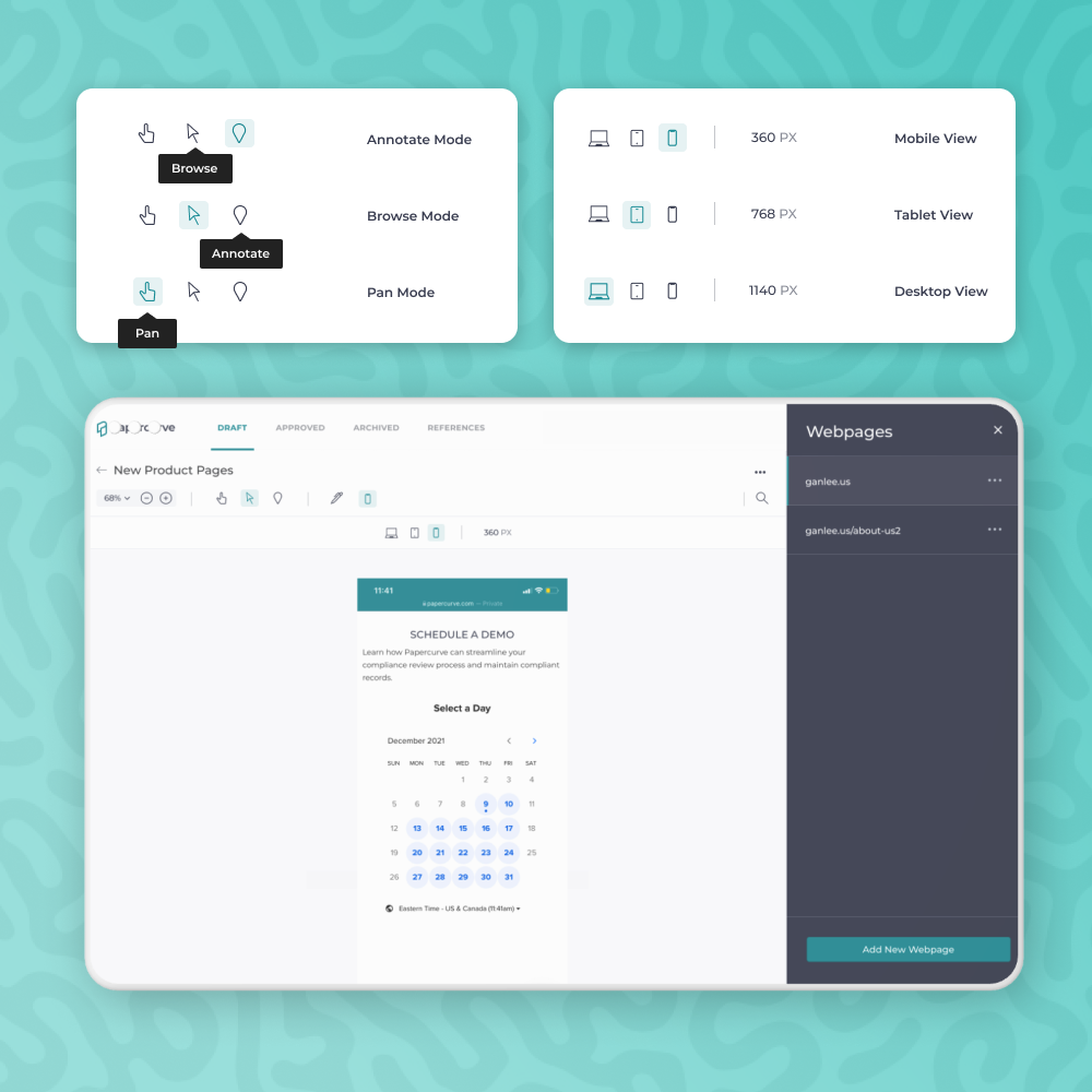
A tool to help users collaborate, review and approve website content on Papercurve, an AI-powered CLM software built for life sciences companies.