
Papercurve users didn't have an easy way to collaborate on, review and approve website content.
The awful workaround used by the account managers & agency folks facilitating the review is to use screenshots or PDF exports that require external tools and can be inaccurate. Then, once the review begins, reviewers tediously input their feedback on a spreadsheet.
Diversify the business by creating tools that bring value to agencies to attract future agency prospects and keep current agency clients .
Papercurve is an AI-powered Content Lifecycle Management software for life sciences companies to streamline their MLR review process.
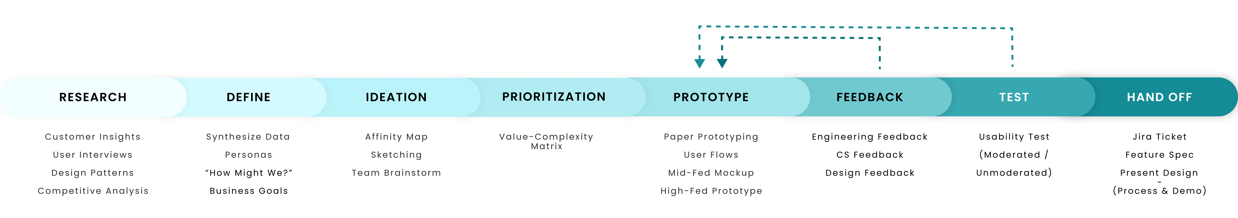
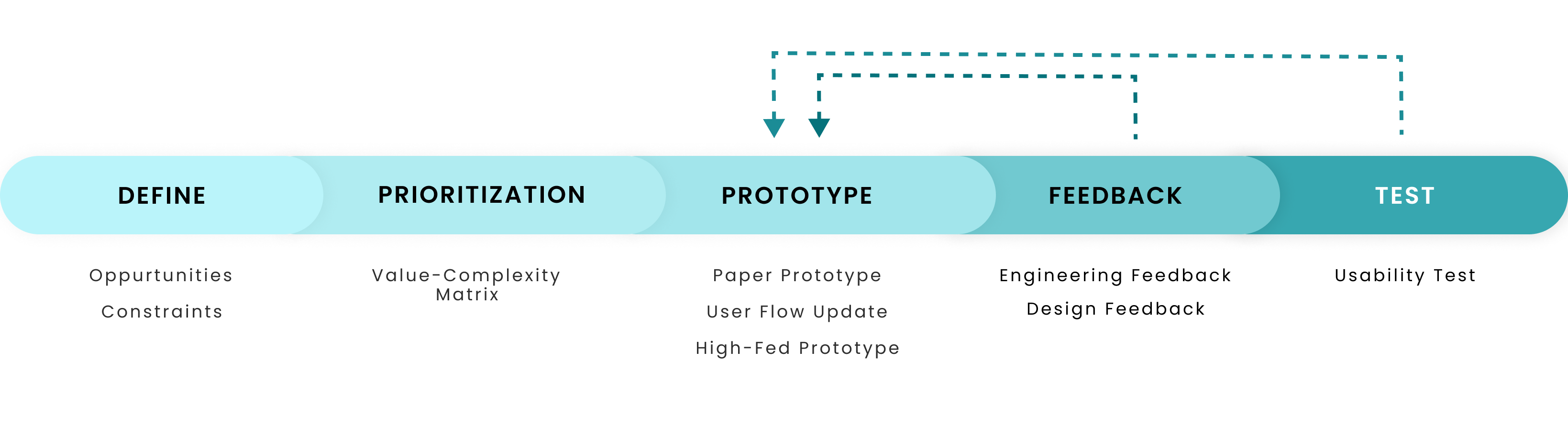
This Case Study is a deep dive into one of eight major product pieces I designed end-to-end at Papercurve. For this feature, I did all the deliverables from research to engineering handoff
Our success metrics were selected upon the business goal of creating value for our agency clients. Here are the results 3 months after the feature released:
This feature was a particularly challenging one and really forced me to think outside of the box. I also became better at staying agile and adaptable, especially when the technology is only tentative.
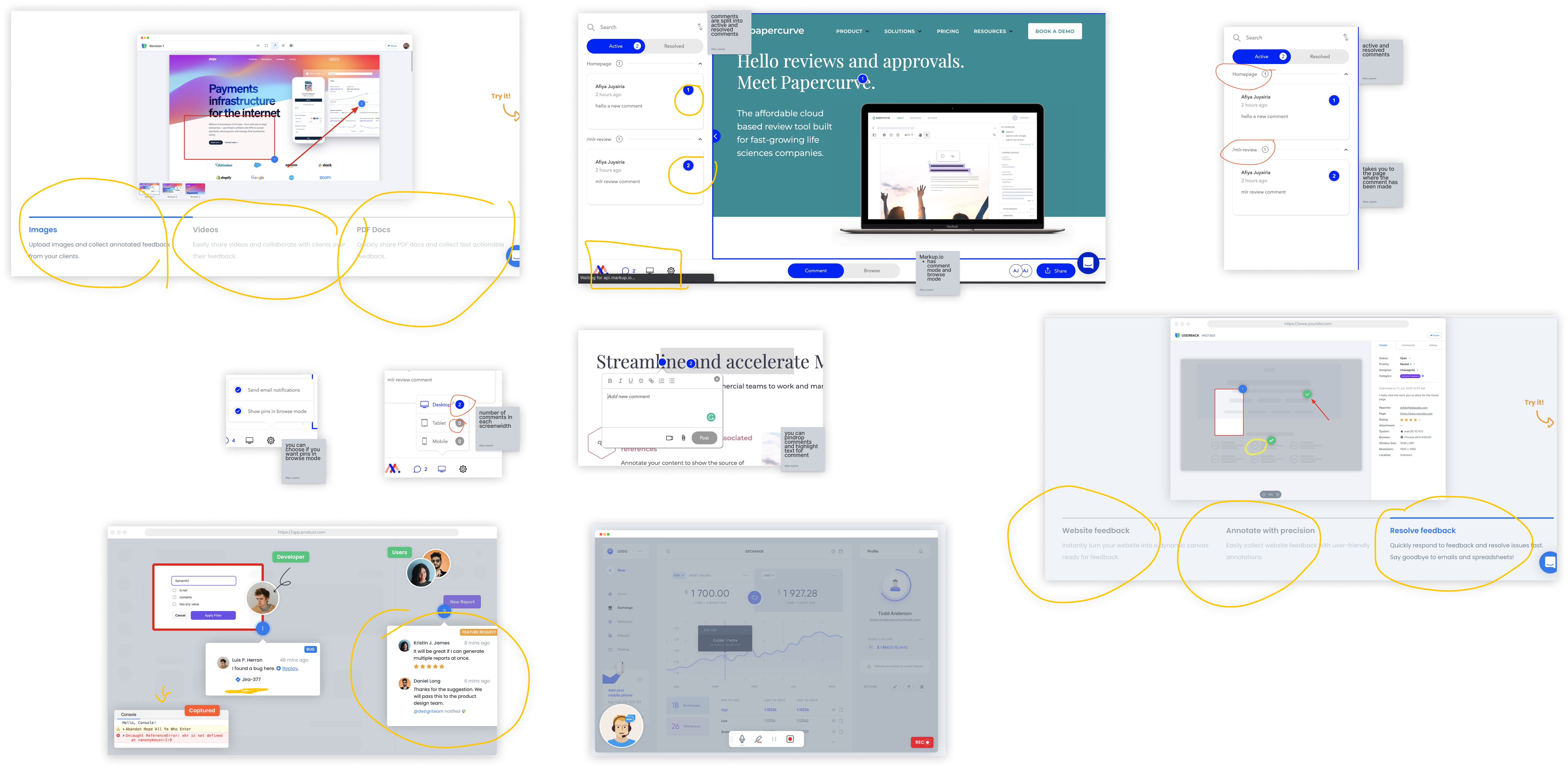
I found 2 products in the market designed for website review: Userback.io and Markup.io. I then investigated the platform for patterns, weaknesses/opportunities and how they overall solved the problem. Some features that stood out were:
Video feedback | image and video attachment | number ID for each comments | browse & annotate mode | desktop tablet and mobile view | naming pages with HTML page name | slack and jira plugin | share as pDF
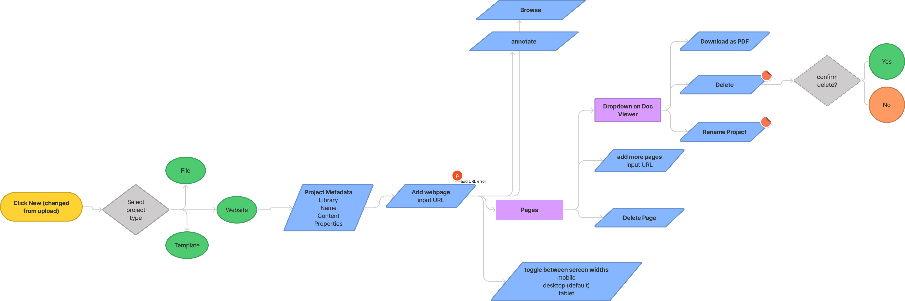
I identified the points where the regular upload flow and document viewer would deviate and did some low fidelity wireframes using my drawing board to communicate to my team how these differences could manifest. This resulted in a back and forth on what solution(s) would be best suited for website review.
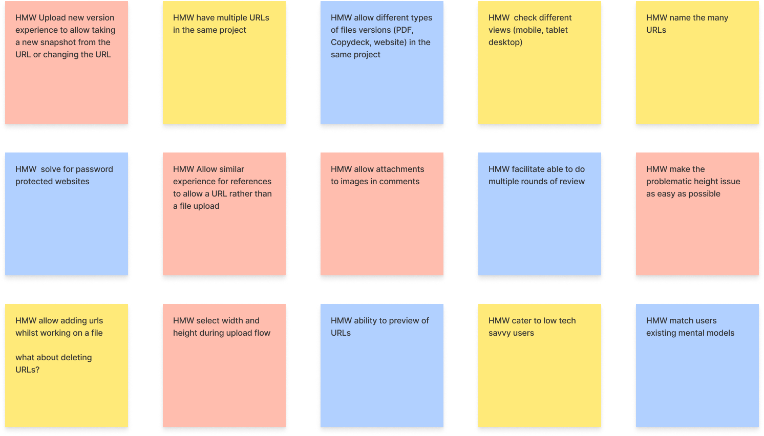
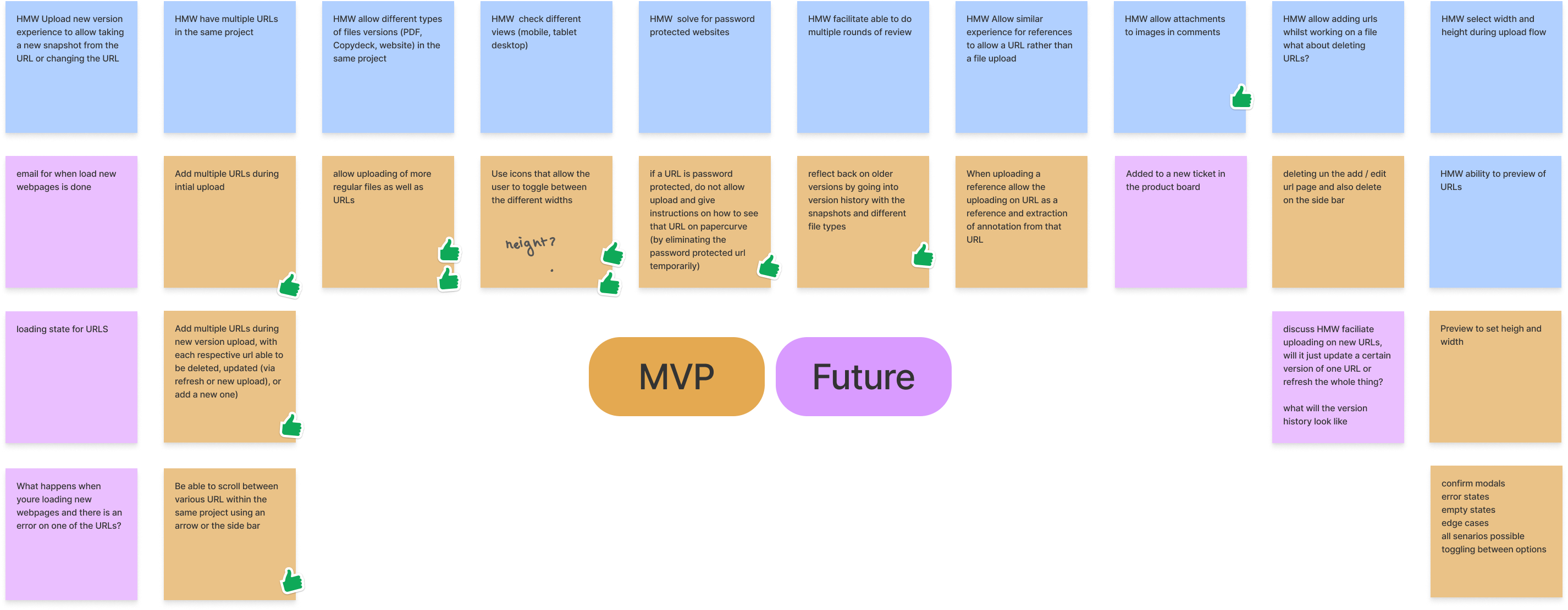
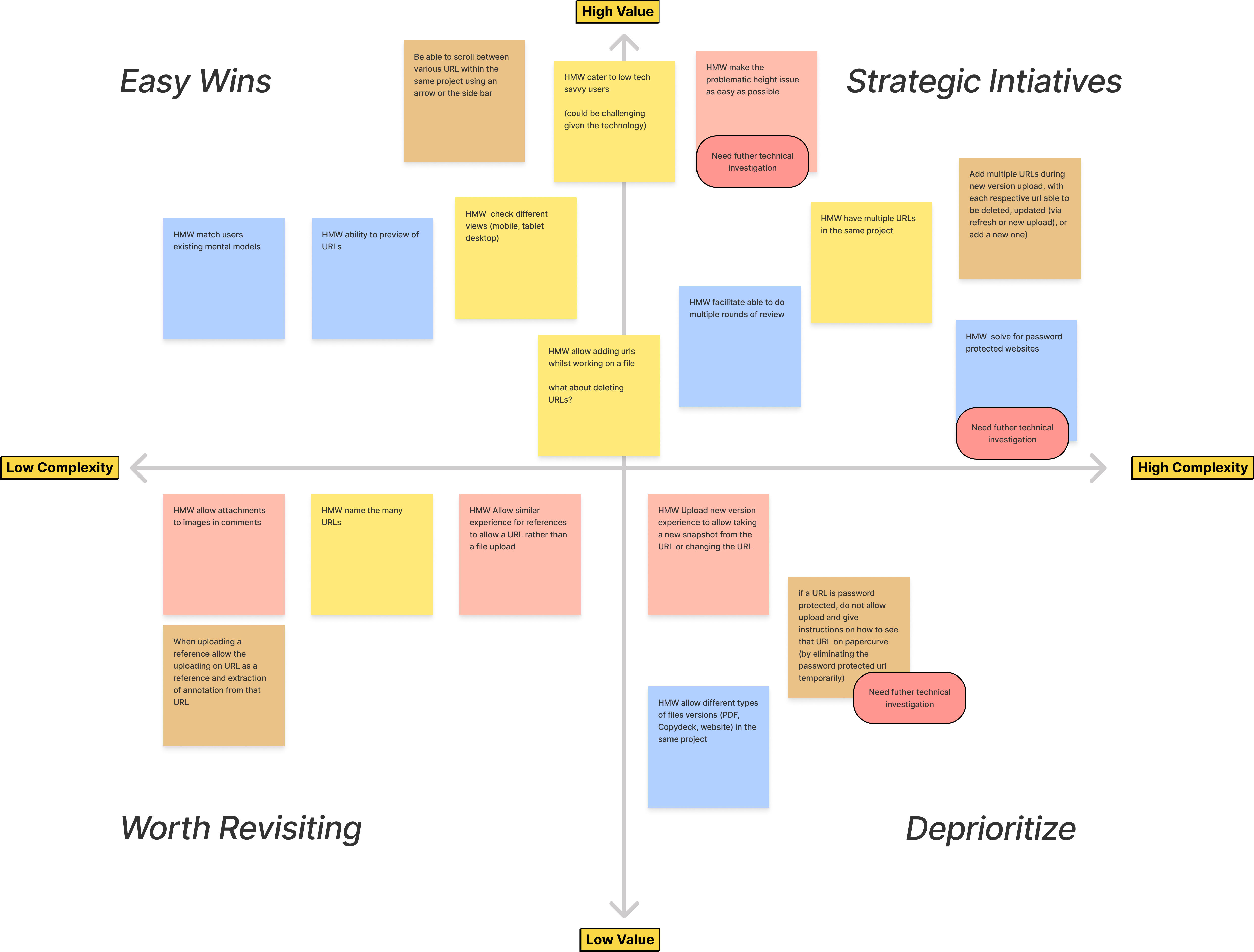
I facilitated a cross-functional team exercise, where we mapped out priorities based on business goals/value & constraints, then decided what to include in the MVP. Everything in the easy wins section were scoped to be done, along with most of the strategic initiatives.
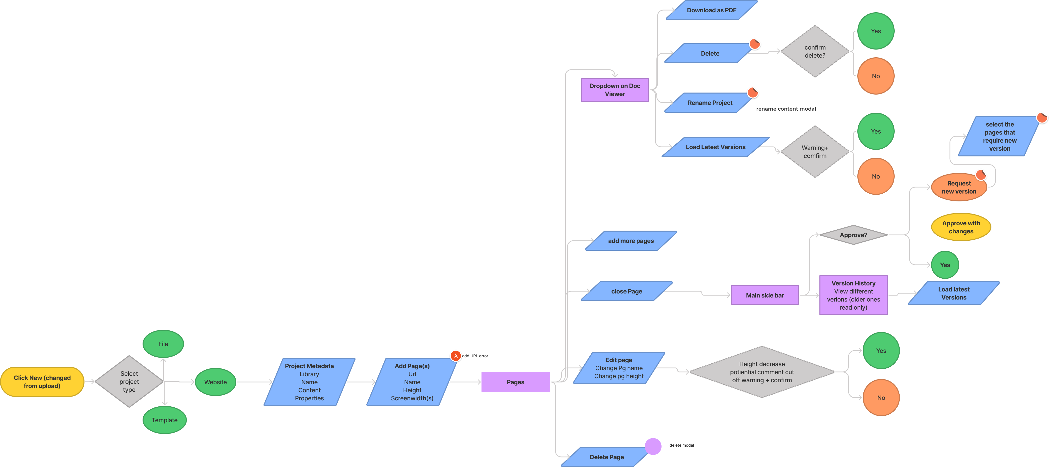
I began by mapping out the user flow for Website Review so that I could communicate my thought process and make a short list of screens and flows that need to be designed.
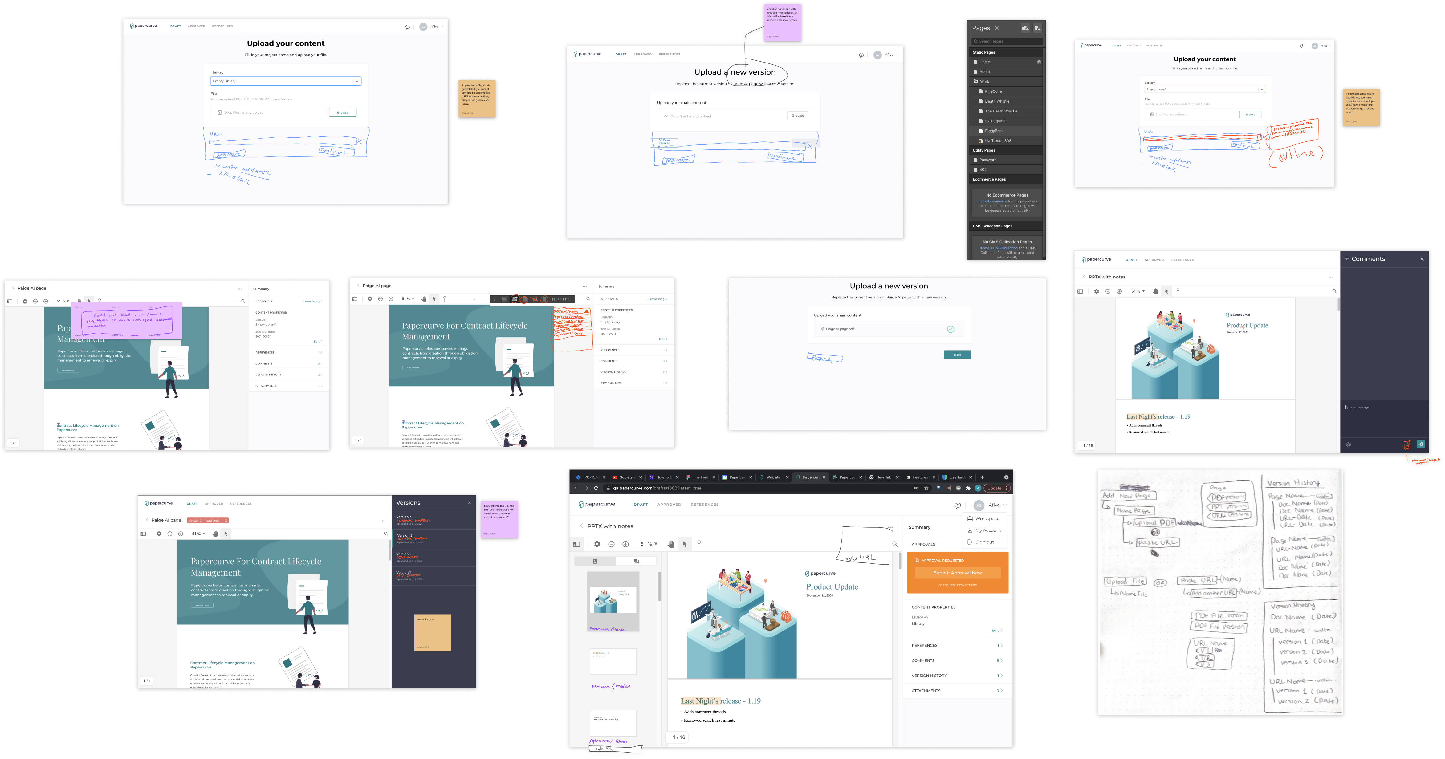
The adding page went through 4 design iterations. First iteration of adding page consisted in a 'preview mode' had a visual separation between the adding webpages flow and doing the actual review but ultimately was retired due to not being very user friendly due to lack of affordance on key inputs and creating needless engineering effort.
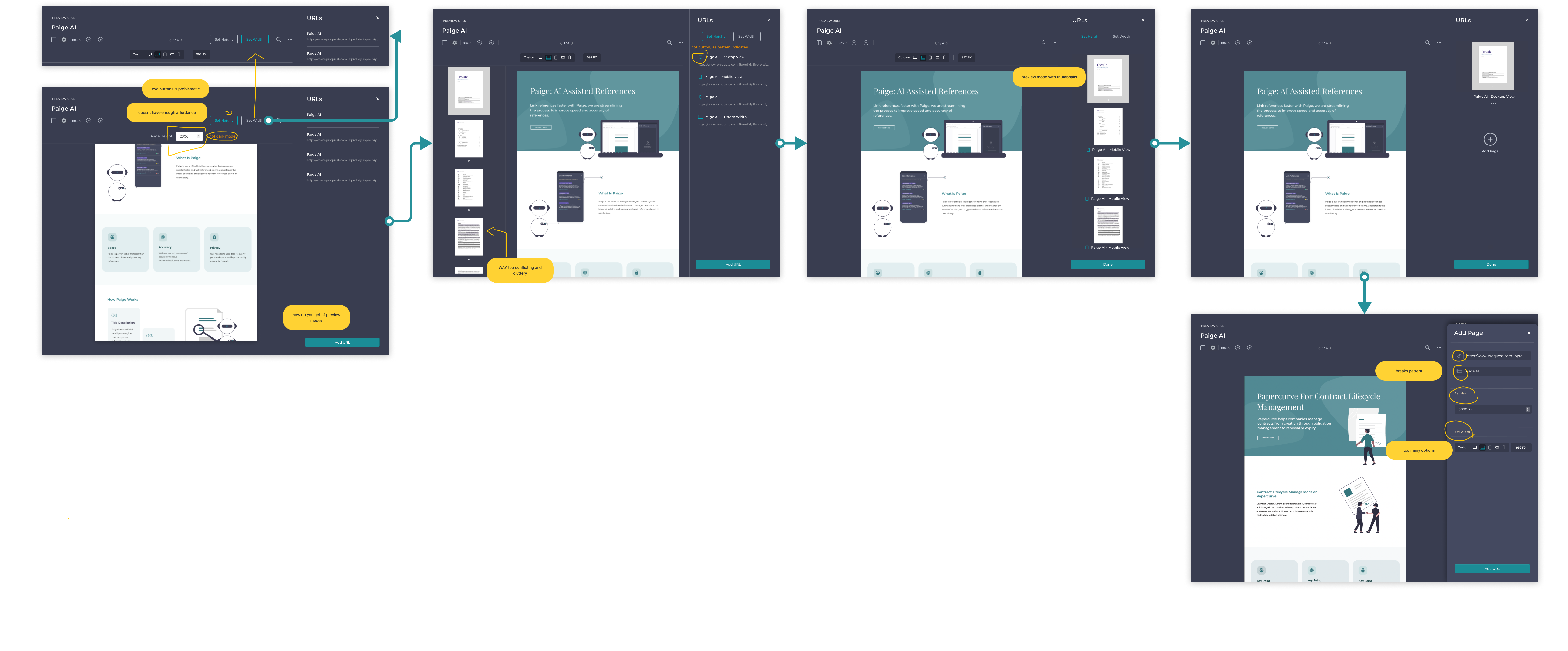
Next I experimented with the 'add page' flow in the main viewer. This flow uses a familiar pattern to users, has the error prevention & affordance needed and also lower engineering effort. However, it brought with it lots of error states and technical complexity. You can see the granular details on the iterations below.
Based on feedback, a new version of 'preview mode' was brought back to the add page flow. Subsequent user testing showed this flow solved the issues found in the previous iterations and is a much simpler flow.
Lots went into figuring out how to facilitate multiple rounds of review & tackle versions, but due to the technical constraints I found while working through it, it had to be descoped until the technology improved.
I created all the secondary screens, empty states, edge cases and error states and then wrote the engineering tickets.
The day after I wrapped up ticketing, we got notice from PDFTron that the software has been updated with significant changes. Engineering then created a demo site to test with. Using that, I determined the new constraints and opportunities this update presented:
New Opportunities
New Constraints
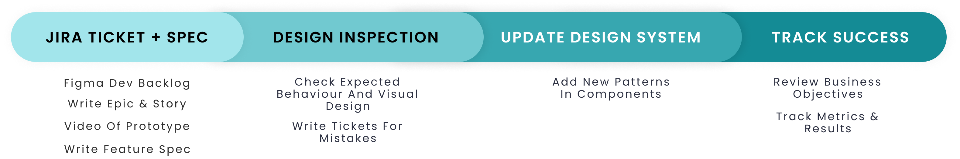
I then revised the user flow to reflect the new update. I was very pleased with it because the user flow was much simpler and easier!
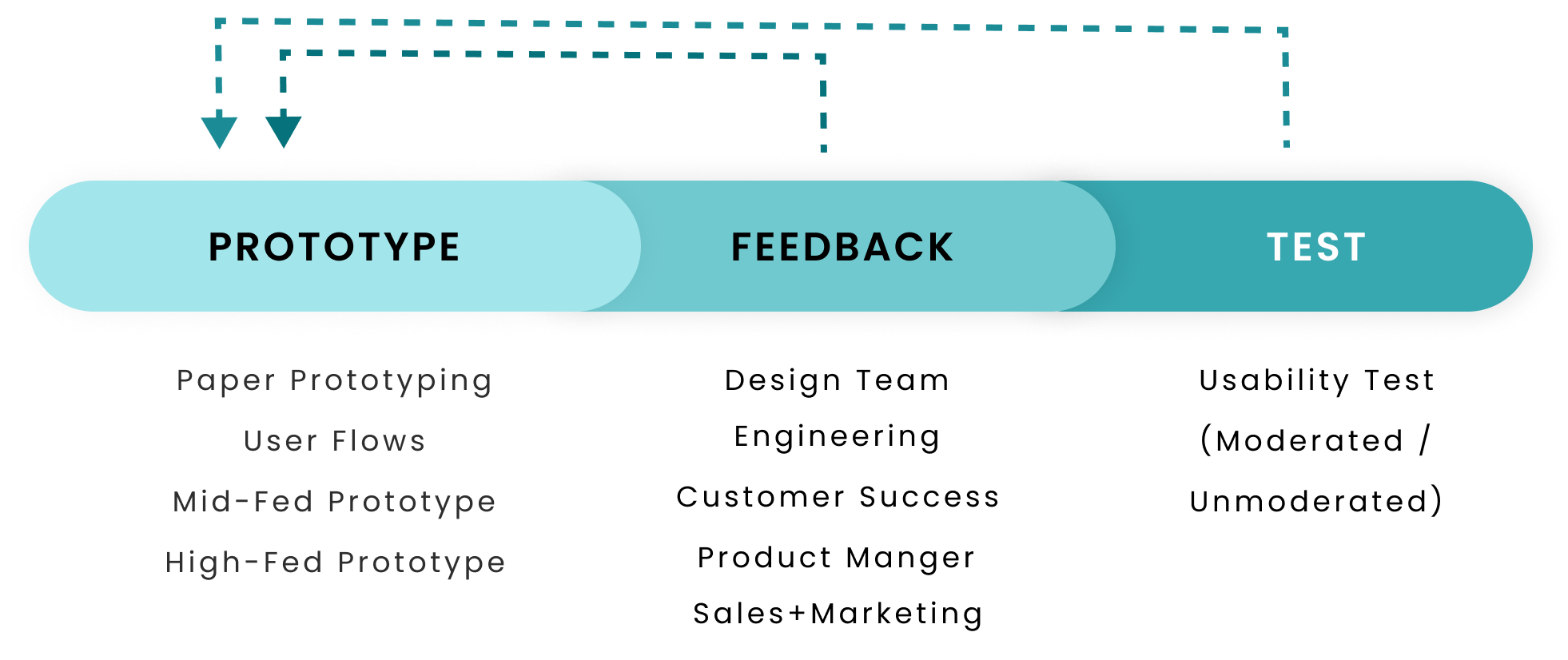
I then used this to do several iterations of design, feedback & usability testing.
Average time to add a webpage cut in half
Metrics showed the average time for the 'add a webpage' task cut down round 50% from the initial design
Correctly understood each feature element and its function
Post-test questions showed an understanding of each element of the feature and its value
Commented on the intuitiveness
Participants commented verbally that the feature was overall comprehensive and intuitive
After completing my design iterations, I moved on to revising the engineering tickets I wrote and wrapping up the feature. Below is the Figma ticket I wrote for development.
The key learning from this design is to voice my intuitions. I had the feeling that the usability issues caused by the technical limits were too great to design around and that we ought to pause on design until PDFTron released a more refined version of the software, but I didn't speak up.
In the end, PDFTron did end up updating the technology, resulting in me having to redesign the feature. This ultimately caused a slight hamper in meeting our quarterly design objectives.
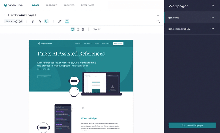
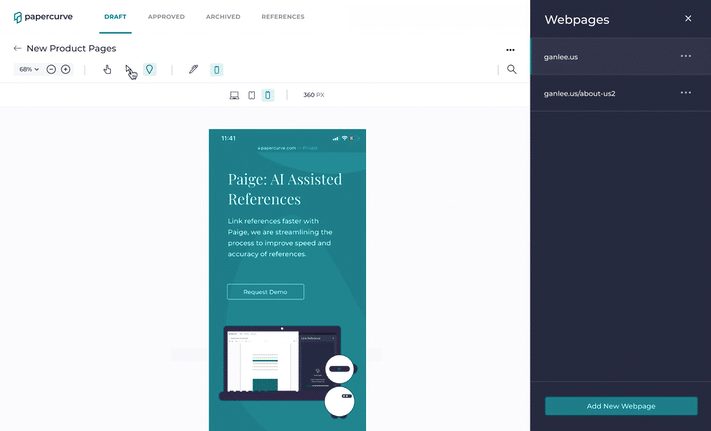
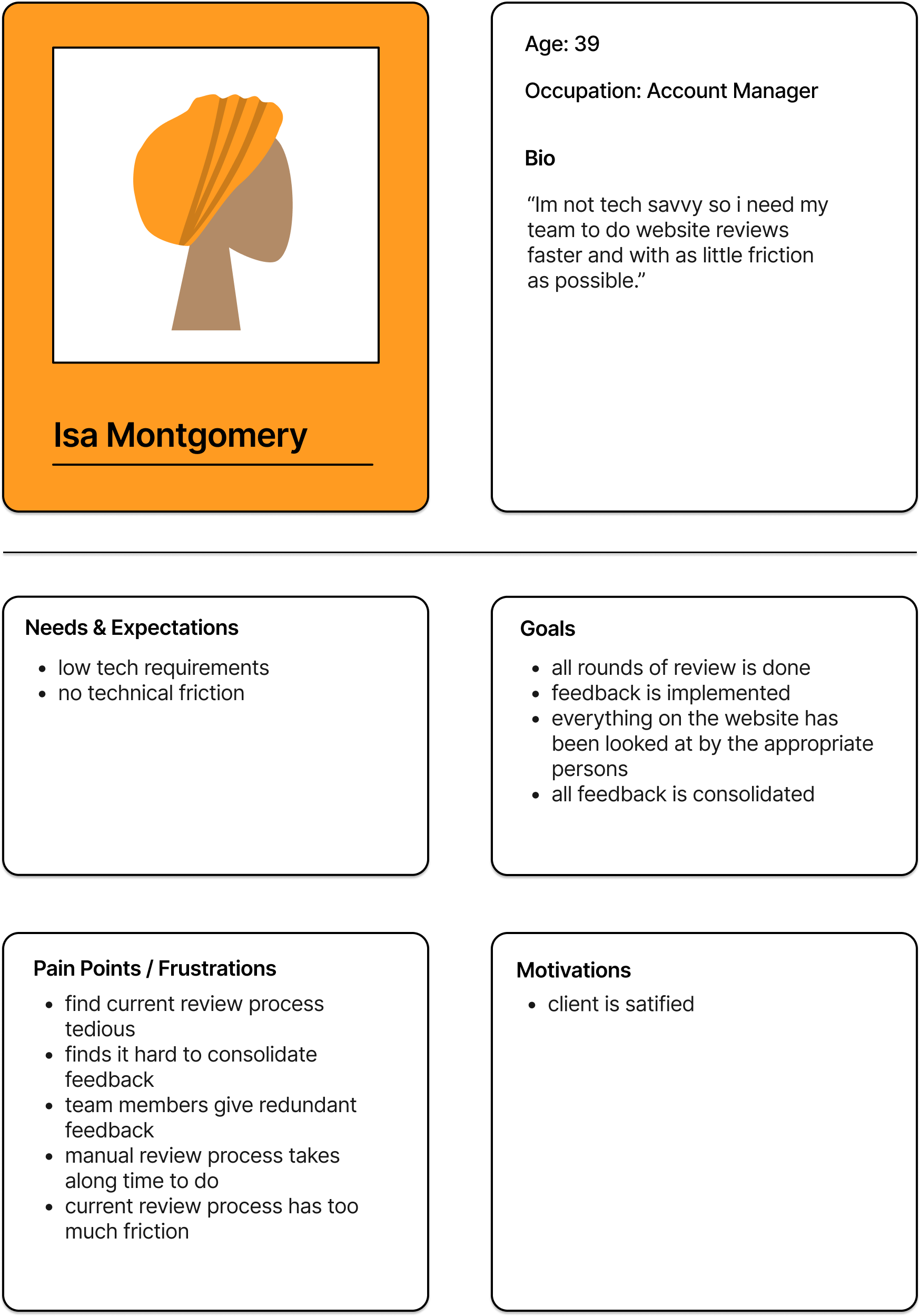
Users are able to add new webpages by simply inputting the URL.
Our research showed that website review is done on many URLs at a time and our low tech users want the simplest solution possible.
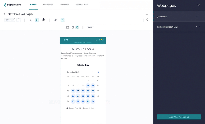
Users are able to review the responsiveness of their website with 3 of the most common screenwidths by clicking the icons in the toolbar.
Our research indicated that users conduct review primarily on desktop but mobile and tablet views are also checked. Our users are also not very tech savvy, hence the 3 simple icons. Also, I selected the screenwidth PX sizes based on stats for most common screenwidths globally.
Users are able to click around and interact with the website using browse mode.
A website is an interactive medium, so a sufficient review cannot be done without being able to review the interactive elements. Users go into browse mode by clicking on the cursor icon, a pattern already familiar to PC users.
Reviewers are able to leave feedback using annotate mode by selecting the pindrop icon, putting the pin on the webpage and then typing up a comment.
The pindrop flow to leave comments has not changed for website review so it is a familiar flow to users, thus matching their mental models.
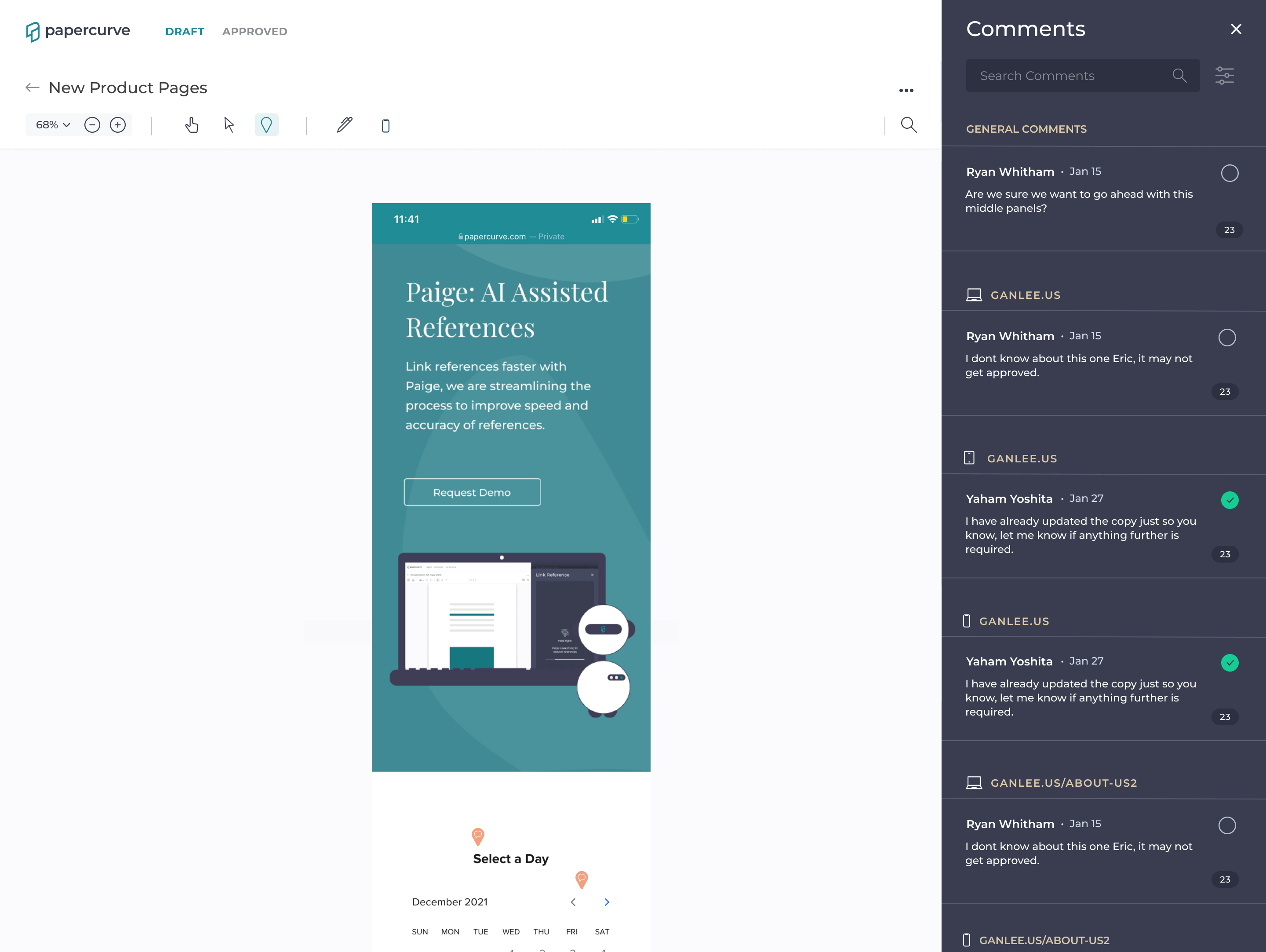
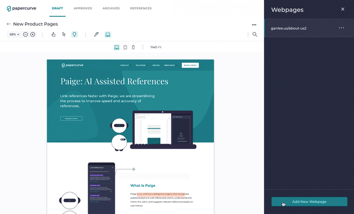
Users are able to see all the feedback in the comments panel which is categorized by page name and screenwidth.
All the feedback lives in one area to make sure nothing is left uncheck. If one needs to filter further, they can use filter feature which now sports a new screenwidth filter.
The design of a mobile app truly tailor for children, functioning to make kids financially literate and build lifelong finance habits using real money and real stakes.