Phase One: Mohamed, Tate, Alena, Gloria.
Phase Two: Samantha, Zhi, Yutong.
Resources: GV Sprint, W3C Web Accessibility, NN/g | Design: Adobe XD, Illustrator | Research: Xtensio, XMind, Optimal Sort, Zoom | Collaboration: Miro, Slack, Asana, Zoom
Skill Squirrel is a SAAS application that facilitates the collection, use, and distribution of verified micro-credentials through the use of blockchain technology which enables people to use qualifications they have acquired beyond traditional education by creating tangible assets that can be included in their resumes.
Skill Squirrel's user interface, designed by a group of backend developers, severely lacked adequate informative architecture and had a myriad of usability issues. I was brought on to redesign the application almost entirely.
Define target users and their pain points and goals, then redesign the information architecture and site flow accordingly. Additionally, identify glaring usability issues and redesign the UI to be intuitive and easy to navigate.
Designed the prototype for the application on XD
Build the basis of a design system
Conduct and lead user research
Collaborated on storyboards, user journey, user personas, and the sitemap
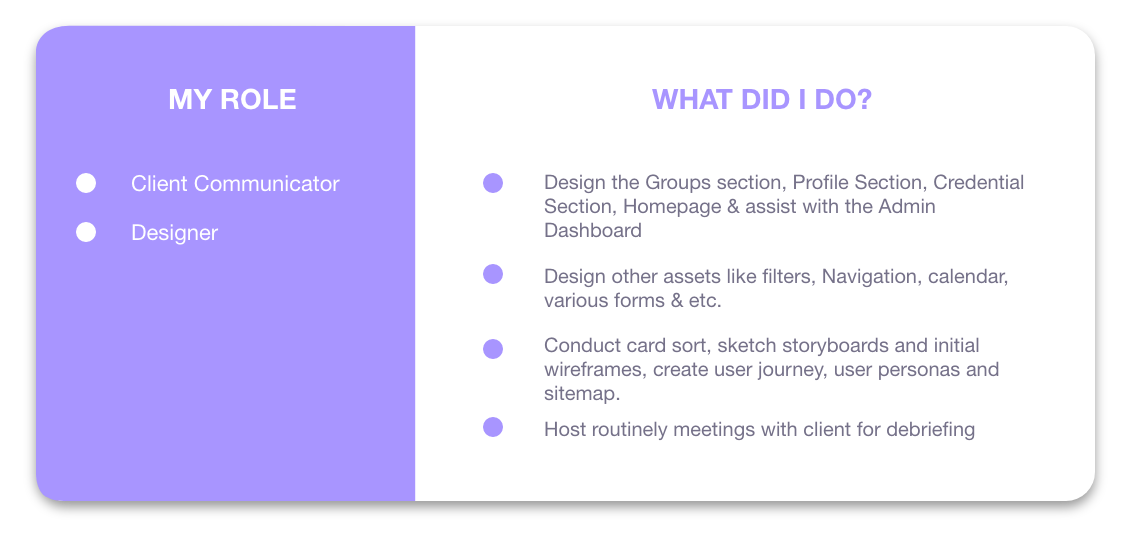
Host routinely meetings with client for debriefing
Lead design team, host weekly meetings and provide feedback to design team.
Keep track of team progress on Slack & Asana. Divide and allocate work to team members.
Communicate with developers in meetings and created a design backlog
Build various sections on the prototype and expanded the design system.
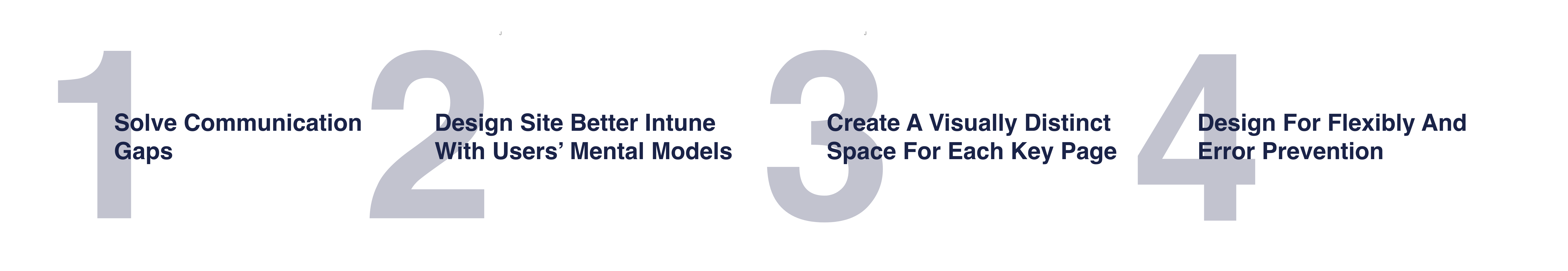
Early users studies indicated users had difficulty completing their tasks because all pages had the same layout so they didn’t know which page was the right one.
To solve this, we made each page visually distinct and designed the layout according to page function. This allowed users to complete their tasks easily and confidently, as shown the drop in the # of error in our later usability tests.
A major finding in our early research was the lack of feedback during and after a task.
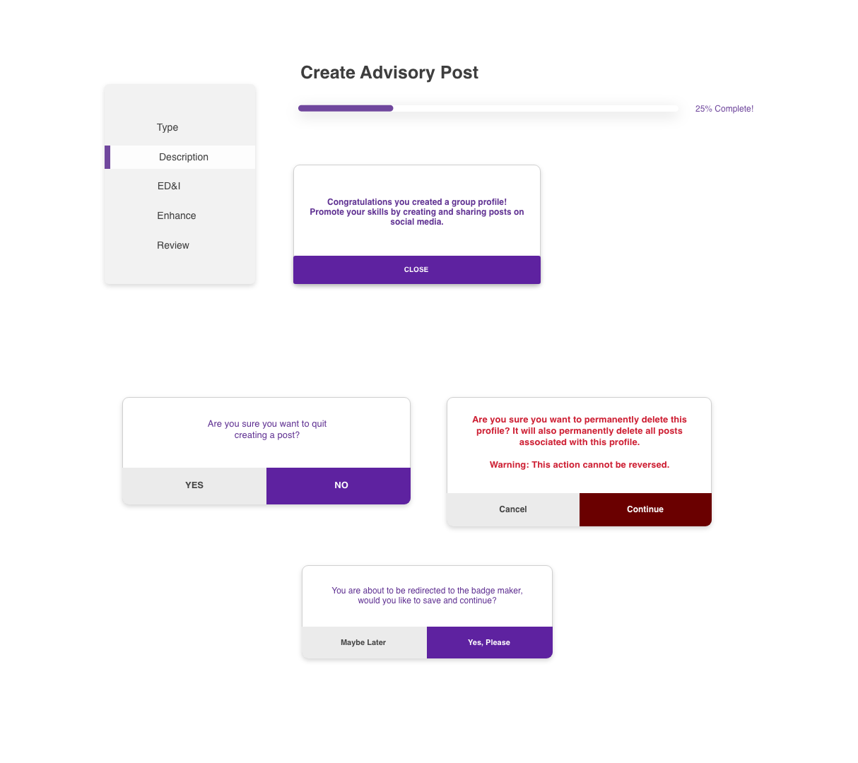
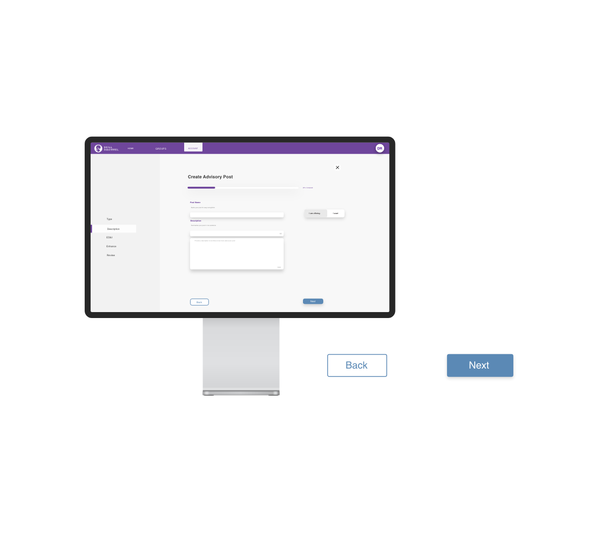
To combat this, I put in a bar measuring how far a task is from being complete, a side bar indicating of what stage of a task the user is on and a popup clearly stating that a task is complete.
Another finding was that when users made progress on a task and clicked away without completion, there was no indication that they where about to click away from a task mid-completion.
To tackle this, we inputted warning modals before the user makes a costly error, giving them second chance before committing to an action.
Our research found that users lack adequate affordance to begin their tasks when starting from the main page, had difficulty navigating between pages and couldn't find specific information without struggle.
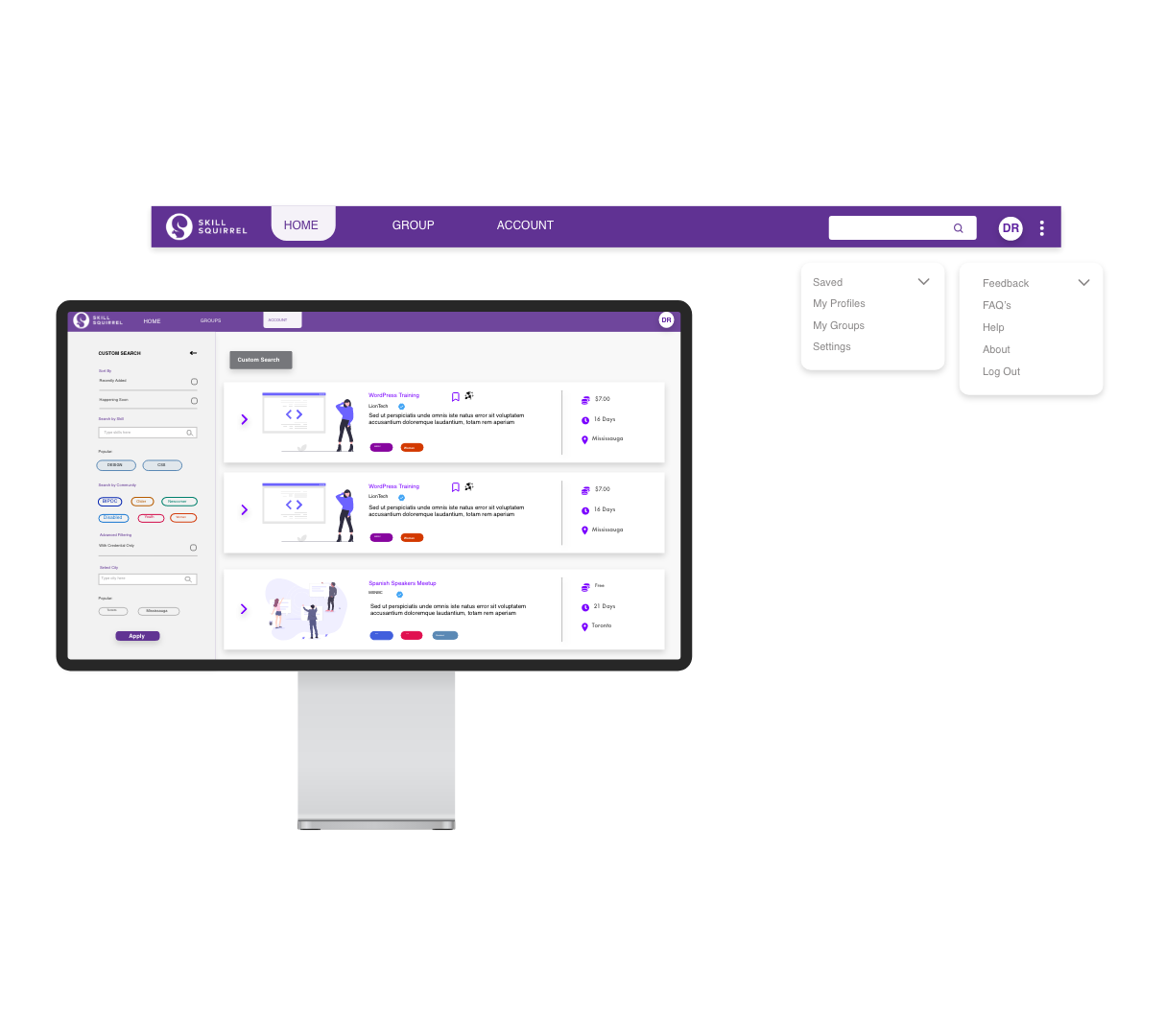
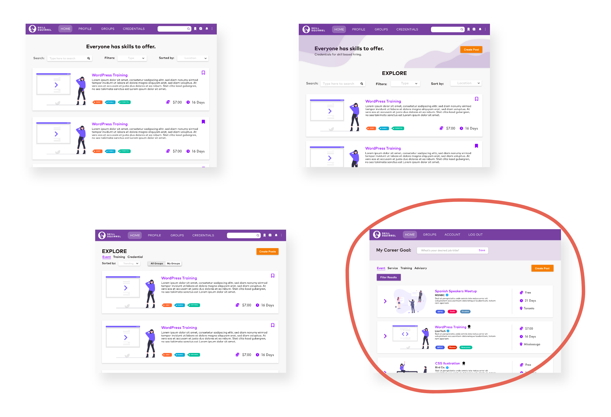
Thus, we created the sticky navigation bar so that users are able to jump to key pages and begin key tasks at any moment. We also made the addition of a global search feature to enable users find what they are looking for quickly. This feature also allows for sorting, filtering and searching within various key categories.
Our early user study found that users got lost and confused by the lack of familiarity so we used visual elements and copy that are consistent with our user's mental models from other platforms. This reduced cognitive load as shown by reduction of time spent on tasks in later usability studies.
Our early users studies indicated users not only were unaware of what errors they made, but also didn’t have the ability to return and solve it quickly.
The addition of a back button allowed the user to easily trace back their steps, fix the mistake and move ahead. This helped in the reduction of time per task because when an error was made, users were not perplexed by what the error was and how they could solve it.
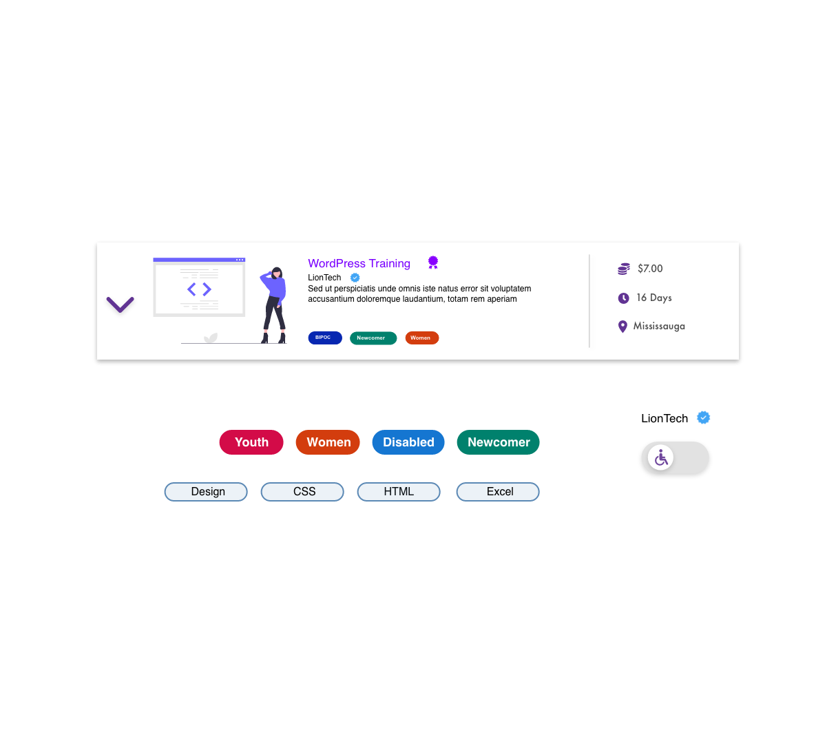
The addition of tool tips was key to improving the application’s usability, in the event the user does not know what a term/icon means, they may hover over it and it will define it.
This decision was made because our early user tests had a lot of “what does this mean?”; our later studies didn’t bring this issue up as a result of this feature.
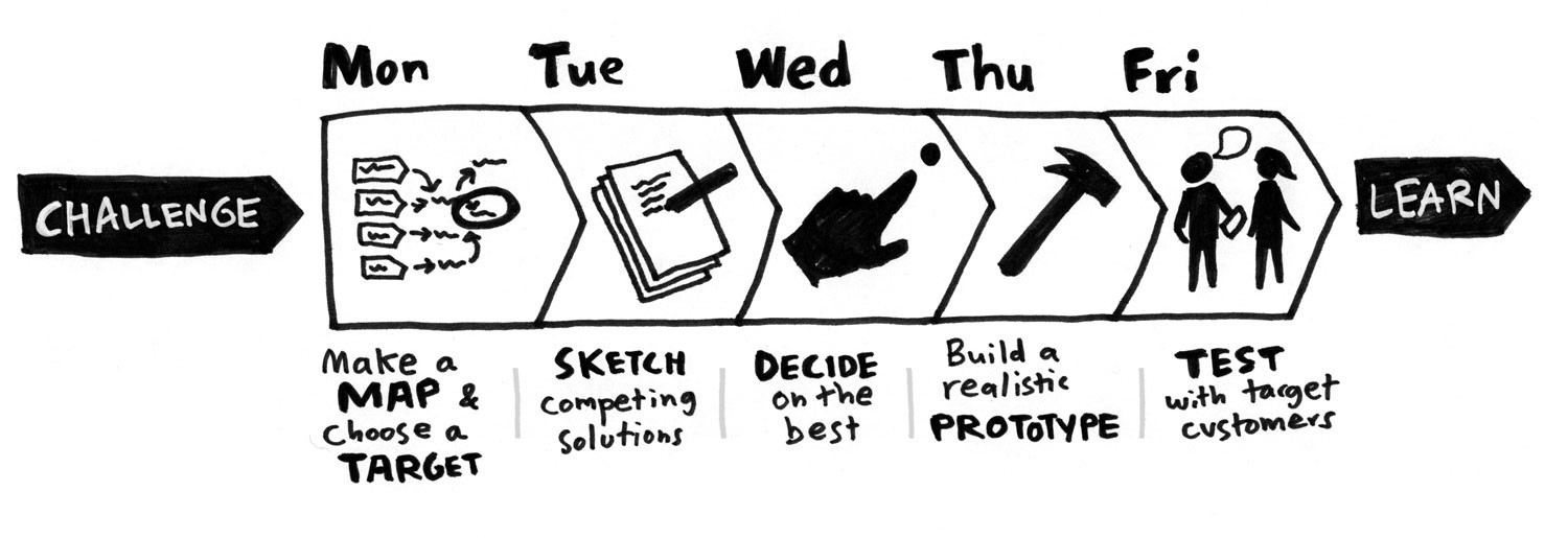
A major constraint for this project the limited time we had, so to combat this, we used the Google's 5-day GV Sprint.
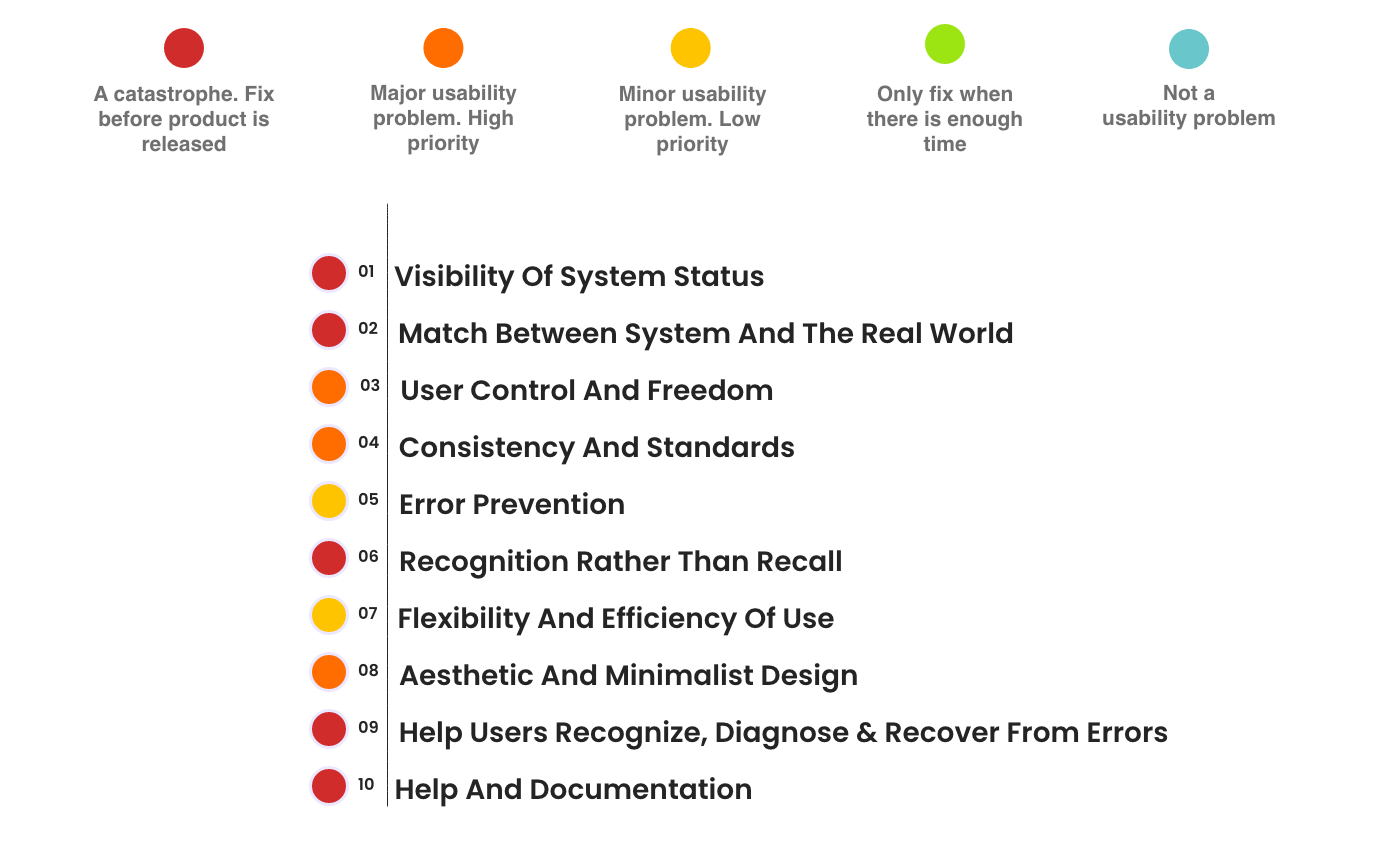
We began by conducting a heuristic evaluation on the existing site and found were a plethora major usability issues.
Among the most pressing problems were the use of unfamiliar copy and not using universal icons.
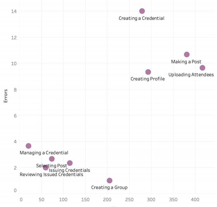
Next we conducted a usability study where, among other metrics, we recorded the Error Rate and the Time Per Task. The scatter plot below details the efficiency of each task by looking at the average time per task and the average user error rate per task.
It is clear here the more complex tasks incurred more errors.
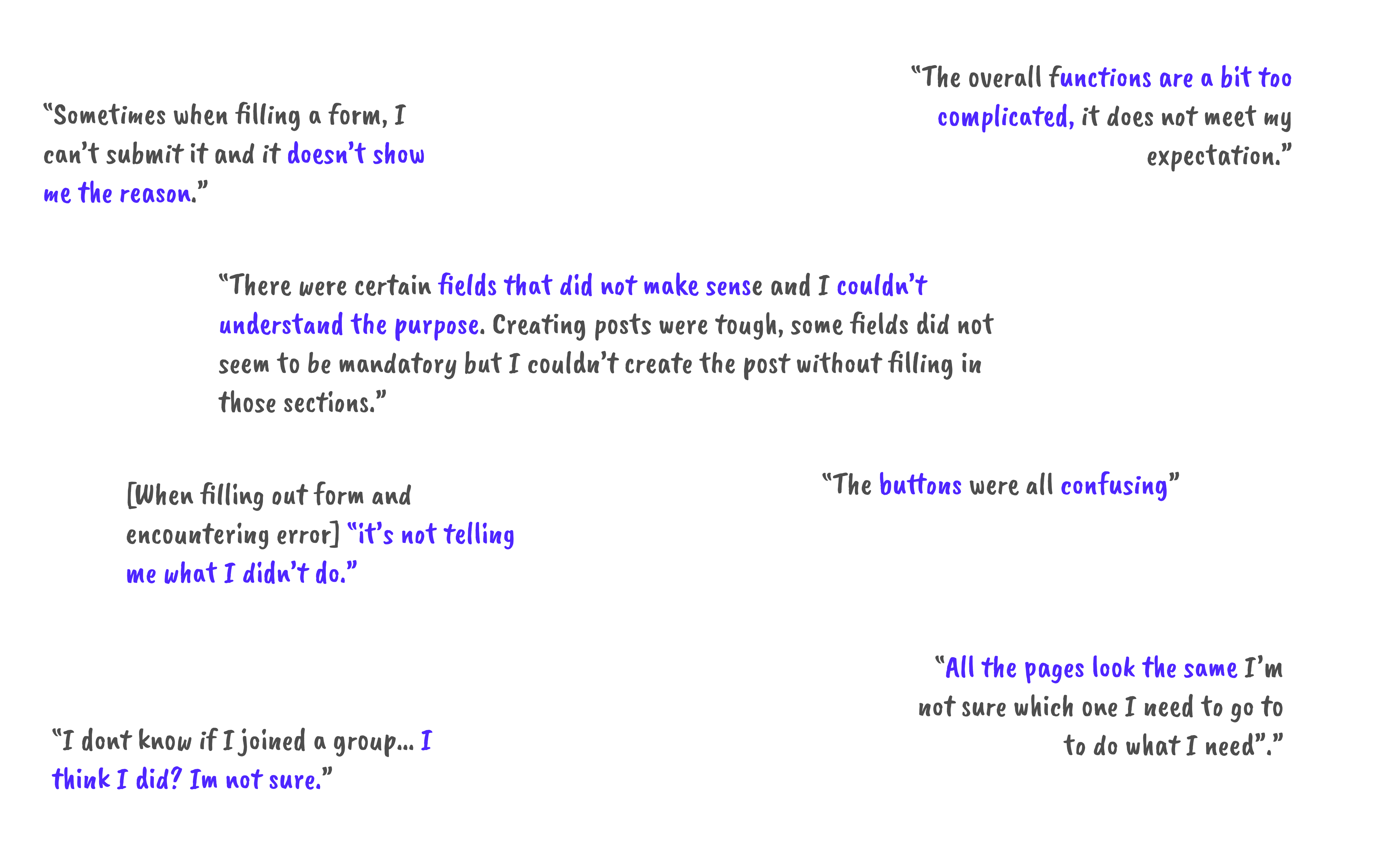
Additionally, we instructed participants to think out loud while doing their tasks and asked a series of pre and post test questions. Some stand out remarks include:
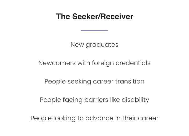
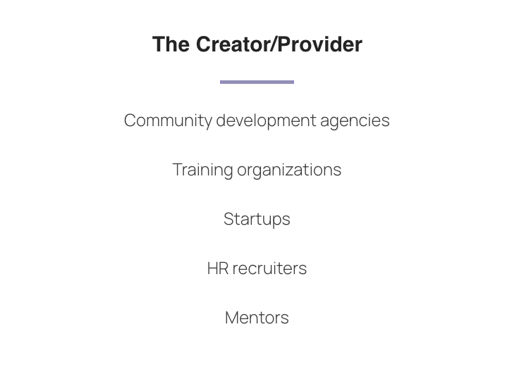
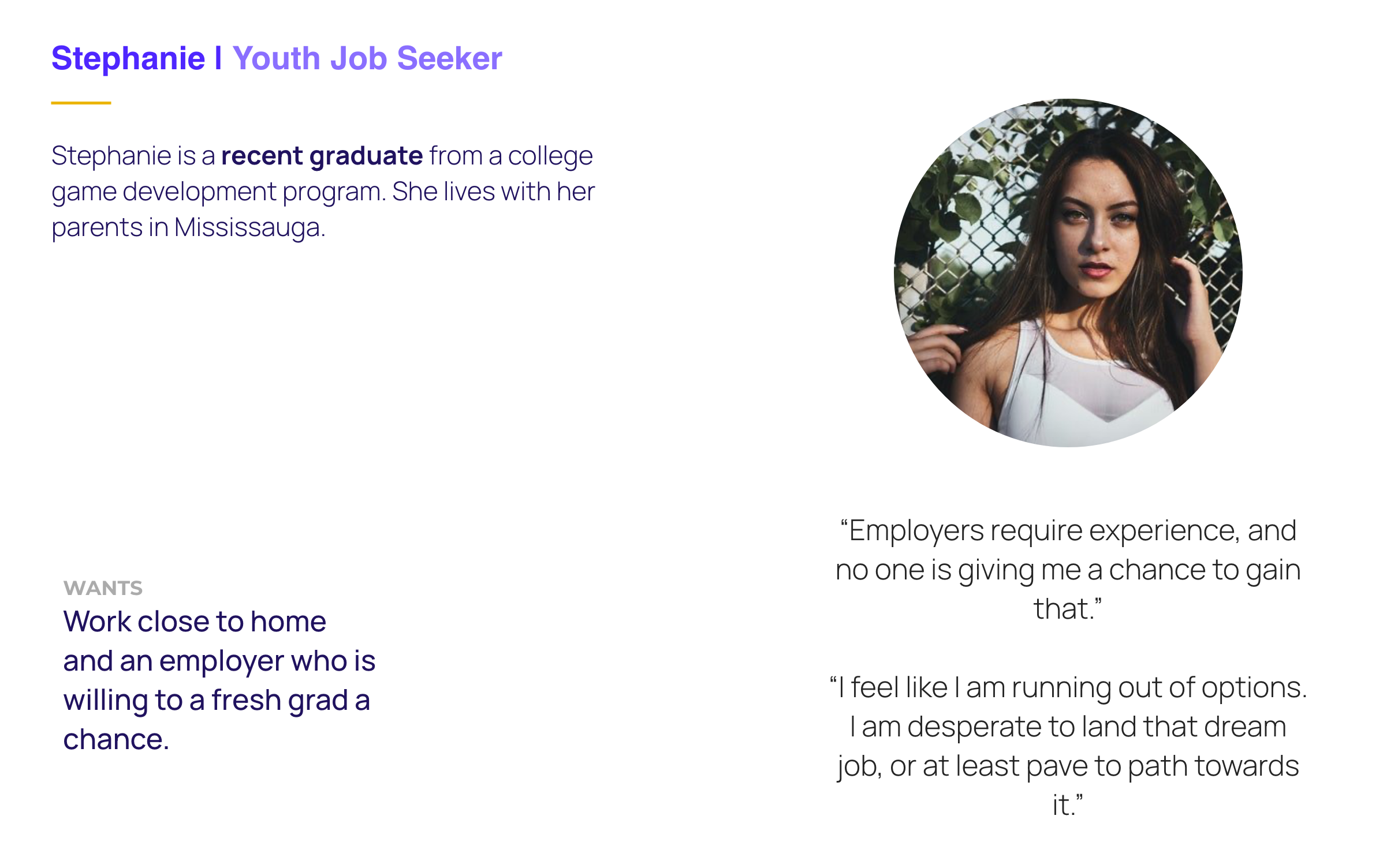
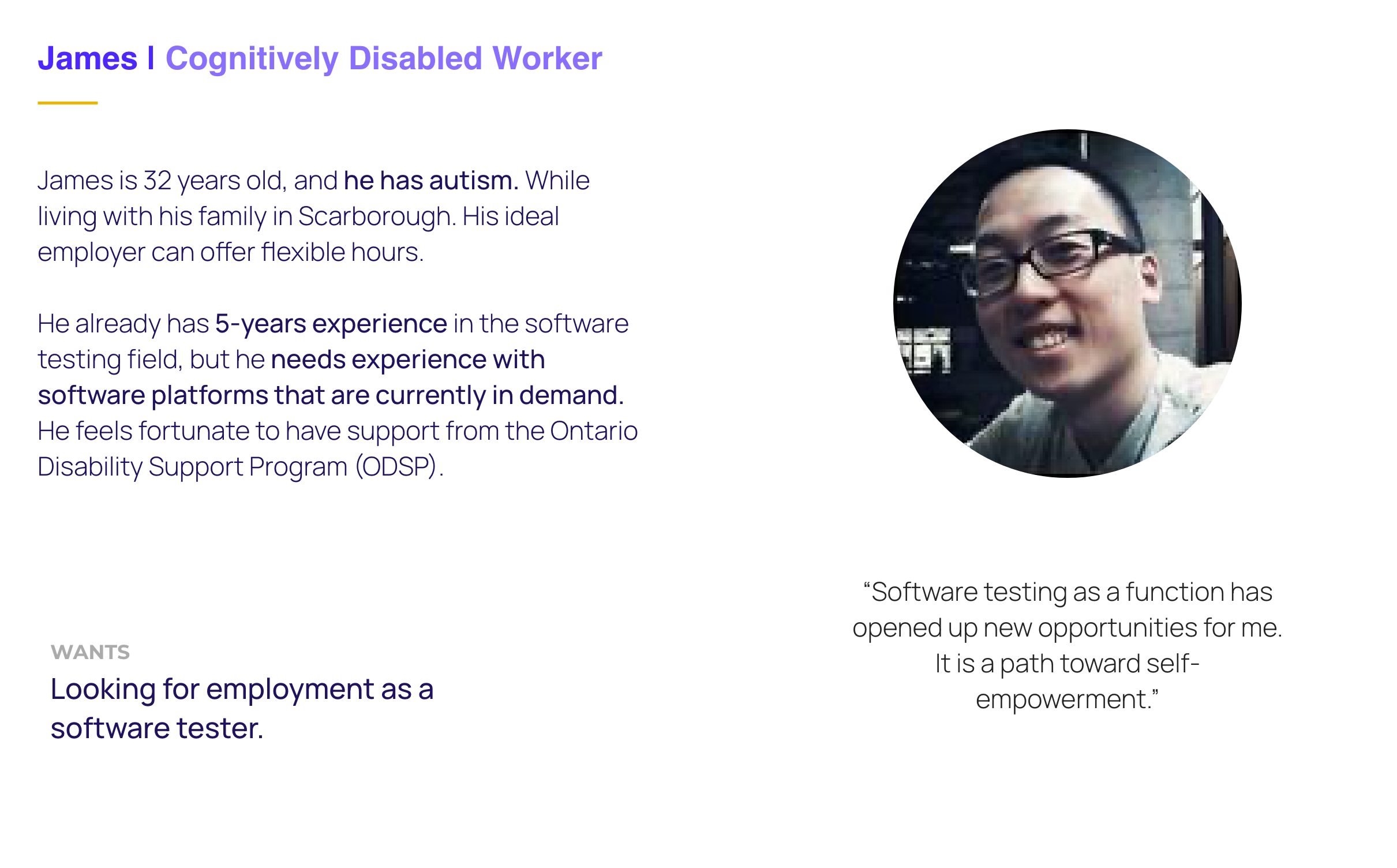
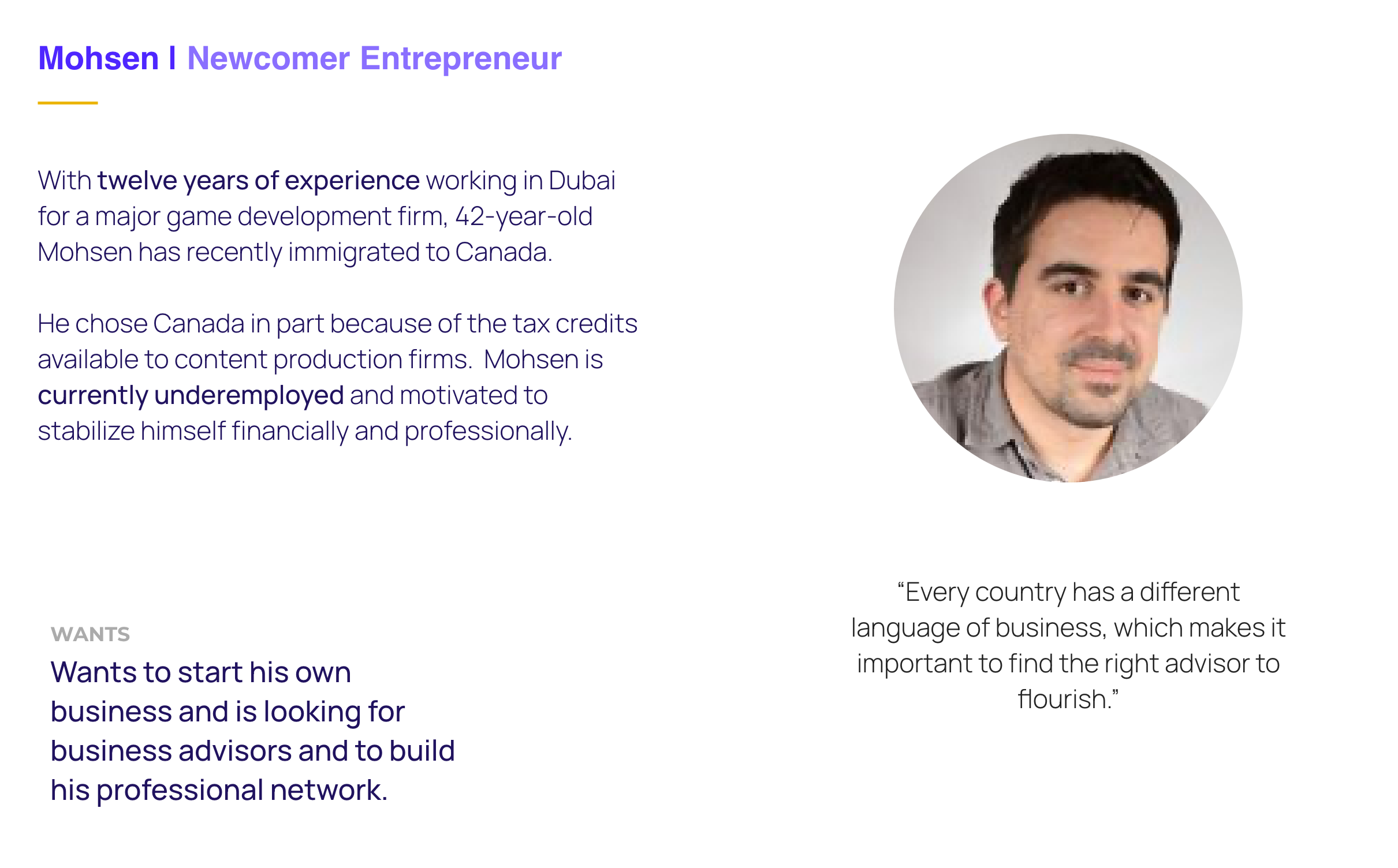
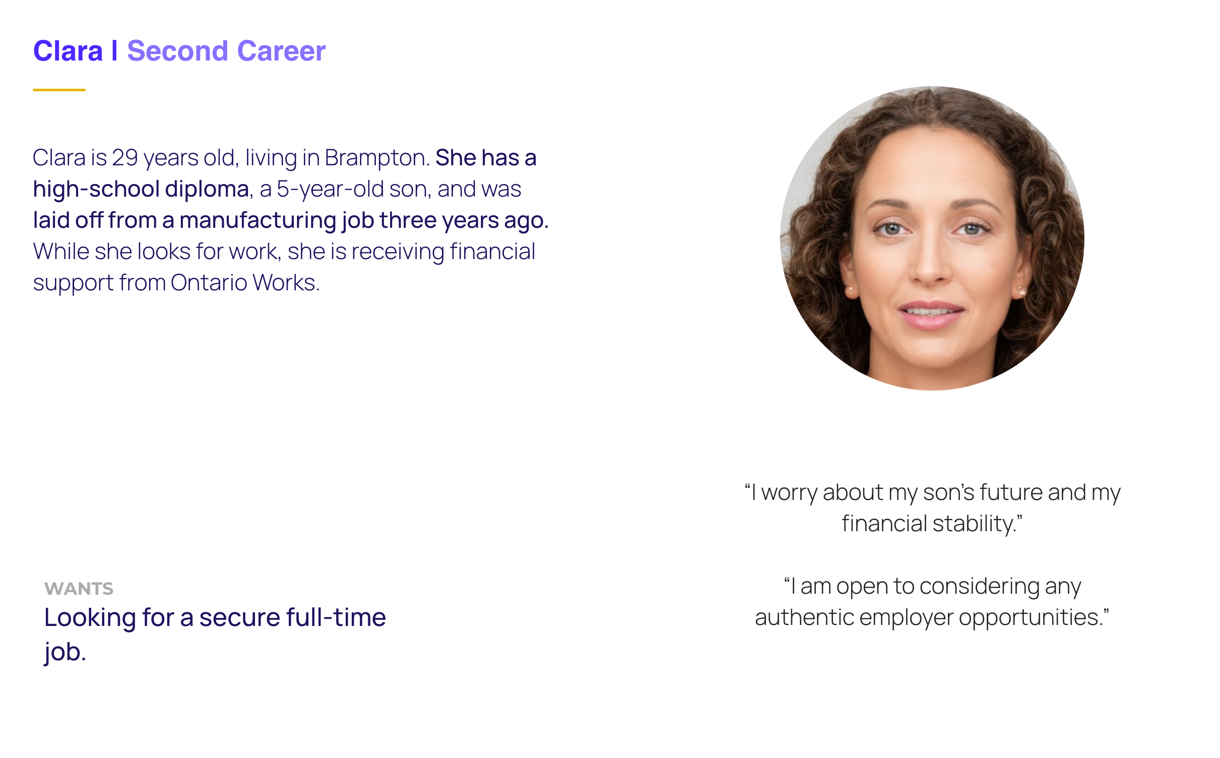
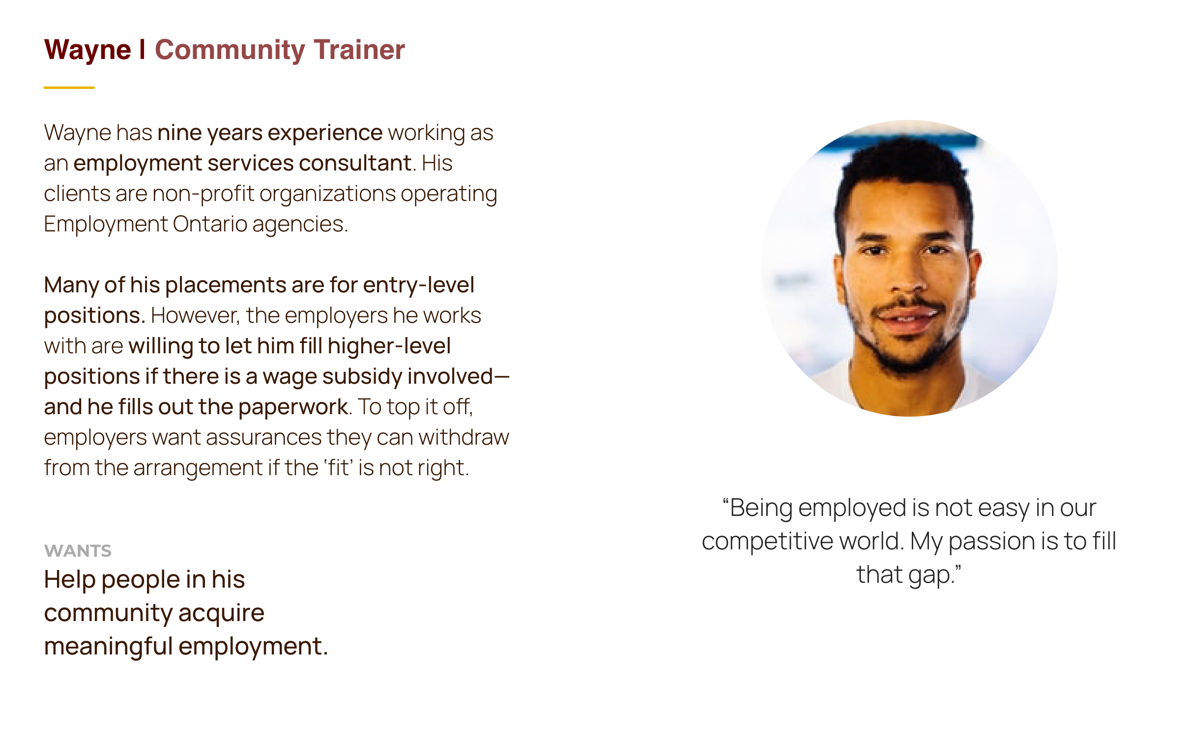
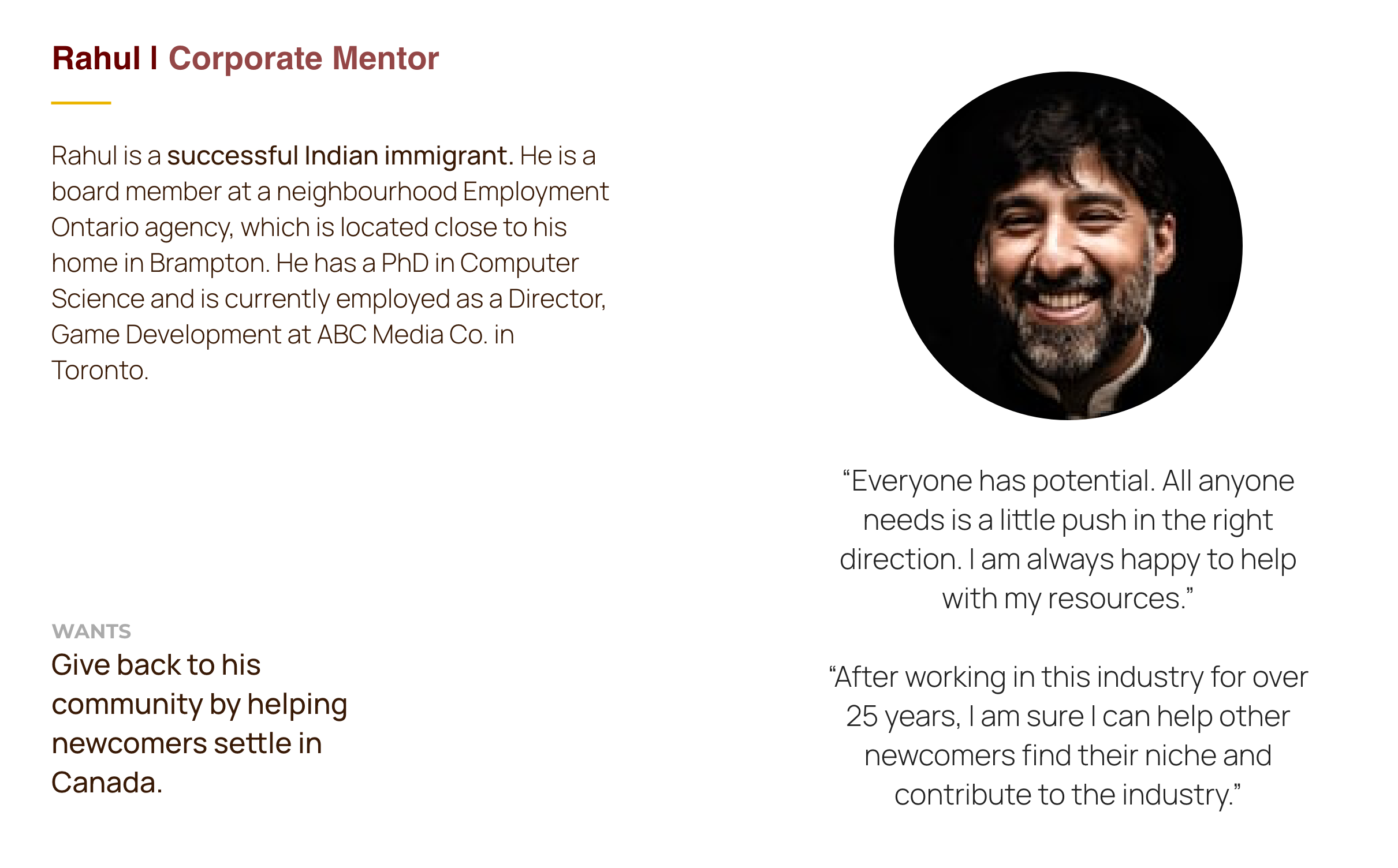
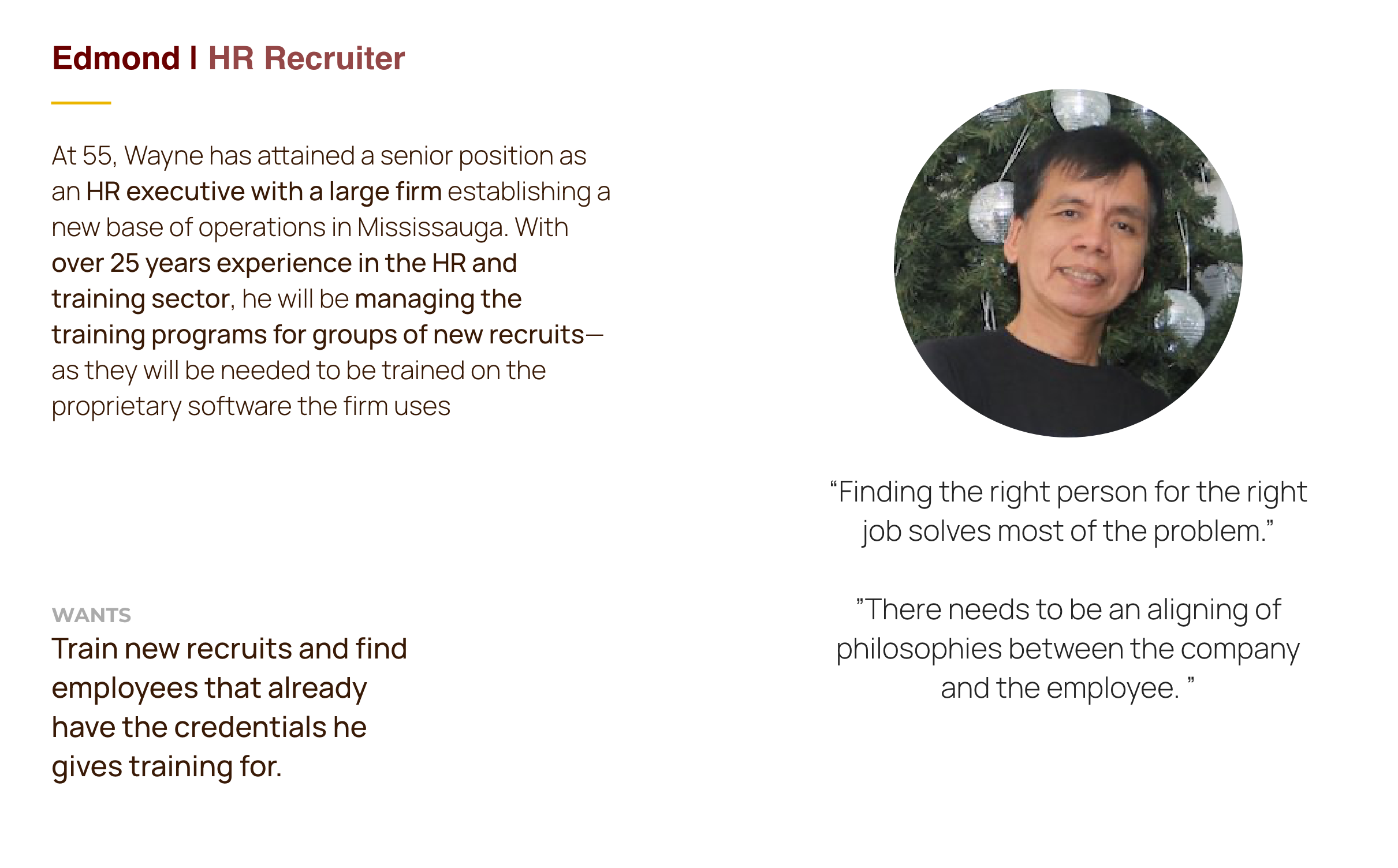
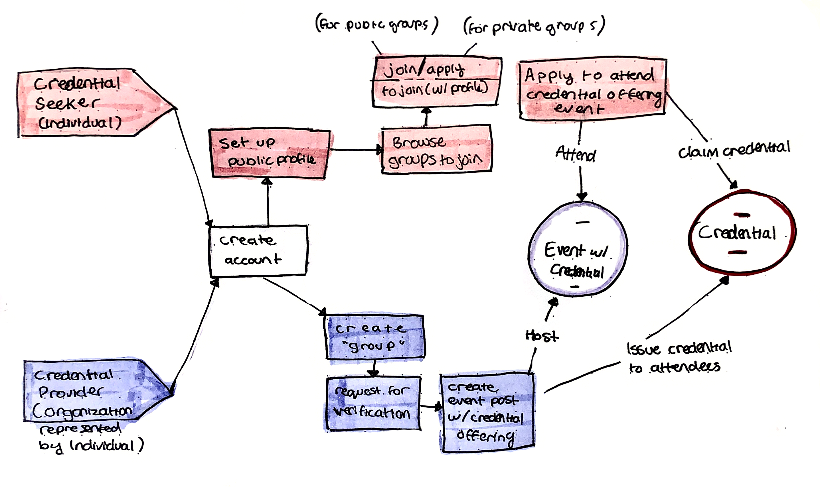
Using the transcripts from interviews our client had completed in the conceptual stage of product development, we identified the two kinds of users on Skill Squirrel
We then developed personas to detail our users needs, wants and goals, and help us assure we keep our users at the centre of our design process.
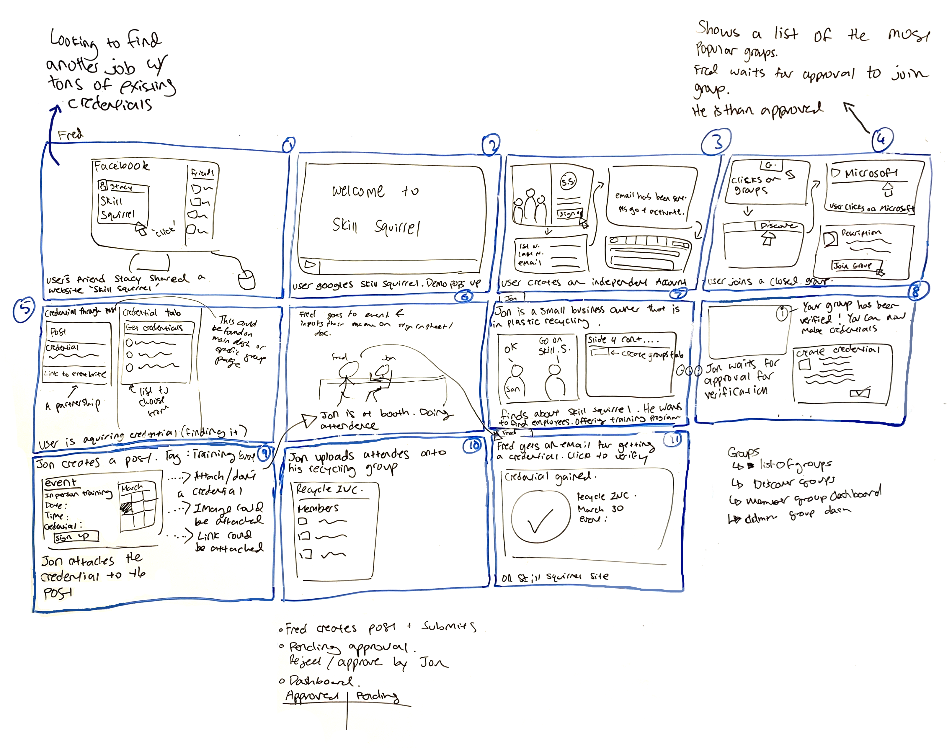
Next, we sketched out a map detailing the users’ journey in completing their primary objective.
The map is a sort of “skeleton” of the product, only covering the high level tasks a user needs to do to achieve their primary goal(s).
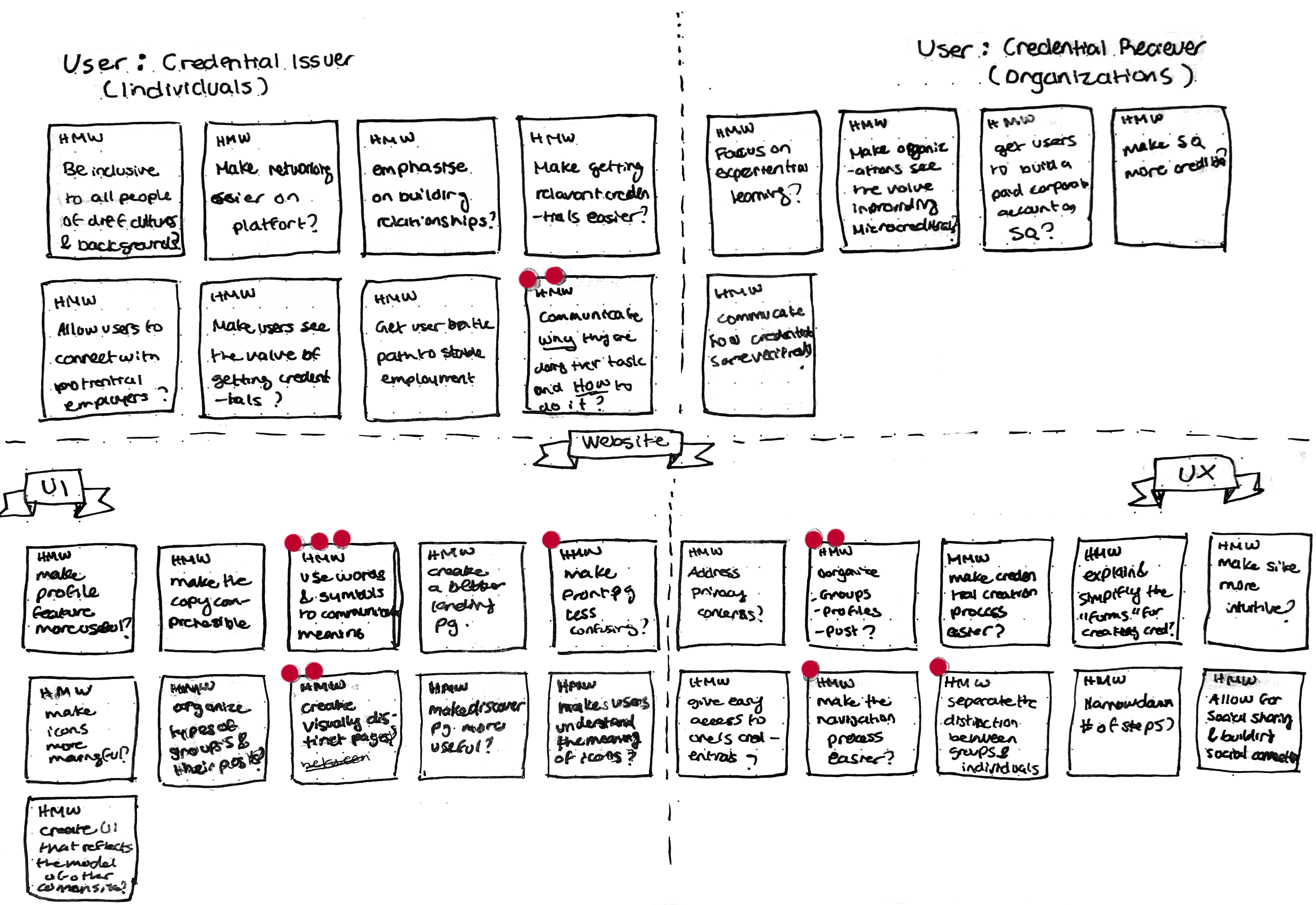
During the our first iteration of testing, we took a TON of “How Might We’ notes, to launch brainstorming.
My fingers cramped for a while that day, but it proved to be worthwhile as it helped us zero in on core problem we were aiming to solve.
We then voted on the best HMWs with three stickers per team member, followed by outlining the region with the biggest pain points.
With this, we listed the high level goals to evaluate our work against at the end of the project.
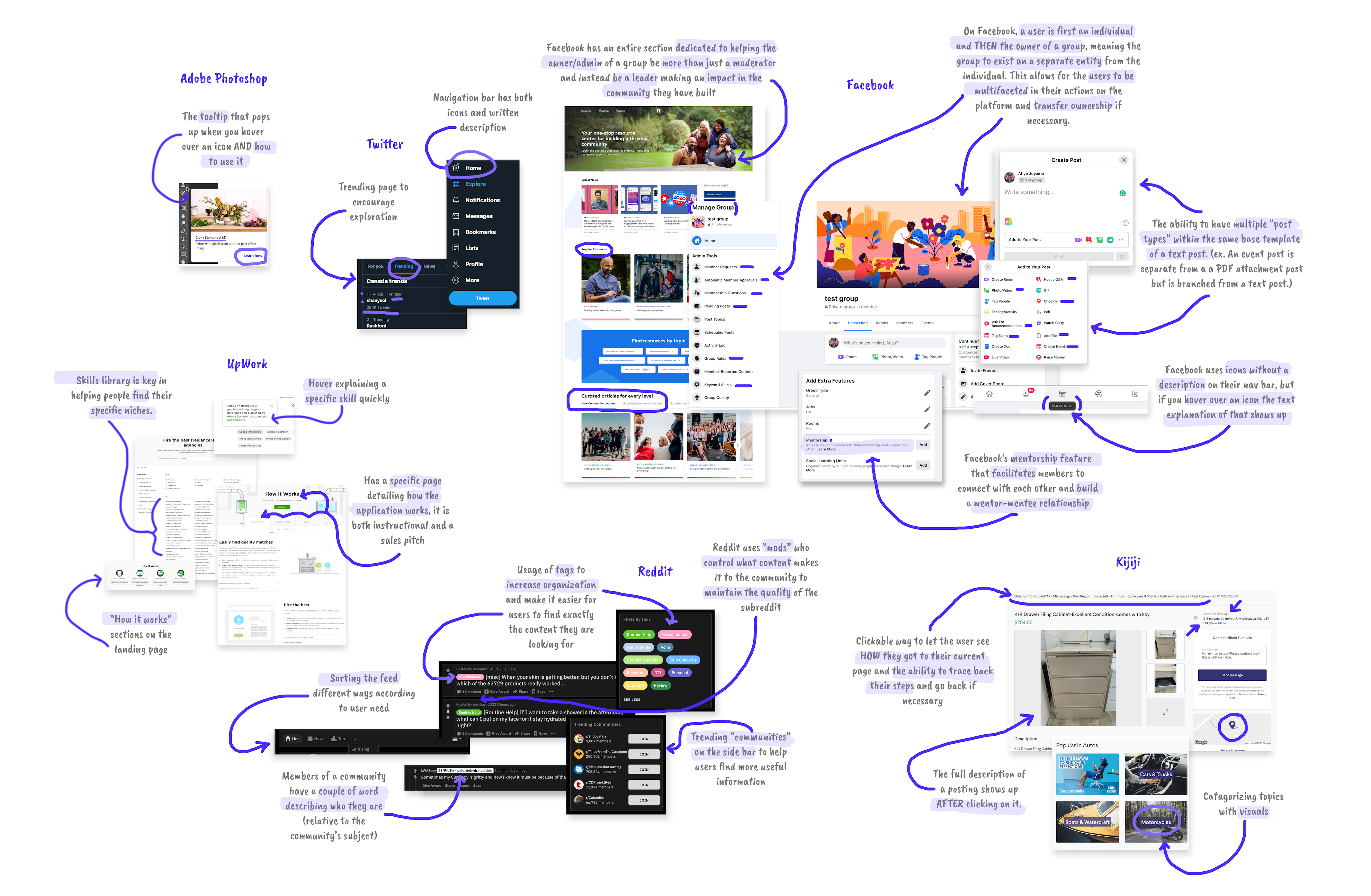
My team looked at a variety of platforms to gain insight into best practices and extrapolate features we could draw inspiration from. This was an important step in the process because it was critical to respect the user’s mental models. To do this effectively, we opted to use similar structures from platforms users were already familiar with. This would help reduce cognitive load and lower the learning curve.
We then formed a storyboard using the user types identified in our personas. This allowed the prototype we were to build to have context and allowed my team to have a uniform mental conception of the user’s journey. This was important as there were multiple team members working on the mockups and we needed insure that everyone was on the same page.
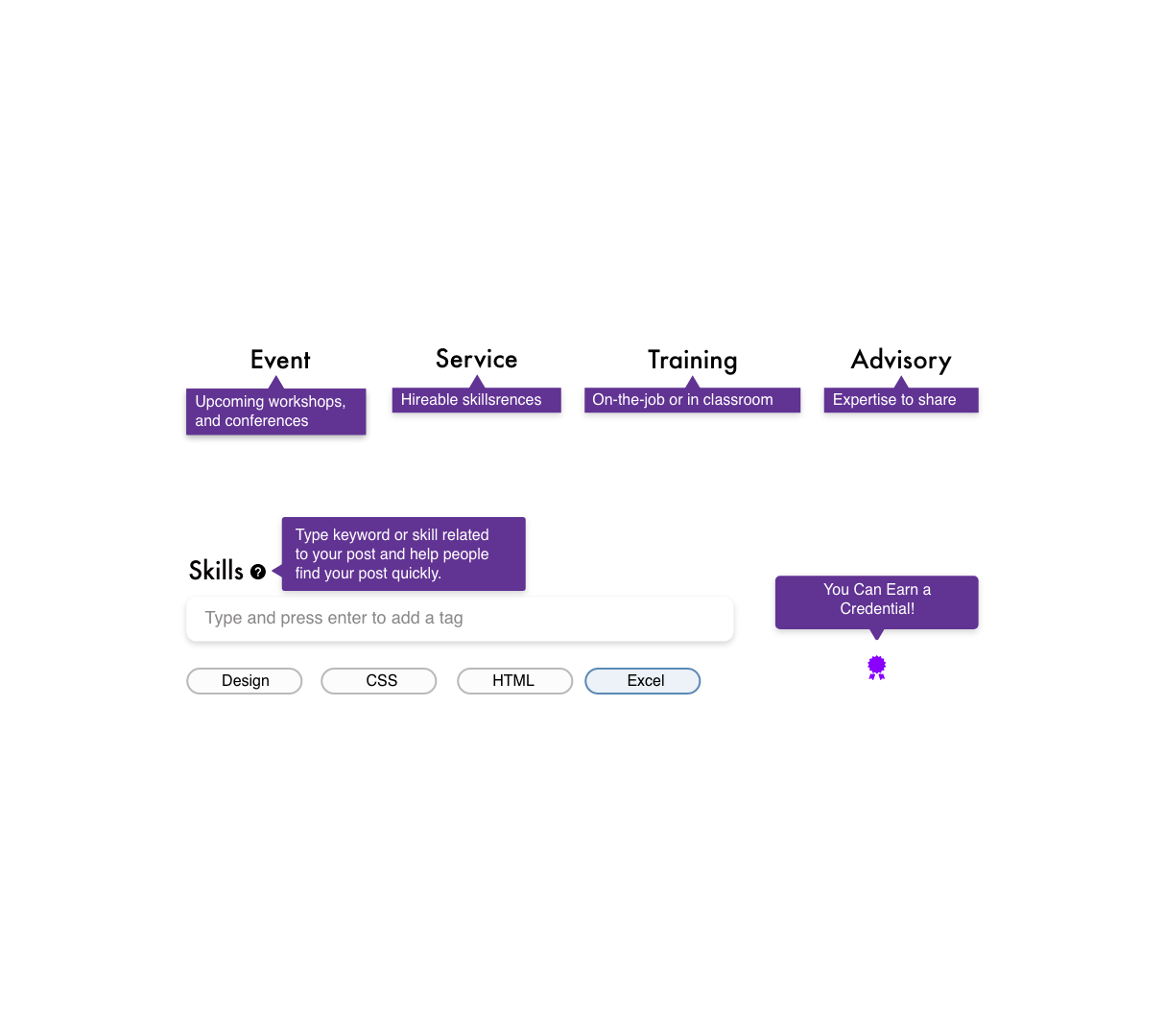
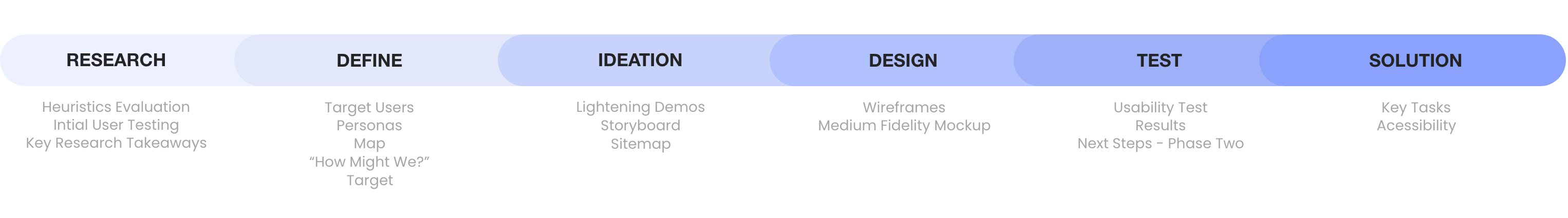
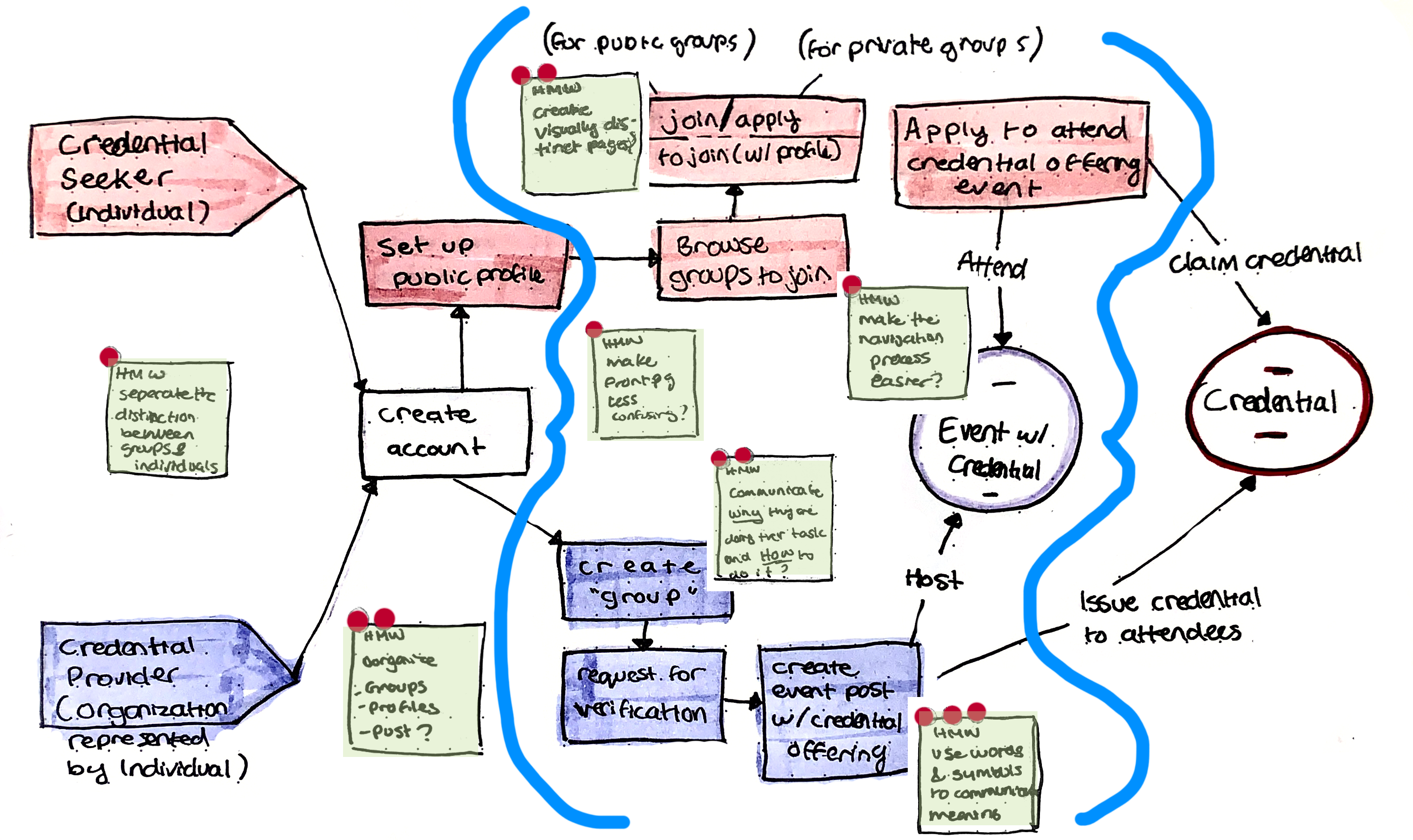
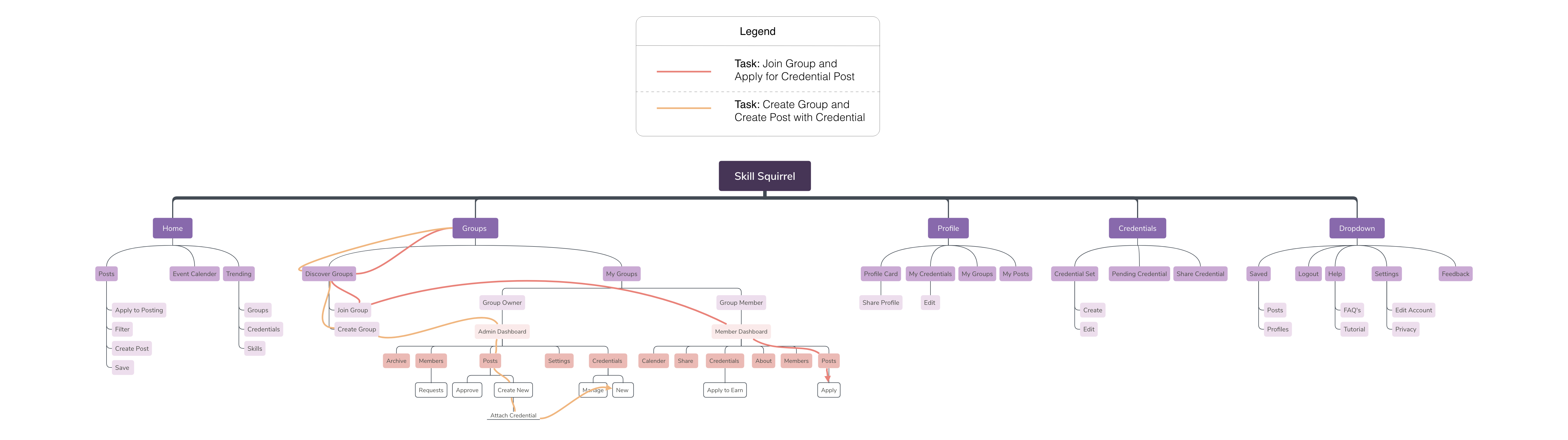
Before prototyping, we sketched out the site map with the new information architecture informed by our card sort and tree test study done on Optimal Sort. This map helped us make sure we built all the necessary features and functionality for the MVP and helped break up the work between team members.
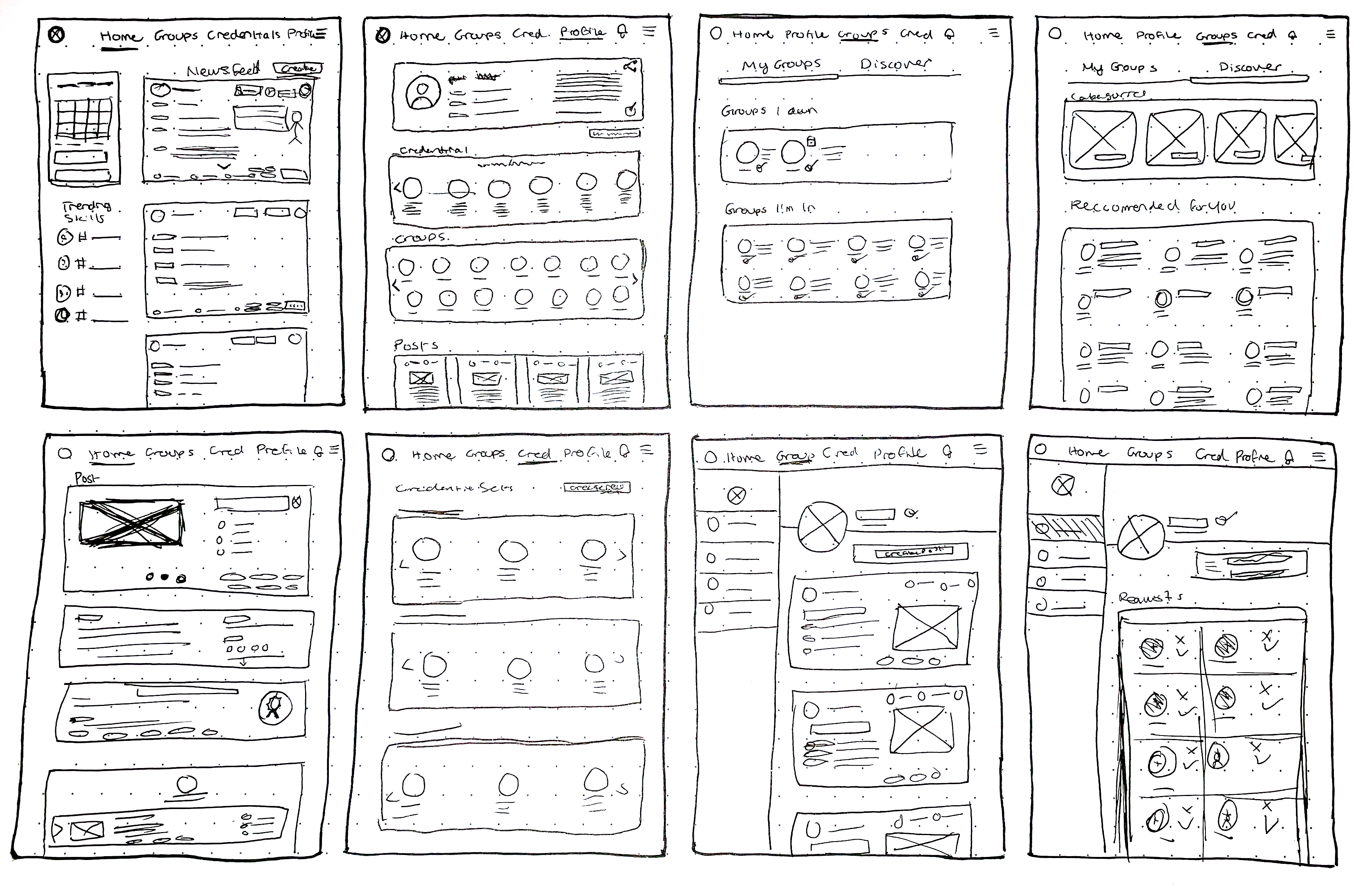
We began our design phase by sketching out low-fidelity wireframes. We did several iterations of the wireframes and then settled on the best ones. We did them mostly as a team on the whiteboard but I finalized them on paper. Here are some of them below:
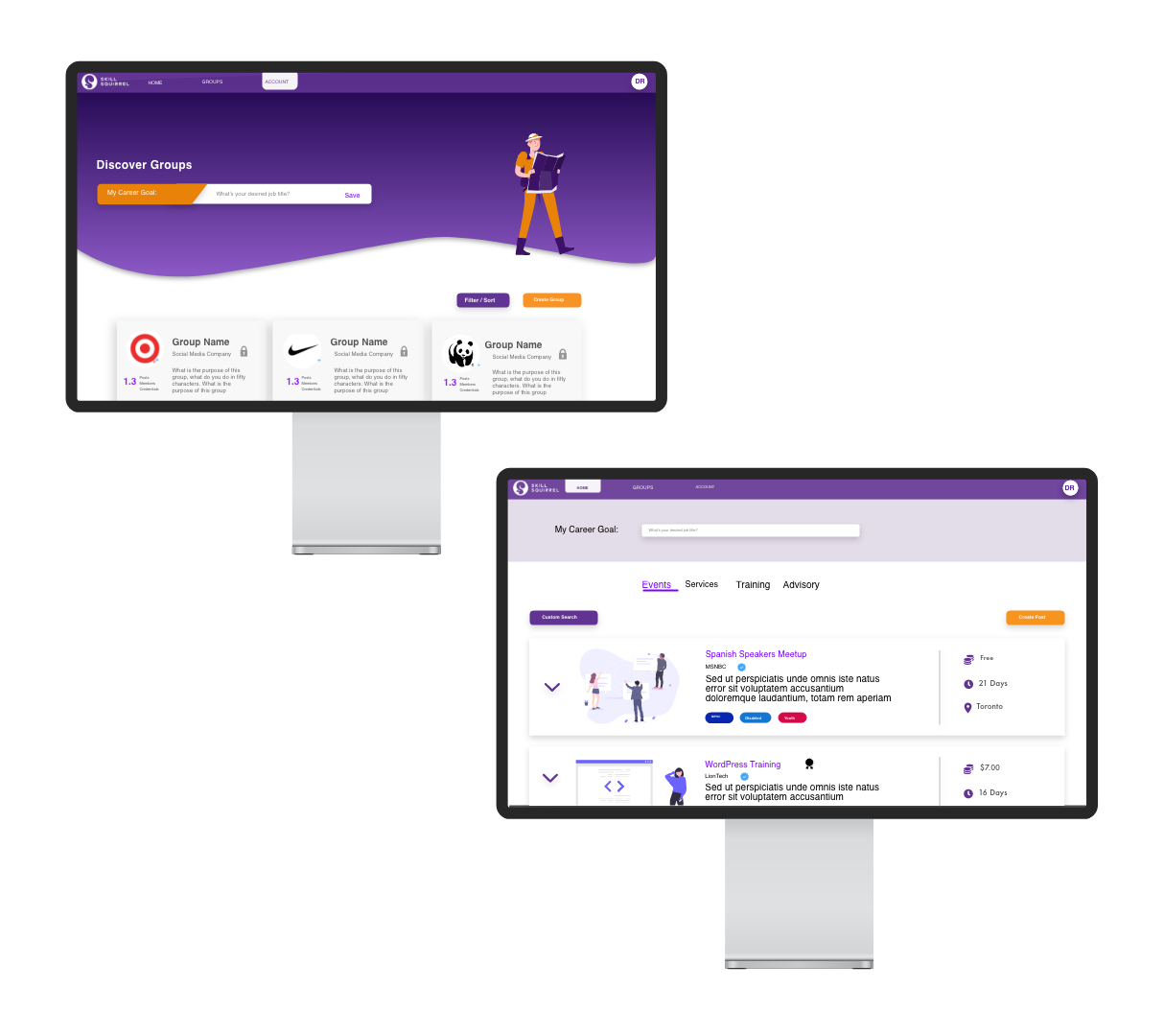
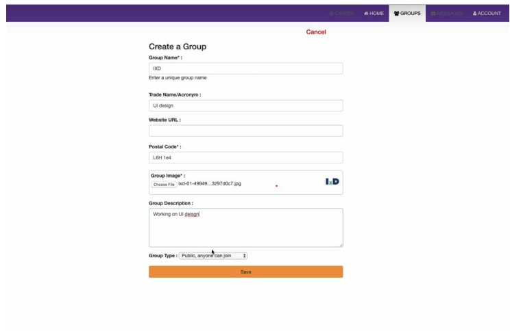
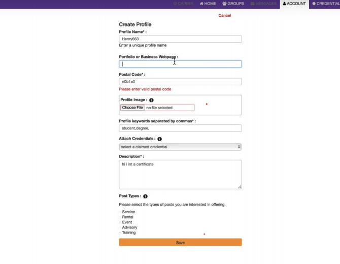
To swiftly get to our first phase of user testing, we produced mockups at a mid-fidelity level. I worked on the Home, Groups, Profile and Saved page and then once the other pages were mostly complete, I went over the entire prototype to create a consistent look, edited anything that was done incorrectly and weaved together the prototype.
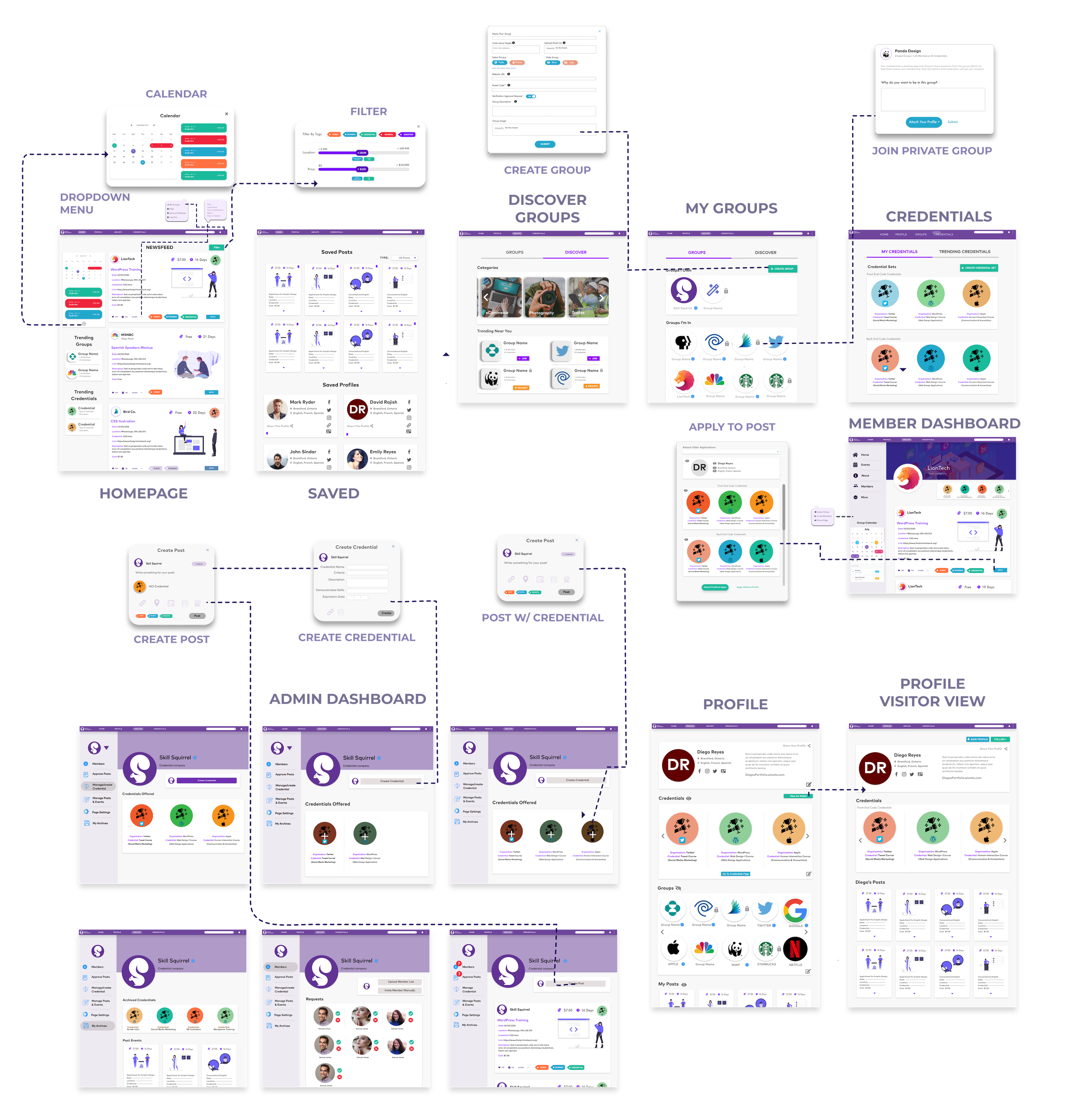
We went through several iterations of prototyping and testing. Below is an example of the iterations the design went through shown through the various versions the homepage, the last one being the final iteration.
Due to the spread of COVID-19 in early 2020, no one was allowed to gather in person until further notice. So, it was time to adapt; going fully remote was challenging, namely because of communication gaps, but we took advantage of remote collaboration tools like Zoom, remote usability testing and Adobe XD and got the work done.
After submitting our handoff package, I was hired on to continue on the project over the summer and assigned me the role of Design Team Lead. The scope of Phase Two was to
-> Design the remaining flows detailed on the sitemap
-> Create a design system,
-> Collaborate with engineers
-> Create a development backlog (image below).
Overall, I believe I was successful on the objectives I set up in the beginning of the project, despite the hiccups. The project was a huge learning opportunity in terms of leadership, working remotely as a team. Namely, the importance of communication (both between team members as well as to the users we design for). I also learned how to effectively work with constraints instead of being limited by them.
Had I had the opportunity to continue with Skill Squirrel, I would integrate further accessibility feature. We have already integrated some but there is more work to be done.
The design of a mobile app truly tailor for children, functioning to make kids financially literate and build lifelong finance habits using real money and real stakes.